
Tilesets with PMTiles in Microsoft Fabric
If you've been following the Icon Map blog for a while, you'll have seen a number of posts about PMTiles. They're an essential part of a serverless, modern geospatial solution.
News, articles and how-to guides about Icon Map and geospatial analytics.
If you've been following the Icon Map blog for a while, you'll have seen a number of posts about PMTiles. They're an essential part of a serverless, modern geospatial solution.
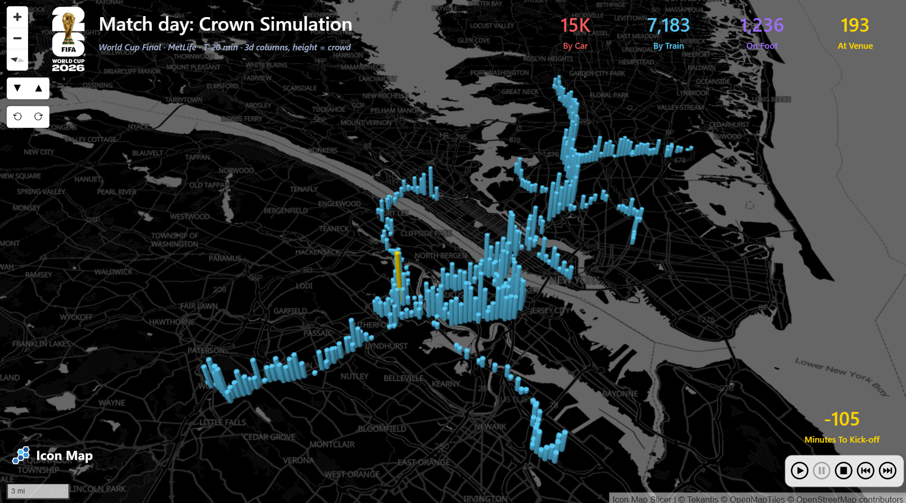
We built a World Cup crowd movement simulation in Icon Map to explore how large event travel patterns can be modelled, visualised and understood directly inside Power BI.
Q-Commerce is inherently spatial, from delivery catchments and dark store coverage to travel times and demand density.
A practical guide to preparing spatial data for reliable, performant Icon Map visuals in Power BI, from checking coordinates and attributes to choosing the right layer approach.
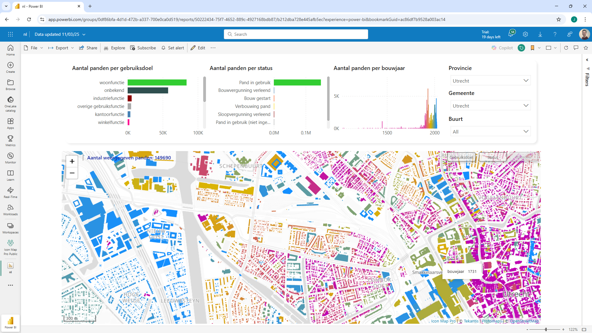
Icon Map is capable of taking longitude and latitude coordinates and automatically generating an H3 hexagon cell at the required resolution to render on the map.
Putting data on a map is usually the easy bit. Using that map to make a better decision is where things get more interesting.
How US insurers can combine Icon Map Catalog layers with policy, claims, exposure and customer data in Power BI to create practical, high-value location intelligence.
There is a need to visualize geographic data in a Power BI report so the decision to include a map is the easy part.
Many business datasets already contain two very powerful dimensions, time and location. Sales happen at a particular moment and in a particular place.
**Making geospatial data easier to use in Power BI**
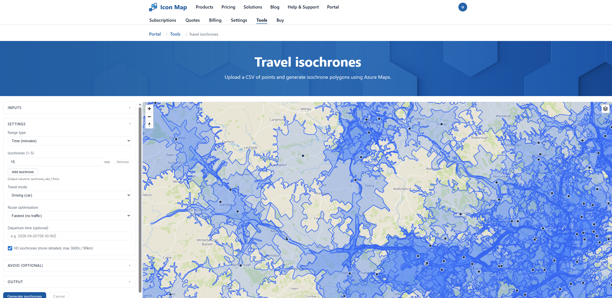
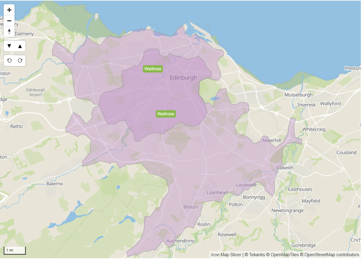
Overview of our Travel Isochrone and Address Geocoder Tools
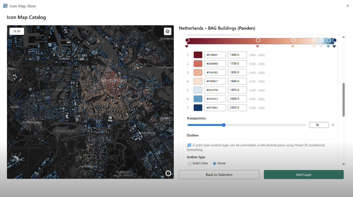
Icon Map from Tekantis has announced the launch of Icon Map Catalog, a new feature within Icon Map that makes it much easier to find and use geographic data inside Microsoft Power BI.
We attended FABCON 2026, where data professionals discussed real-time analytics, AI and modern data platforms. A key theme was getting more value from data without adding complexity to existing workflows.
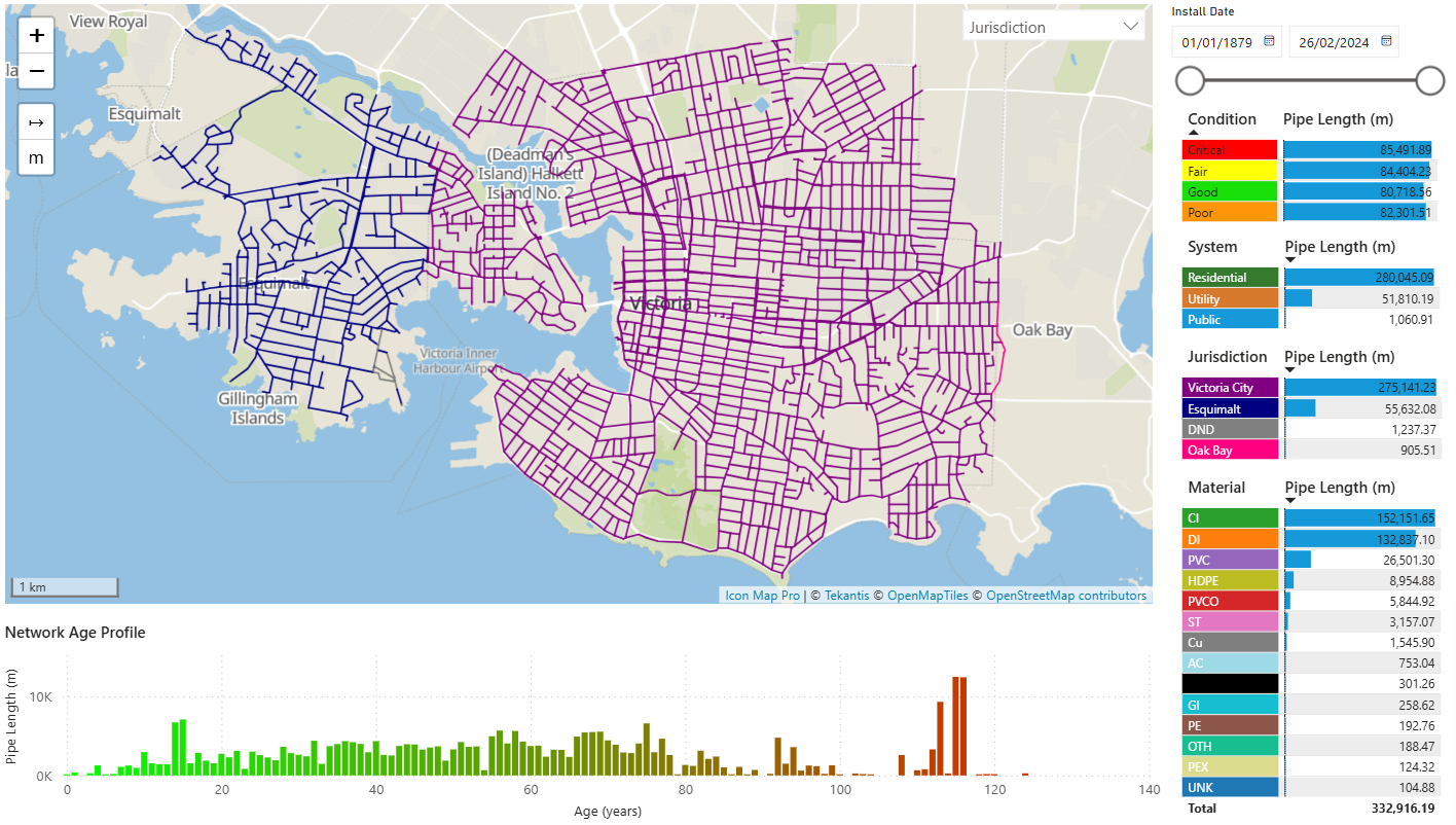
Utilities and Telecoms organizations generate huge volumes of operational data.
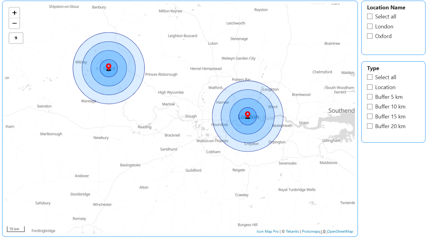
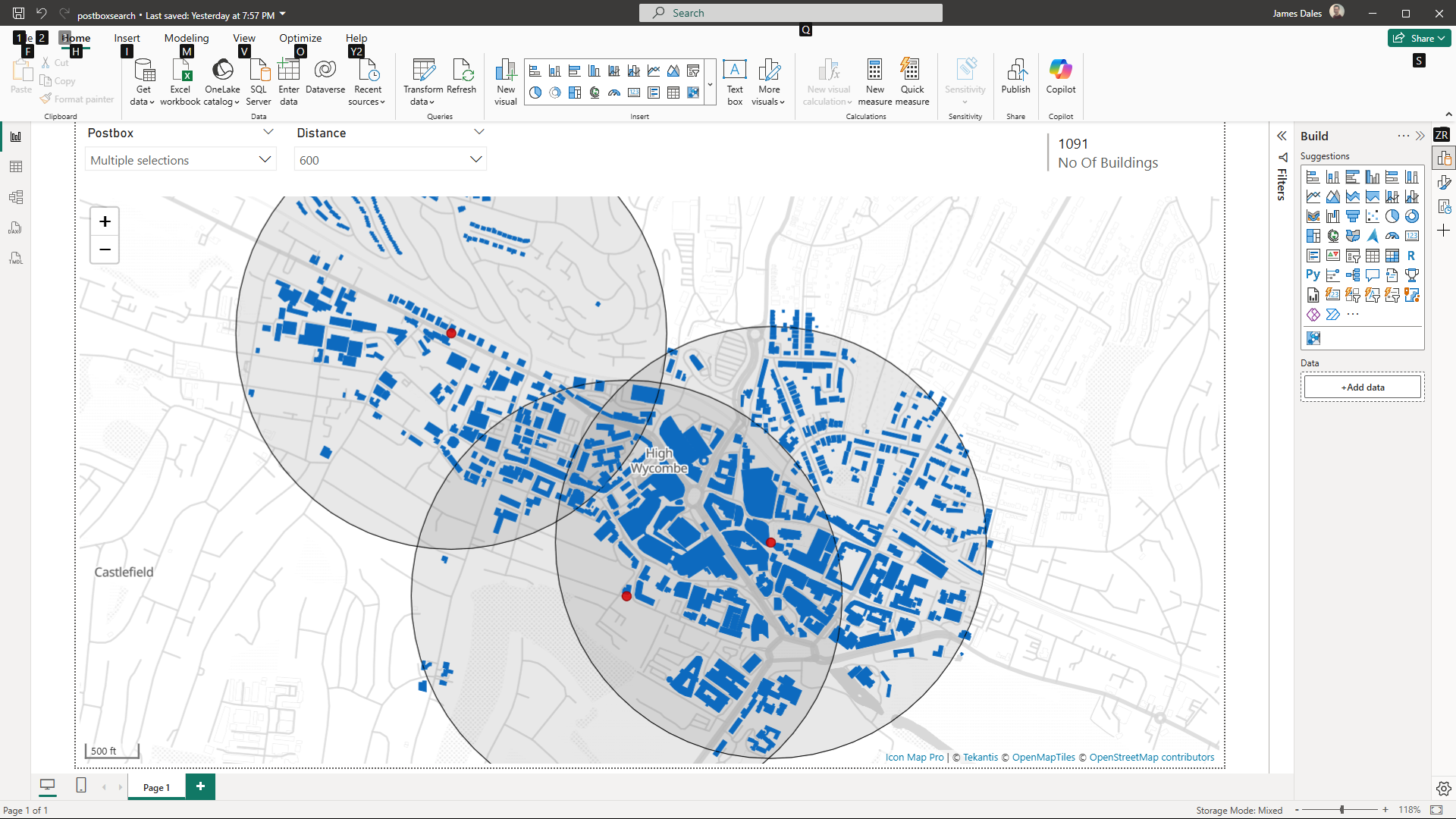
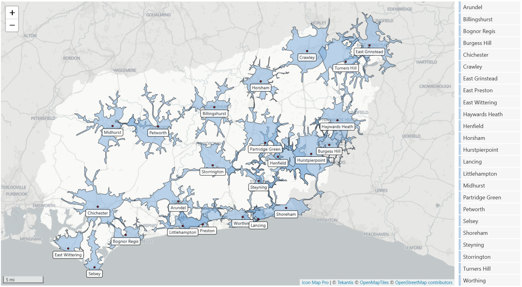
Circular buffers turn point maps into proximity-aware analysis in Power BI.
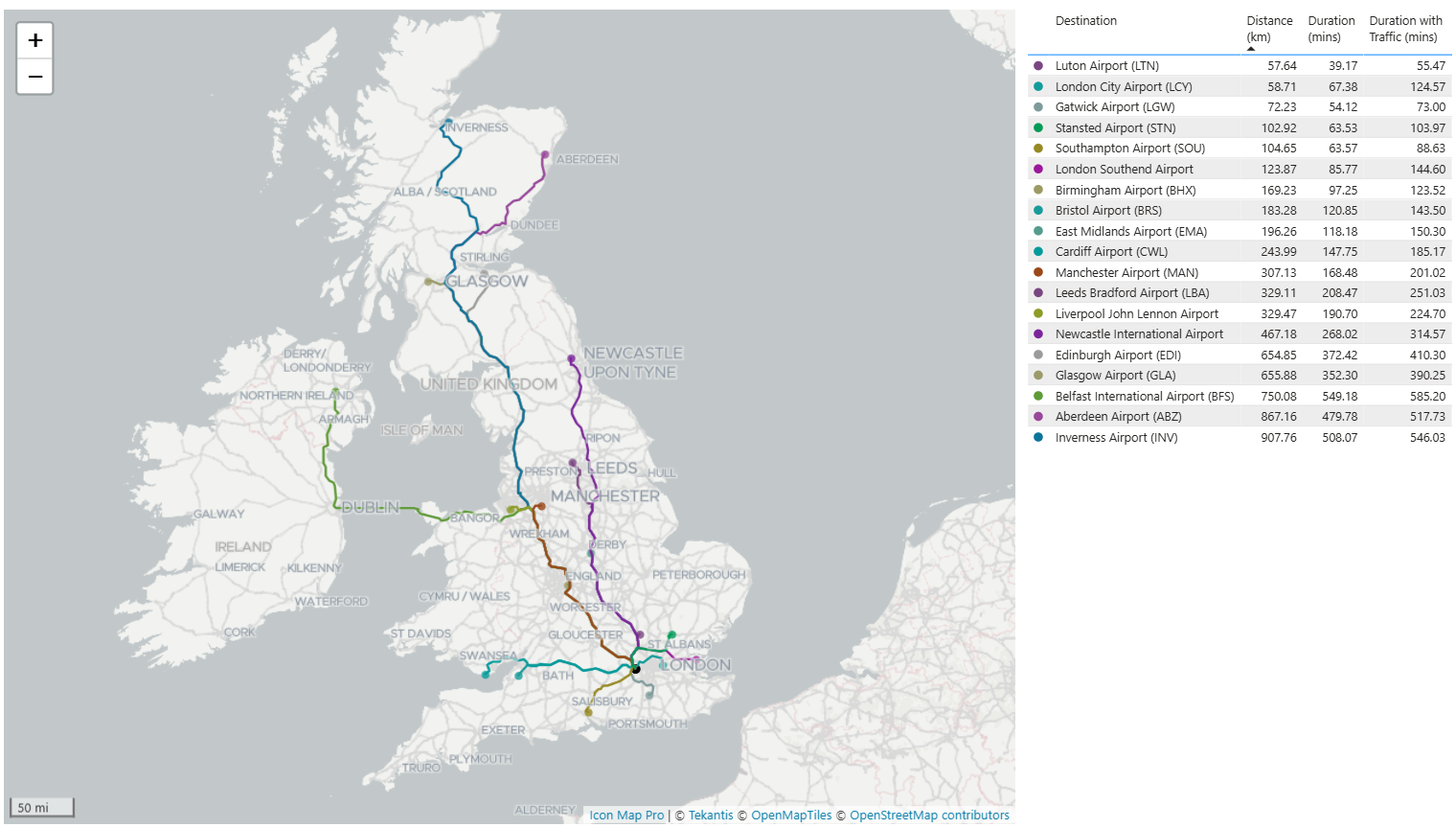
Aviation runs in space, time and height.

In January 2026 we revamped our licensing model based on feedback, consolidating and simplifying our usage-based licensing and introducing a developer license enabling free use of Icon Map in Power BI Desktop for up to 6…
Retail analysts get asked questions that sound simple, but rarely are:
Last week, Tekantis presented at the London Power BI and Fabric User Group for a session that showcased the capabilities of Icon Map.
Maps that use gradient color schemes can be excellent for showing patterns, but they are also one of the easiest ways to mislead your audience by accident.
Tekantis has announced a major update to Icon Map, its geospatial analytics software for Power BI. The update introduces a six month free developer license, a usage based pricing model and a new client portal.
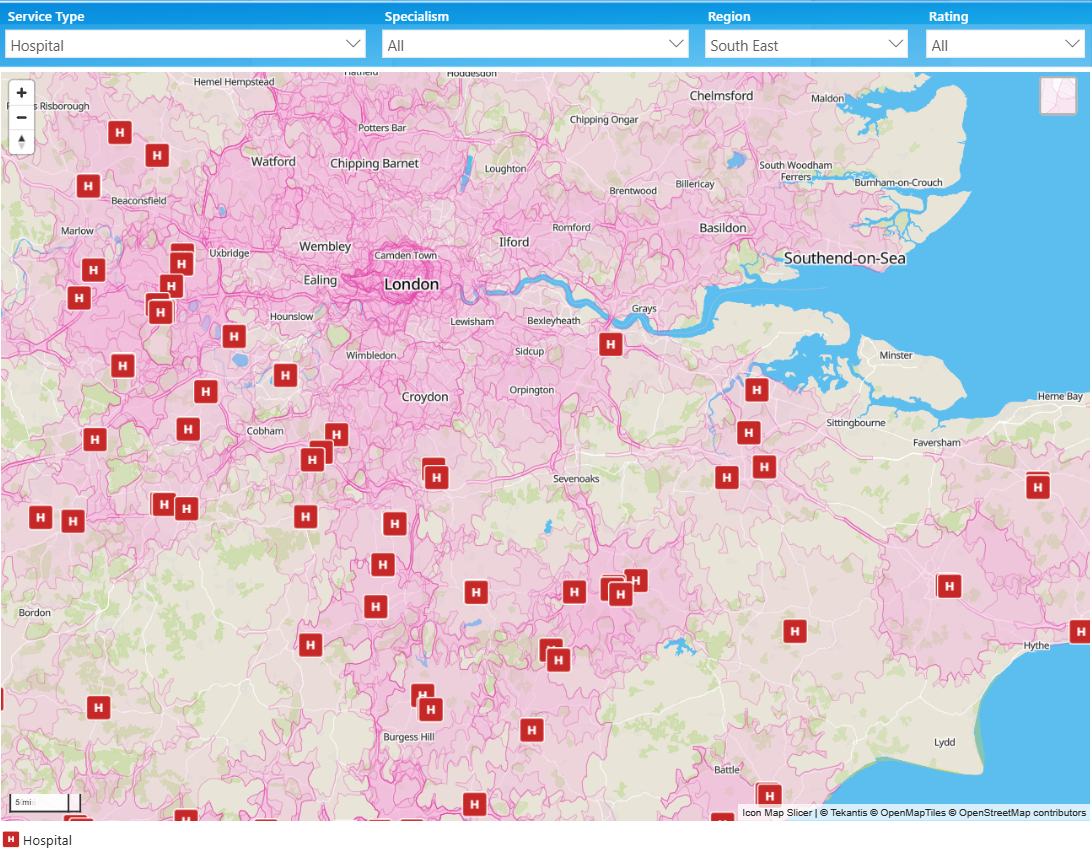
For NHS and public health analysts, location intelligence helps turn routine health data into clearer insight on disease patterns, service access and vaccination coverage, supporting more confident operational decisions.
Icon Map joined the Fabric & Power BI Wales User Group for a session that truly captured why we enjoy working with maps so much.

Geo-analytics adds location and spatial context to business data, revealing patterns, risks and opportunities that traditional dashboards often miss.
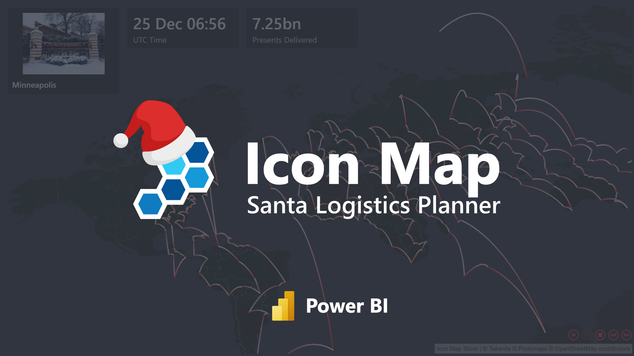
A fun seasonal project showing how NORAD’s Santa data, Power Query and Icon Map Slicer can be combined to create a fully animated Santa tracker in Power BI.
We made it!
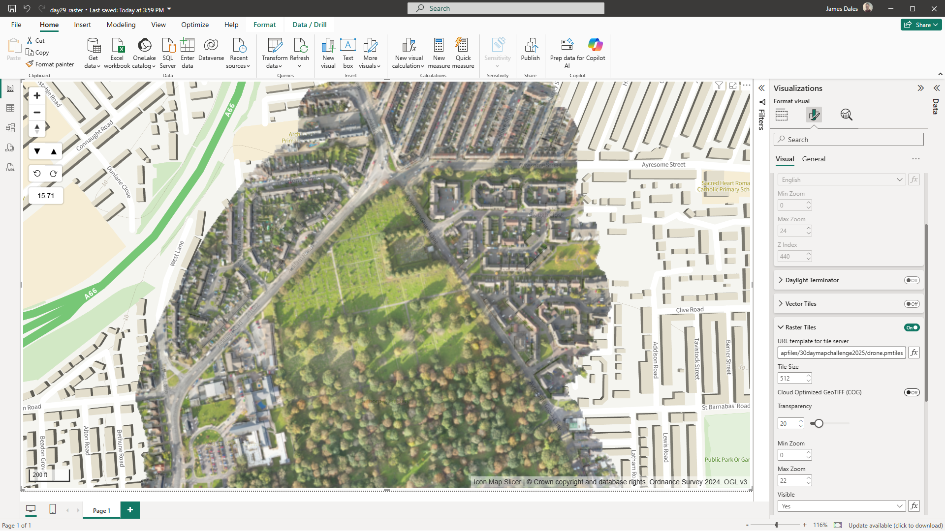
It's day 29 of the 30 Day Map Challenge and the theme is "Raster".
We're on to day 28 of the 30 Day Map Challenge and today's theme is "Black":
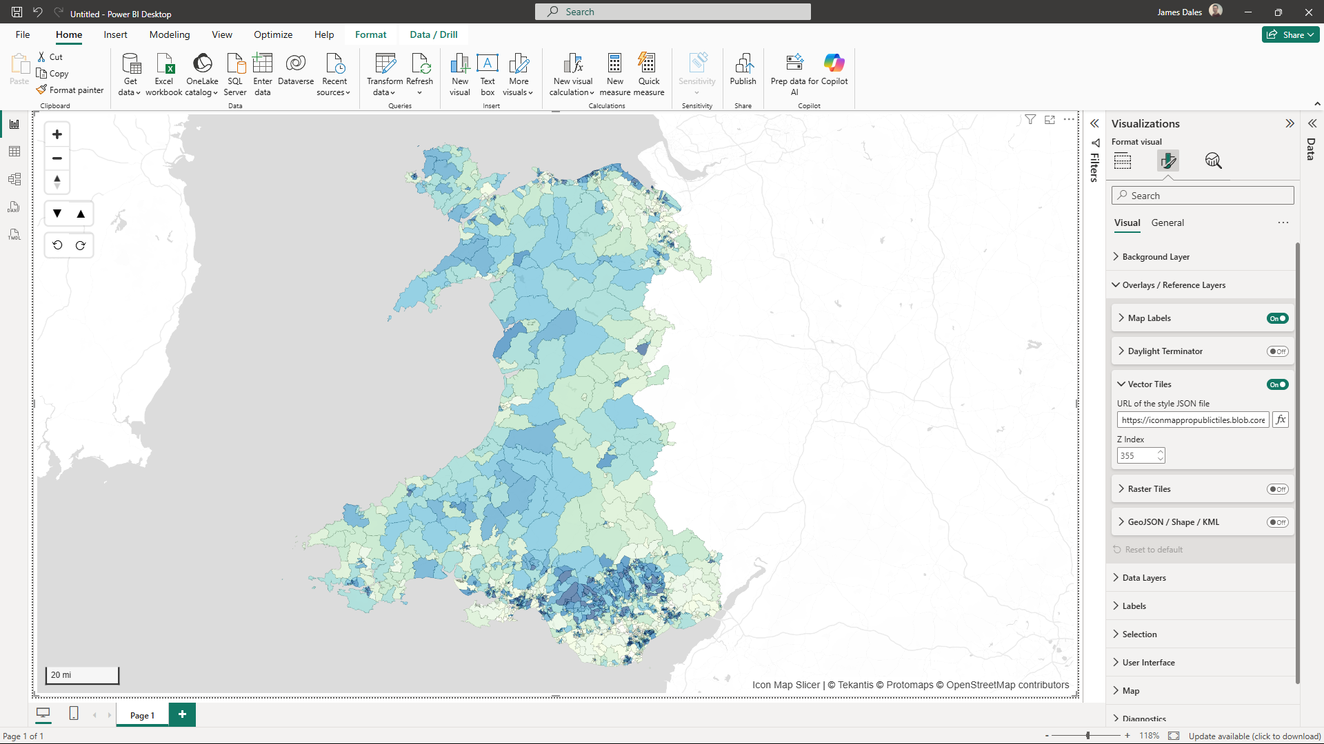
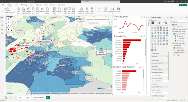
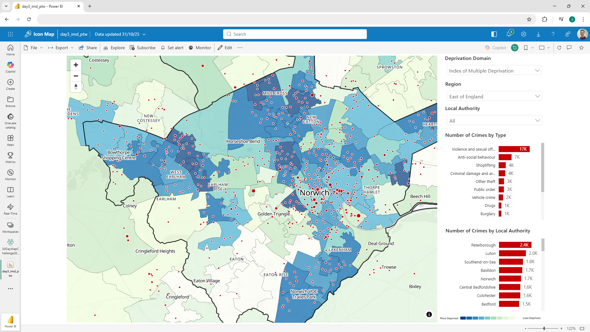
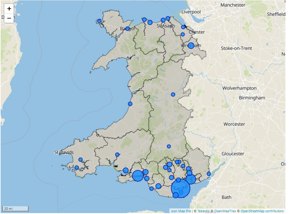
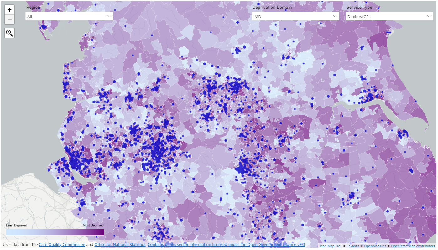
The Welsh Government have just released the Welsh Index of Multiple Deprivation (WIMD) dataset, updated for 2025.
Day 27 of the 30 Day Map Challenge and today's theme is "boundaries".
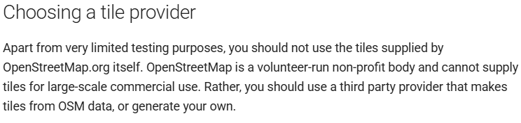
We're of the 30 Day Map Challenge and today's theme is "Data: OpenStreetMap".
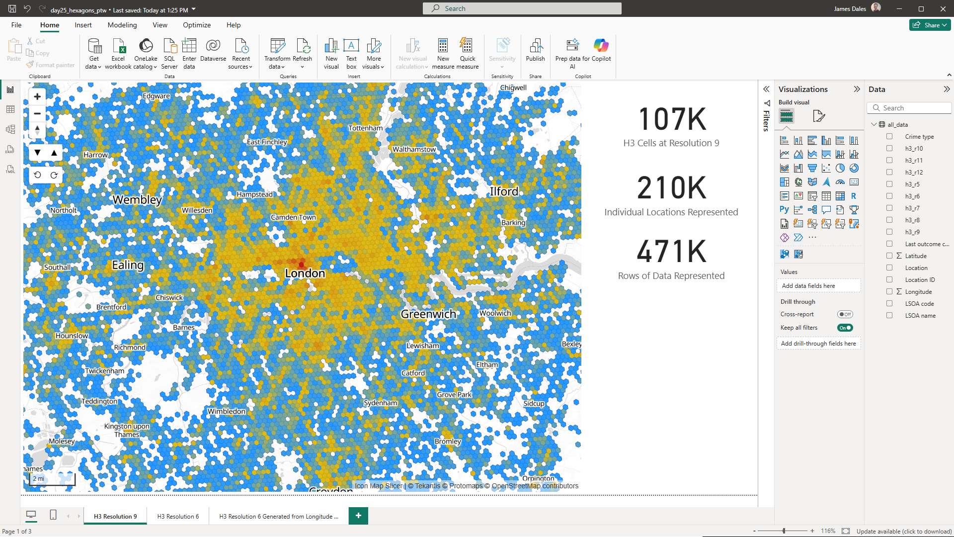
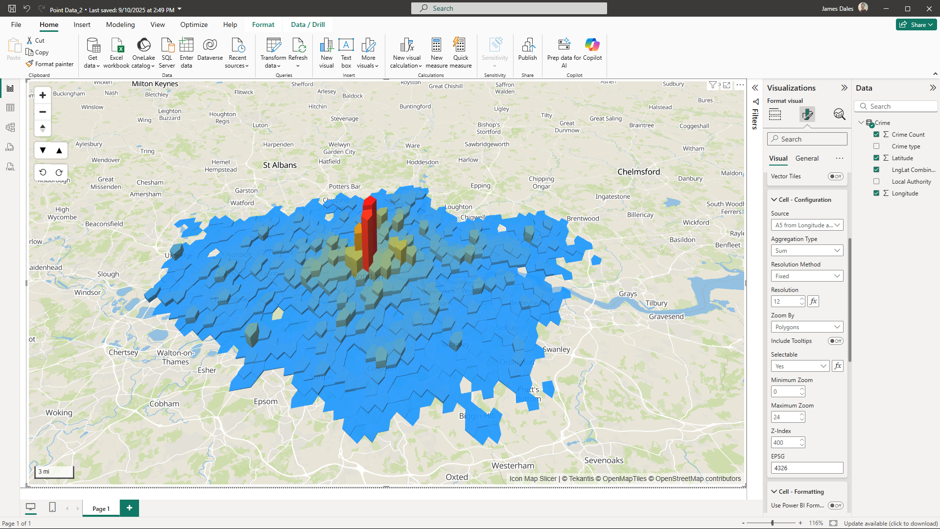
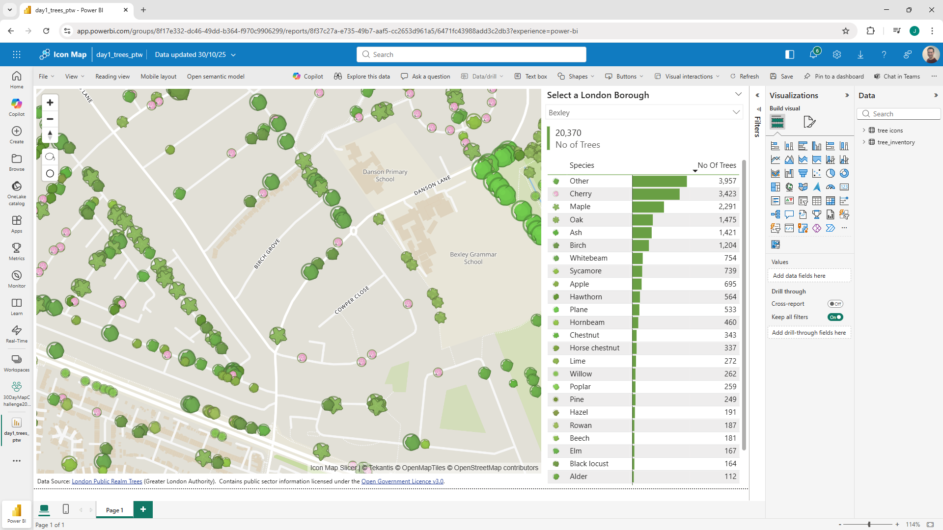
It's day 25 of the 30 Day Map Challenge and today's theme is "Hexagons".
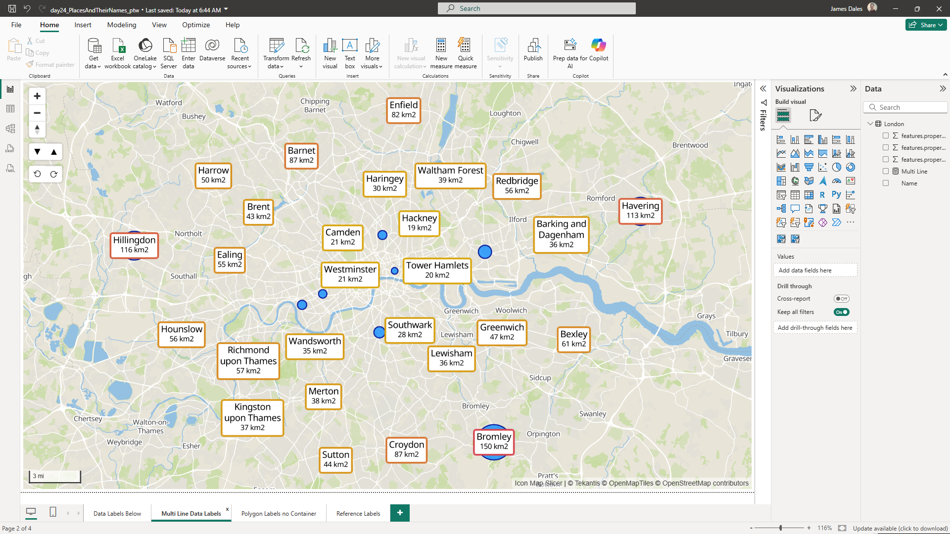
Already day 24 of the 30 Day Map Challenge and today's theme is "Places and their Names".
Moving onto day 23 of the 30 Day Map Challenge and today's theme is "Process"
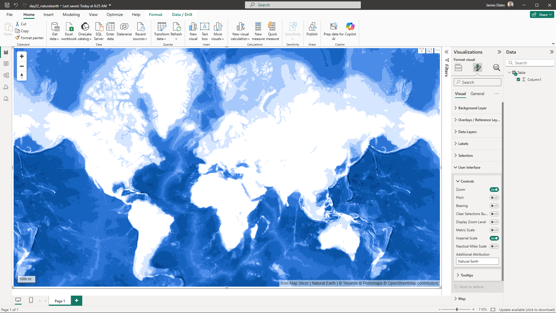
It's day 22 of the 30 Day Map Challenge and today's is a data challenge to use data from "Natural Earth".
It's day 21 of the 30 Day Map Challenge and today's theme is "Icons".
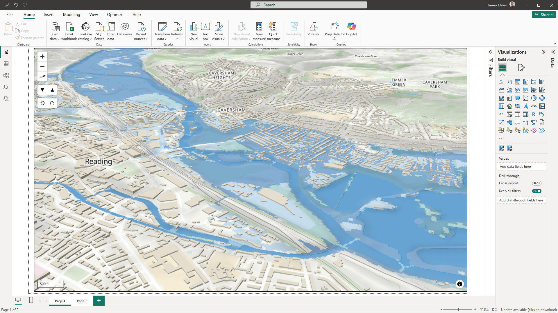
It's day 20 of the 30 Day Map Challenge and today's theme is "Water".
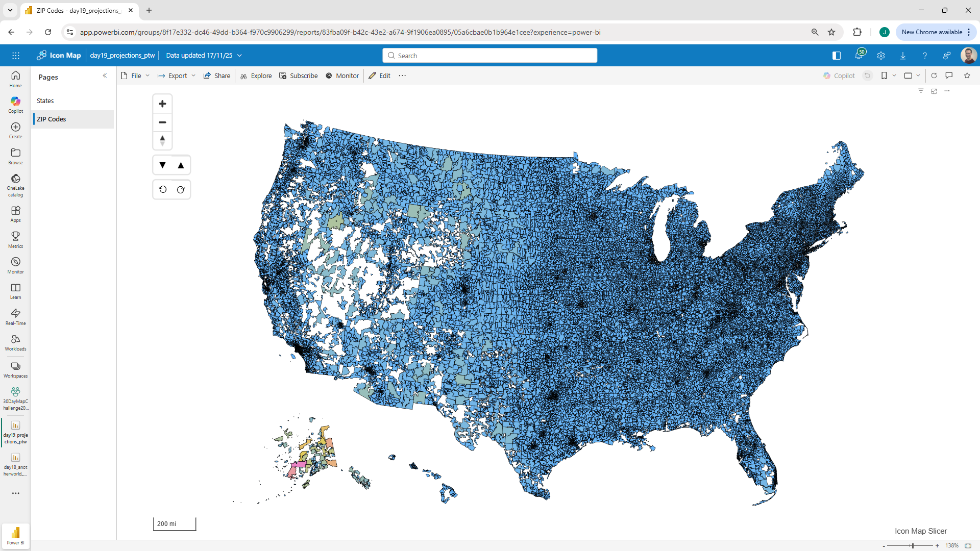
It's day 19 of the 30 Day Map Challenge and today's theme is "Projections".
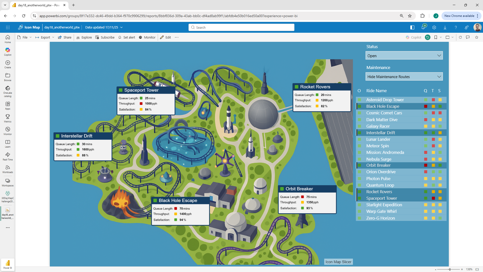
It's day 18 of the 30 Day Map Challenge and today's theme is "Out of this World".
Day 17 of the 30 Day Map Challenge and today's theme is "A New Tool":
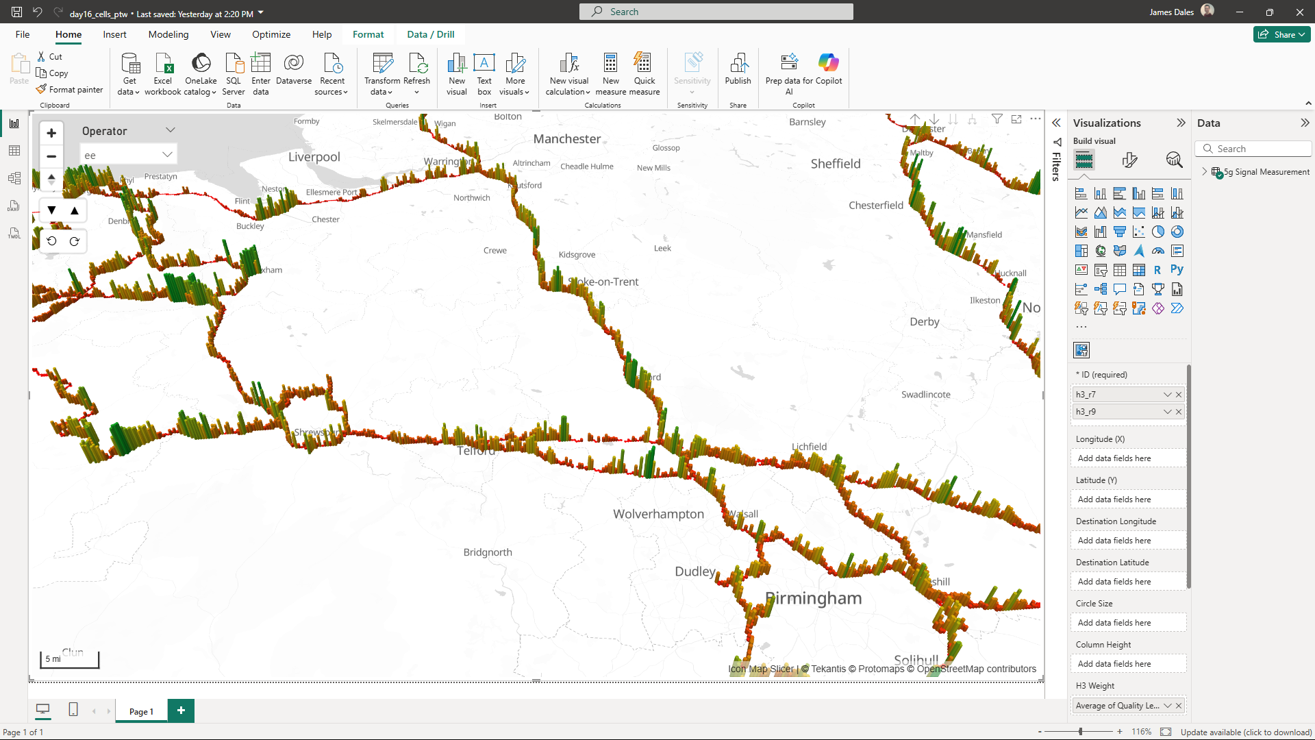
Day 16 of the 30 Day Map Challenge and today's theme is cells:
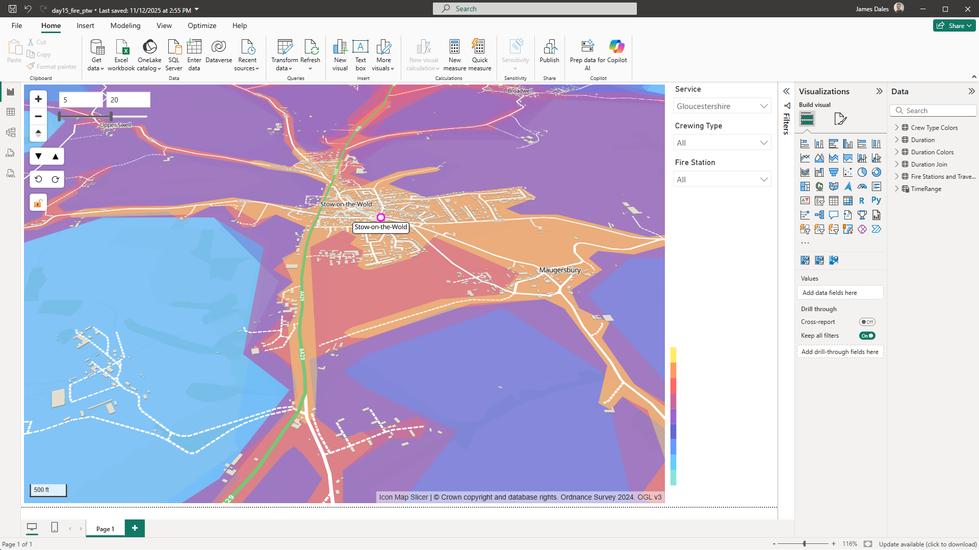
On to week 3 of the 30 Day Map Challenge. It's day 15 and the theme is "Fire".
Already day 14 of the 30 Day Map Challenge and today's theme is "Data: OpenStreetMap".
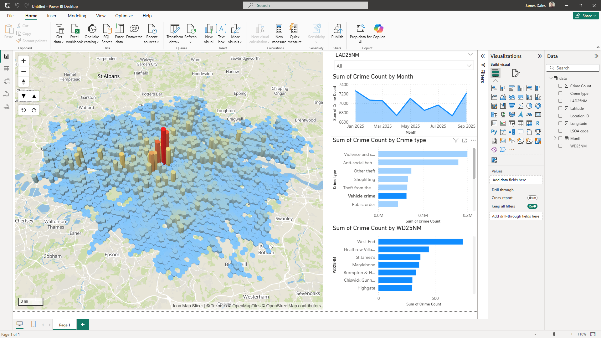
It's day 13 of the 30 Day Map Challenge and today's theme is "10 Minute Map".
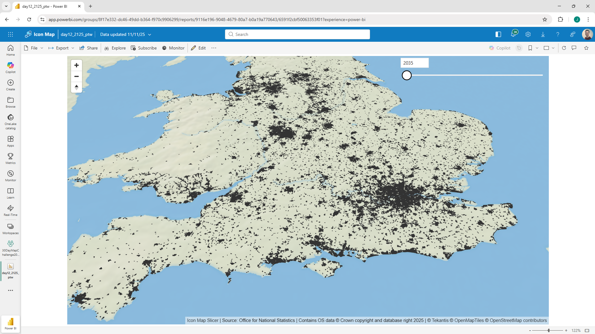
Day 12 of the 30 Day Map Challenge and today's theme is "a map from 2125".
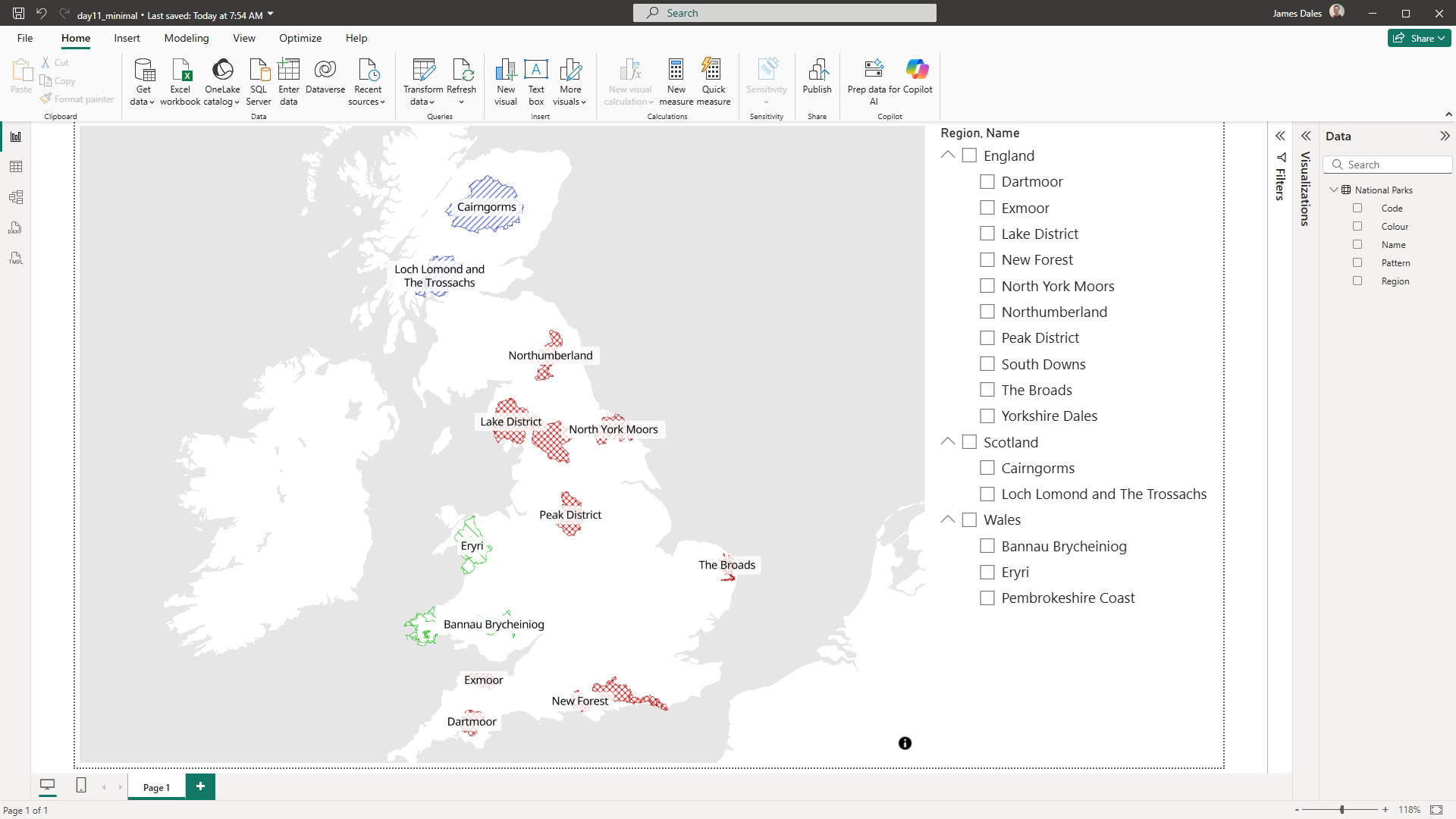
It's day 11 of the 30 Day Map Challenge and today's topic is "Minimal Map"
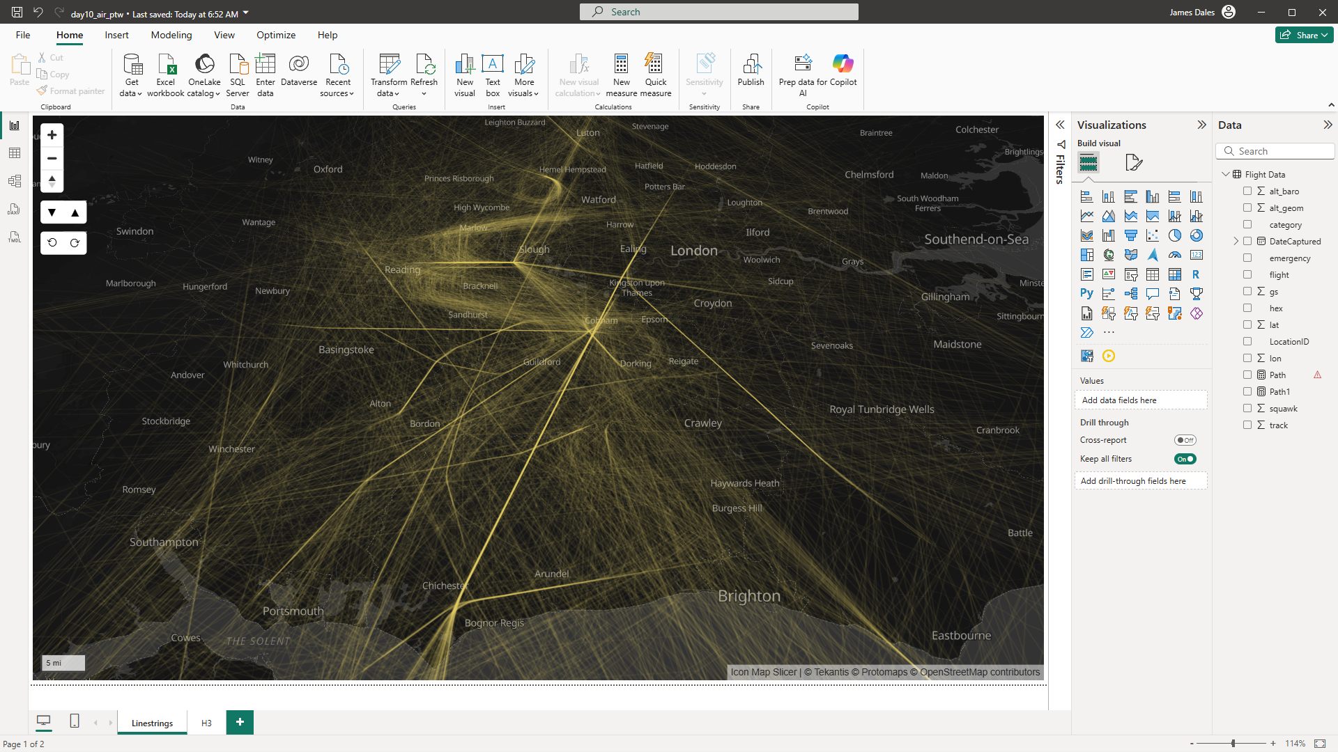
Monday brings us to day 10 of the 30 Day Map Challenge and today's topic is "Air"
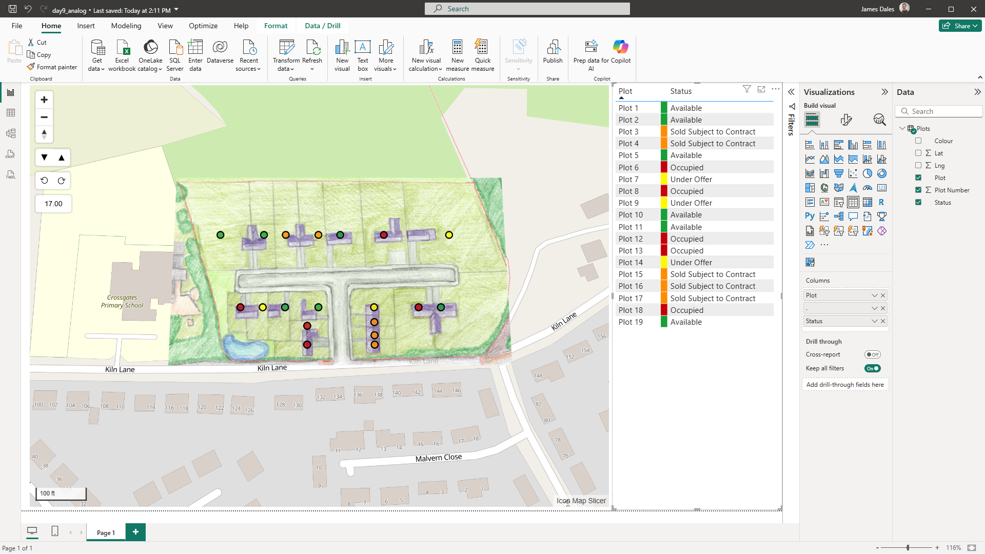
On to day 9 of the 30 Day Map Challenge and the topic is "Analog" - time for me to get out the kid's coloring pencils.
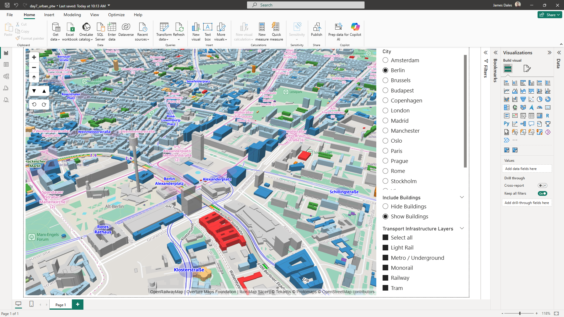
On to week 2 of the the 30 Day Map Challenge. The topic for day 8 is "Urban" to mark World Urbanism Day and I'm using today's challenge to highlight some of new functionality we're about to release in Icon Map Slicer 1.
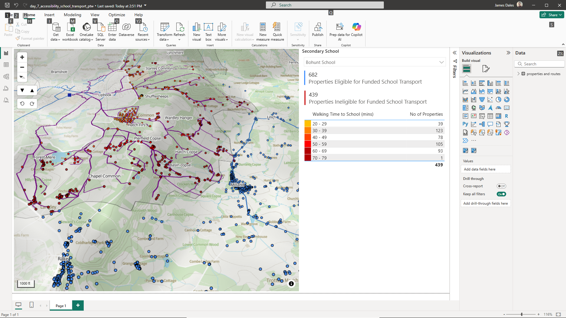
We're already at the end of the first week of the 30 Day Map Challenge. The topic for day 7 is "Accessibility".
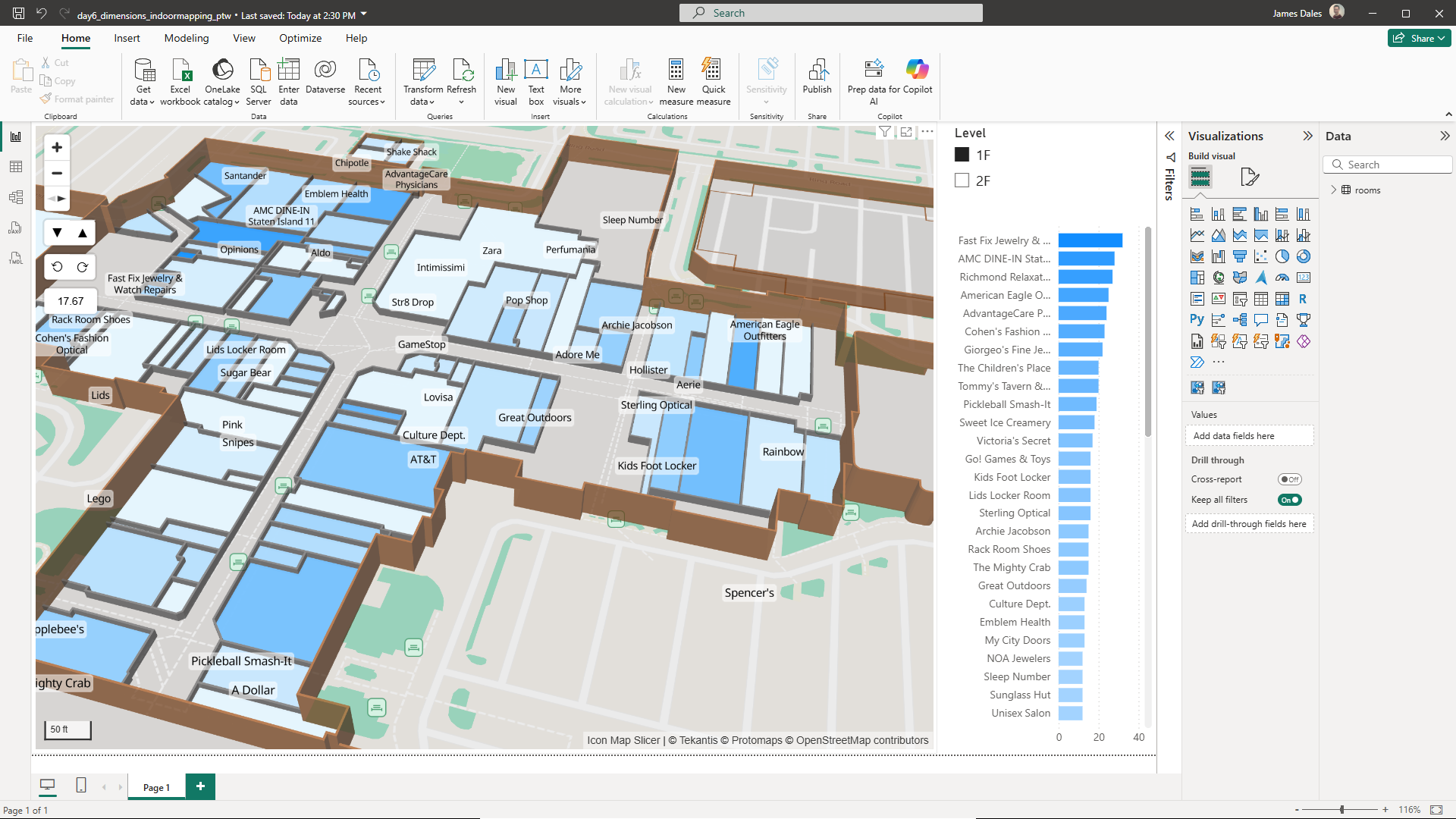
Day 6 of the 30 Day Map Challenge and the topic today is "Dimensions"
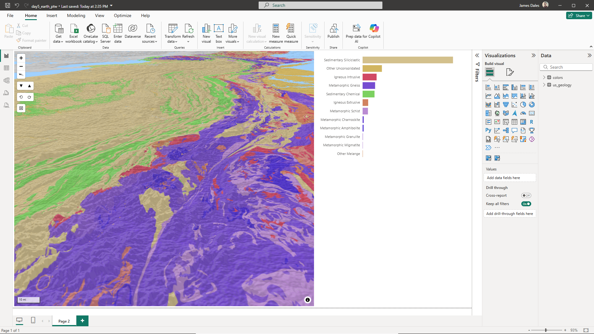
Day 5 of the 30 Day Map Challenge is all about "Earth".
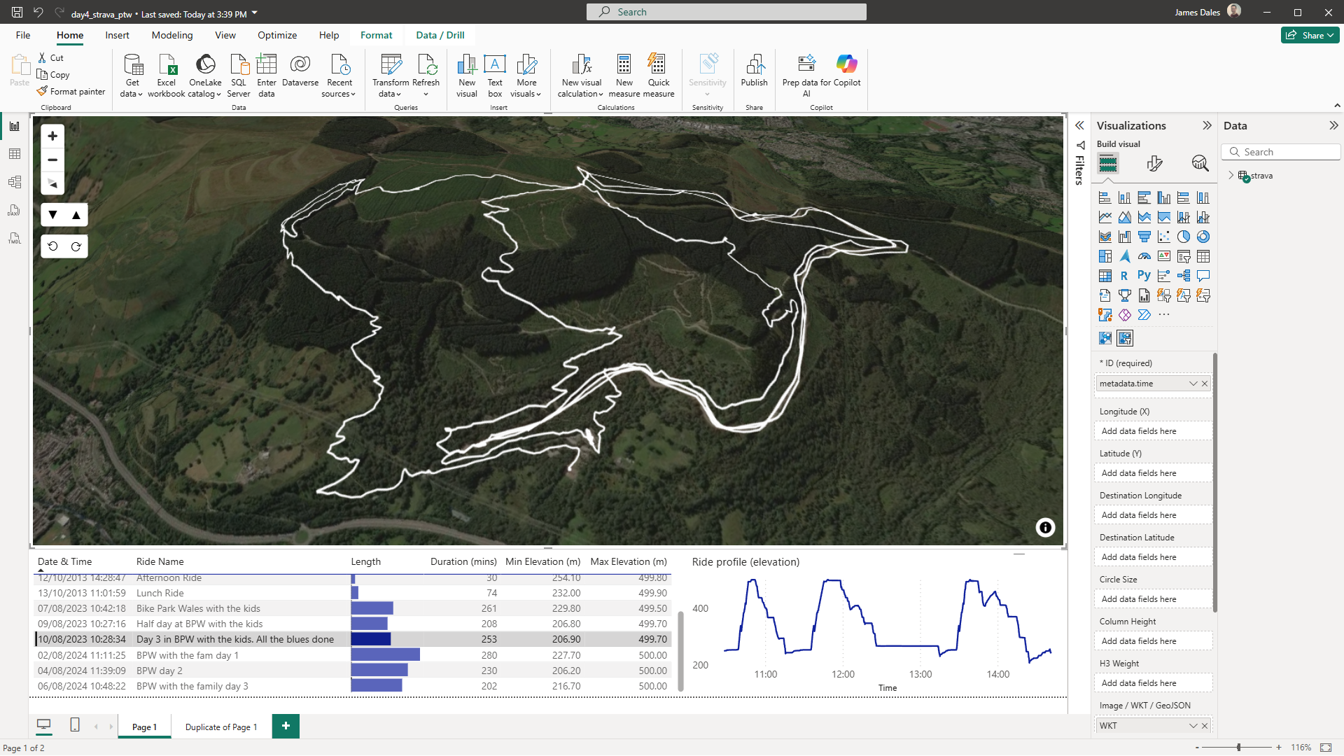
Day 4 of the 30 Day Map Challenge brings us to the topic of "my data".
On to day 3 of the 30 Day Map Challenge and today's theme is Polygons:
On to the 2nd day of the 30 Day Map Challenge.
It's November 1st, which means it's the first day of this year's 30 Day Map Challenge. Of course I'm aiming to use Icon Map for as many of the challenges as possible.
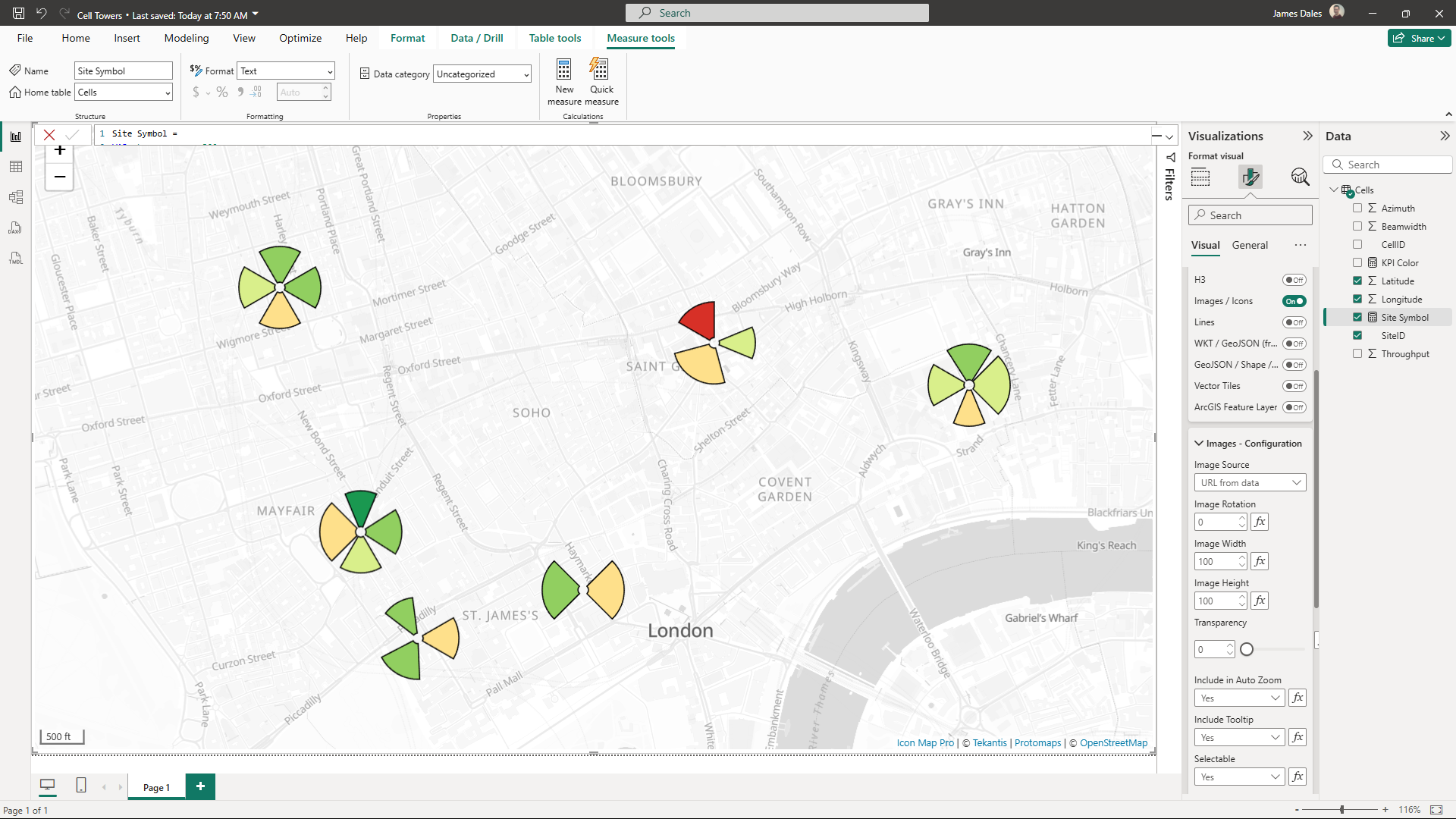
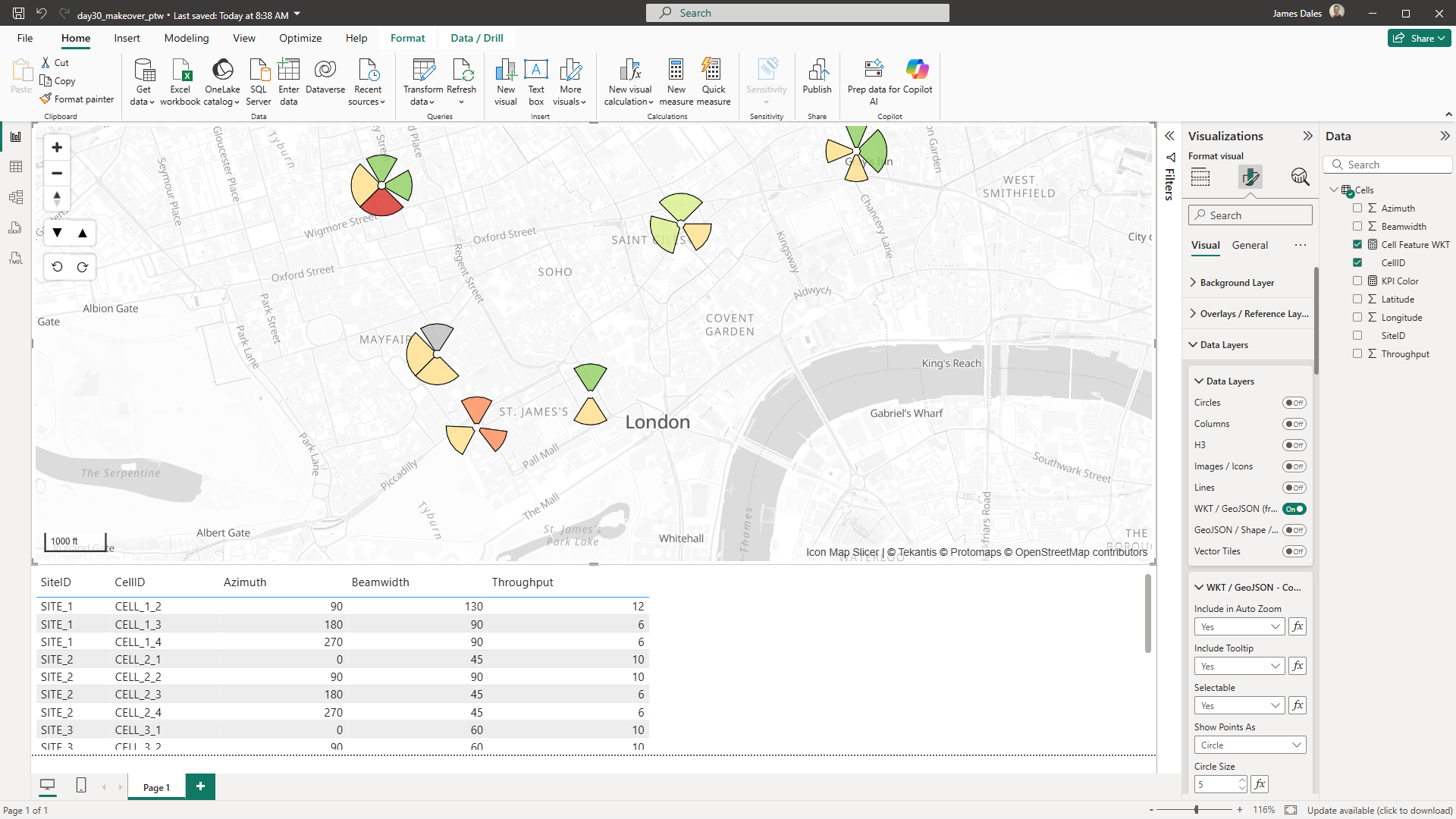
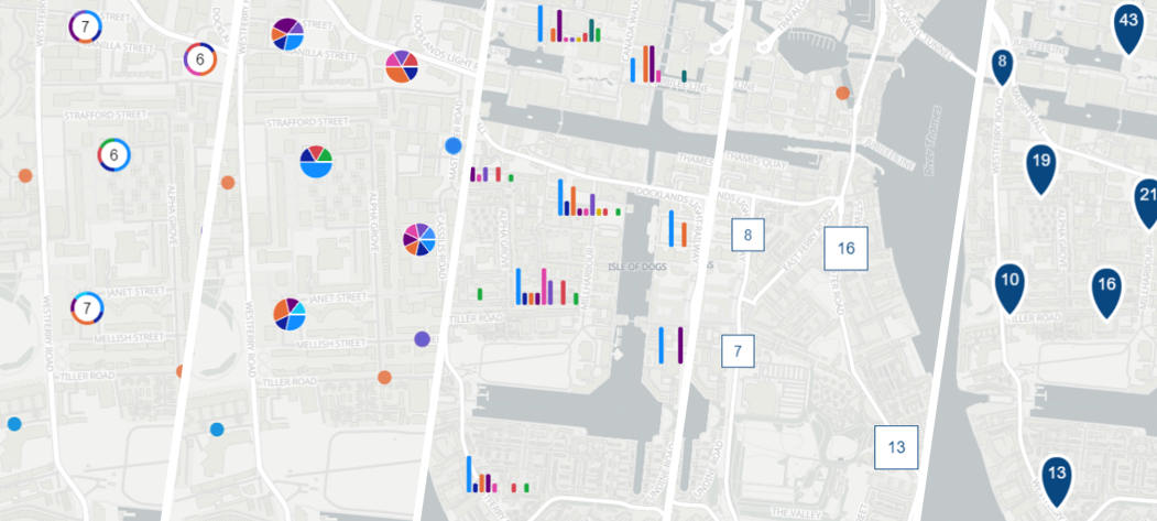
A common use case for our telecoms customers is to show cell tower locations, using wedge diagrams, to represent various information and KPIs. This blog shows a repeatable approach for achieving this using Icon Map Pro.
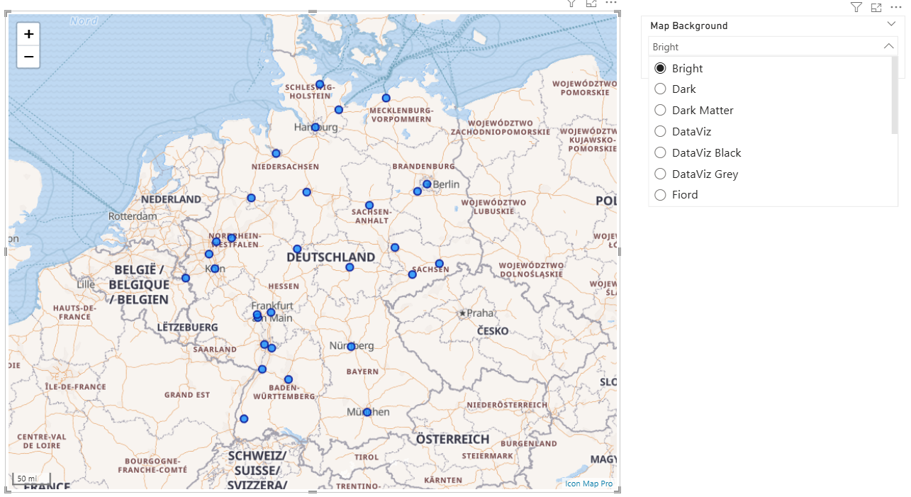
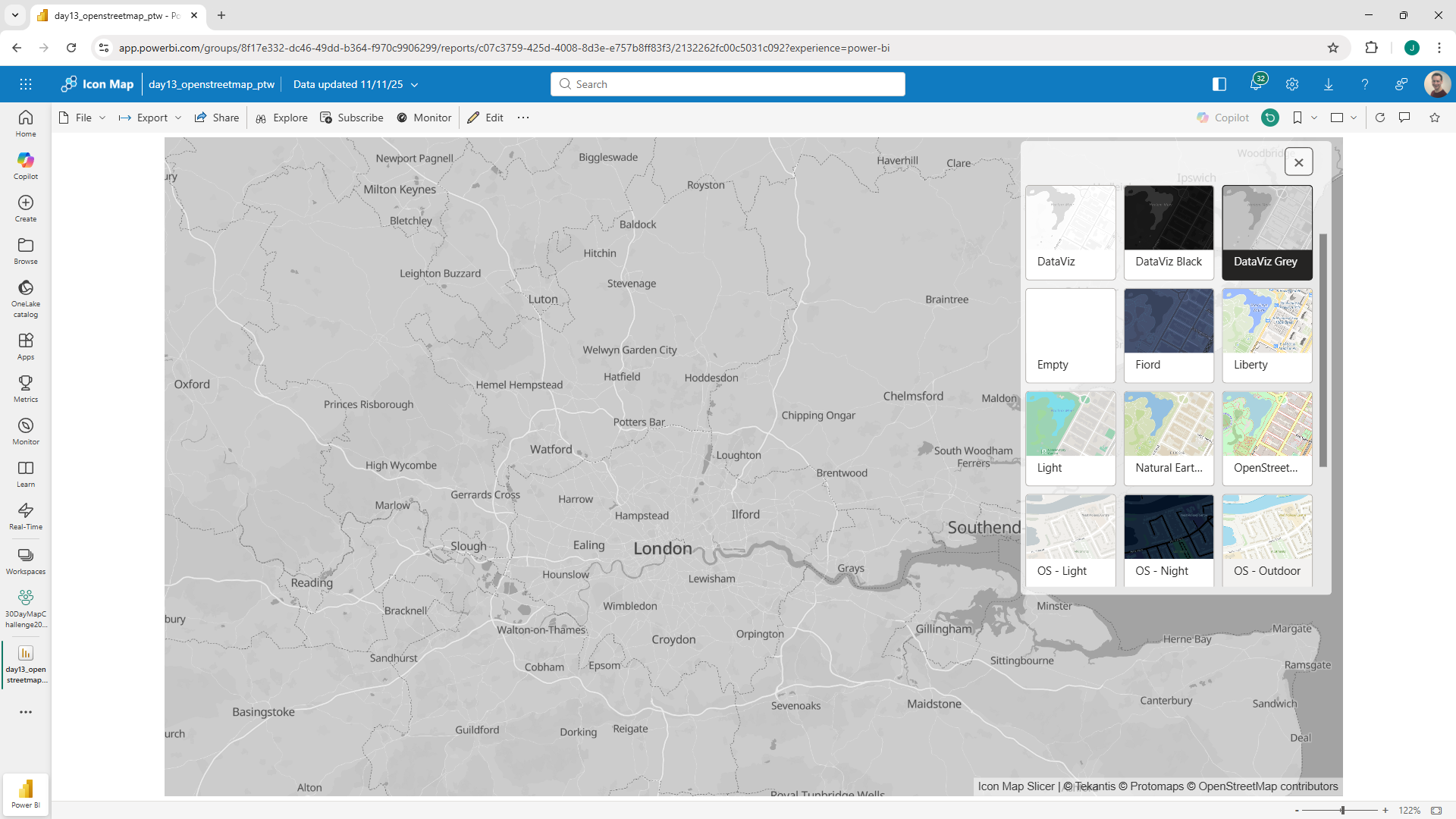
Icon Map Pro comes with a range of available background styles included. Sometimes you may want to provide the ability for the end-users of your report to select the style themselves.
Icon Map Pro provides the ability to show reference layers on the map. These reference layers are not connected to the Power BI data, they just additional context to the data layer.
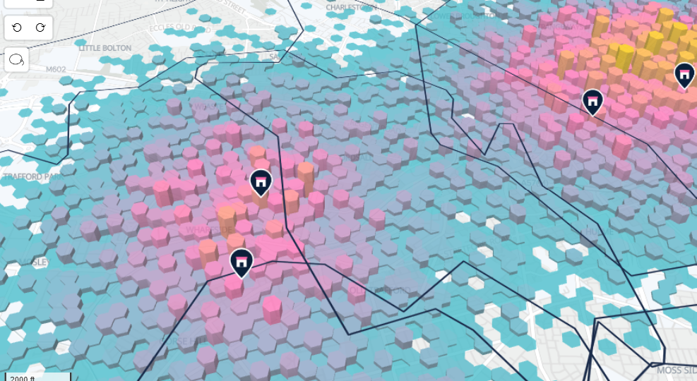
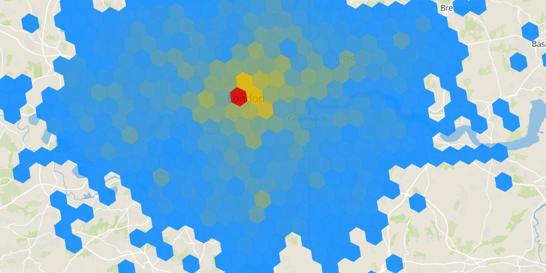
H3 Hexagons provide a great mechanism for aggregating large volumes of point data.
Last week we released **Icon Map Slicer**. Knowing this would raise some questions, I thought I’d address them up front in a blog post.
You'll see references in the Icon Map Pro and Icon Map Slicer documentation about one of the hosting requirements for images etc. is to have CORS configured.
When most people think of maps, they picture roads, rivers, and perhaps outlines of buildings.
James Dales and I recently spoke at SQLBits about how geospatial analytics is transforming thanks to modern cloud-native formats.
Version 1. 0.
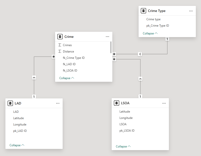
When explaining how to configure Icon Map Pro, for simplicity and ease of understanding, I usually show the data as a single flat table.
With SQL Server now in public preview inside of Microsoft Fabric, I was keen to investigate it's spatial data functions.
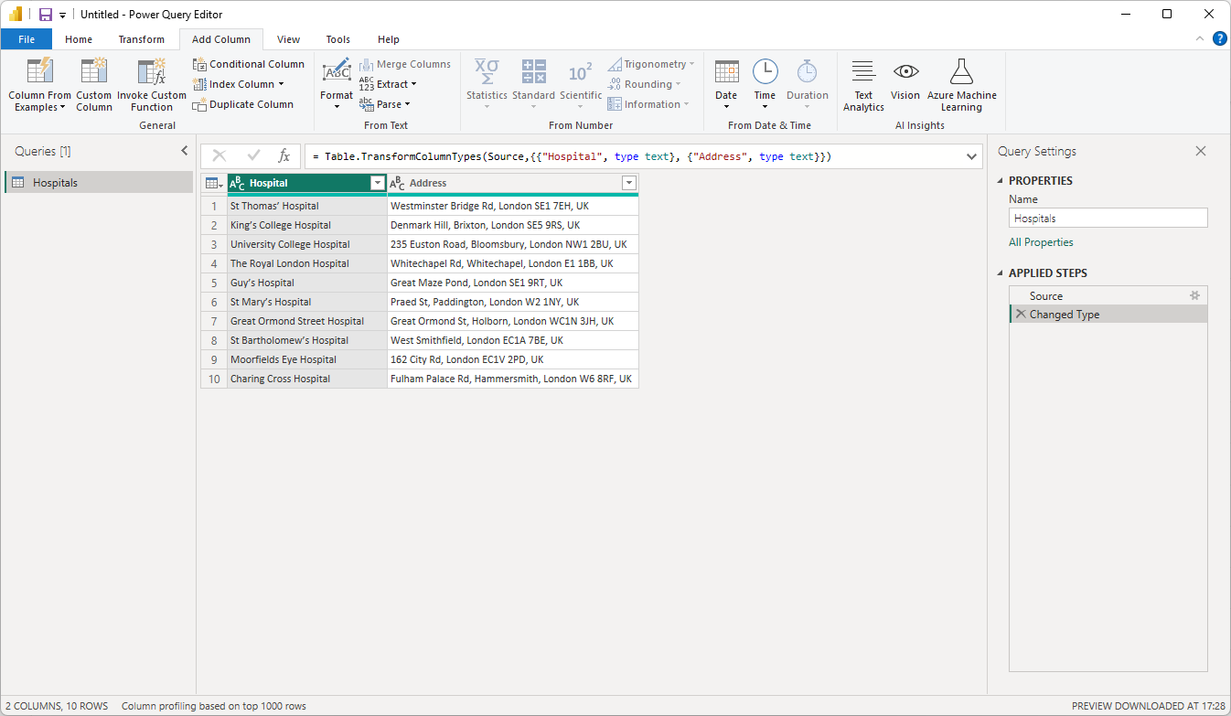
Unlike the AzureMaps and ArcGIS Power BI visuals, Icon Map Pro doesn't have the ability to geocode data - to take a postal address or placename and turn it into a longitude and latitude to display on the map.
Vector tiles unlock all sorts of possibilities in Icon Map Pro as they allow us to place complex lines and polygons on the map without having to load large files into the report.
In the Icon Map Pro visual, there is a settings option, “Rendering”, so I thought I’d explain in more detail what’s behind this option, and why it’s there.
We had an interesting support request come through yesterday from a customer.
Yesterday I published a blog about drawing drive time isochrones on the map using the Azure Maps API called from PowerQuery, all inside of Power BI.
Yesterday Microsoft published a blog post about Isochrones in the Azure Maps Route Range API. Isochrones are a great way to represent the amount of time it takes to travel from a point.
During the recent 30 Day Map Challenge I published a report with many of Europe's railway routes, which gained a lot of interest. I thought I'd see whether the same thing was possible for bus routes.
We made it! It's the 30th so the final day of this year's #30DayMapChallenge.
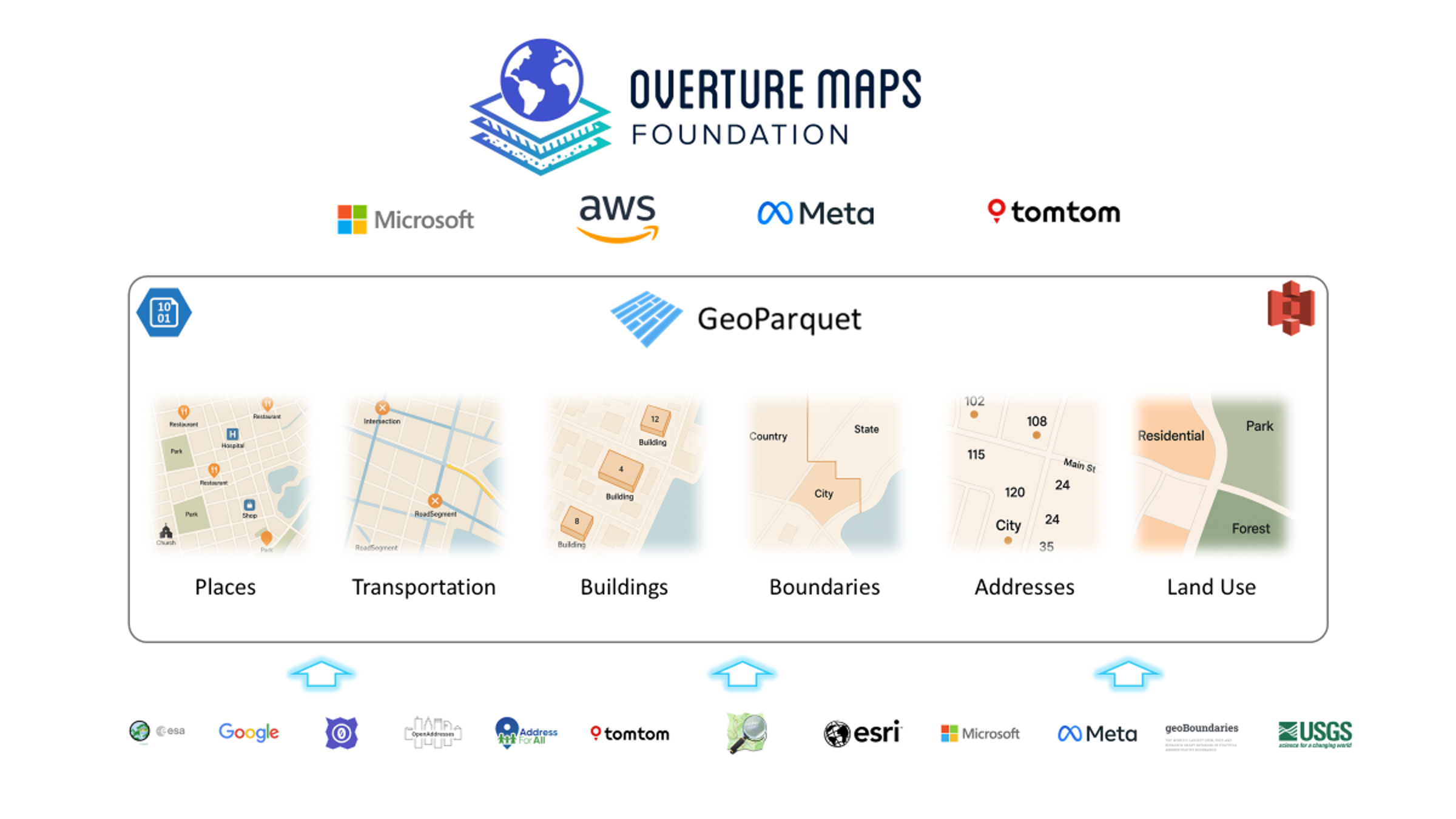
The penultimate day - it's day 29 of the #30DayMapChallenge and today's topic is "Overture" - *Use data from the Overture Maps Foundation.
Nearly there - it's day 28 of the #30DayMapChallenge and today's topic is "The blue planet" - *Map oceans, rivers, and lakes. Focus on water today.
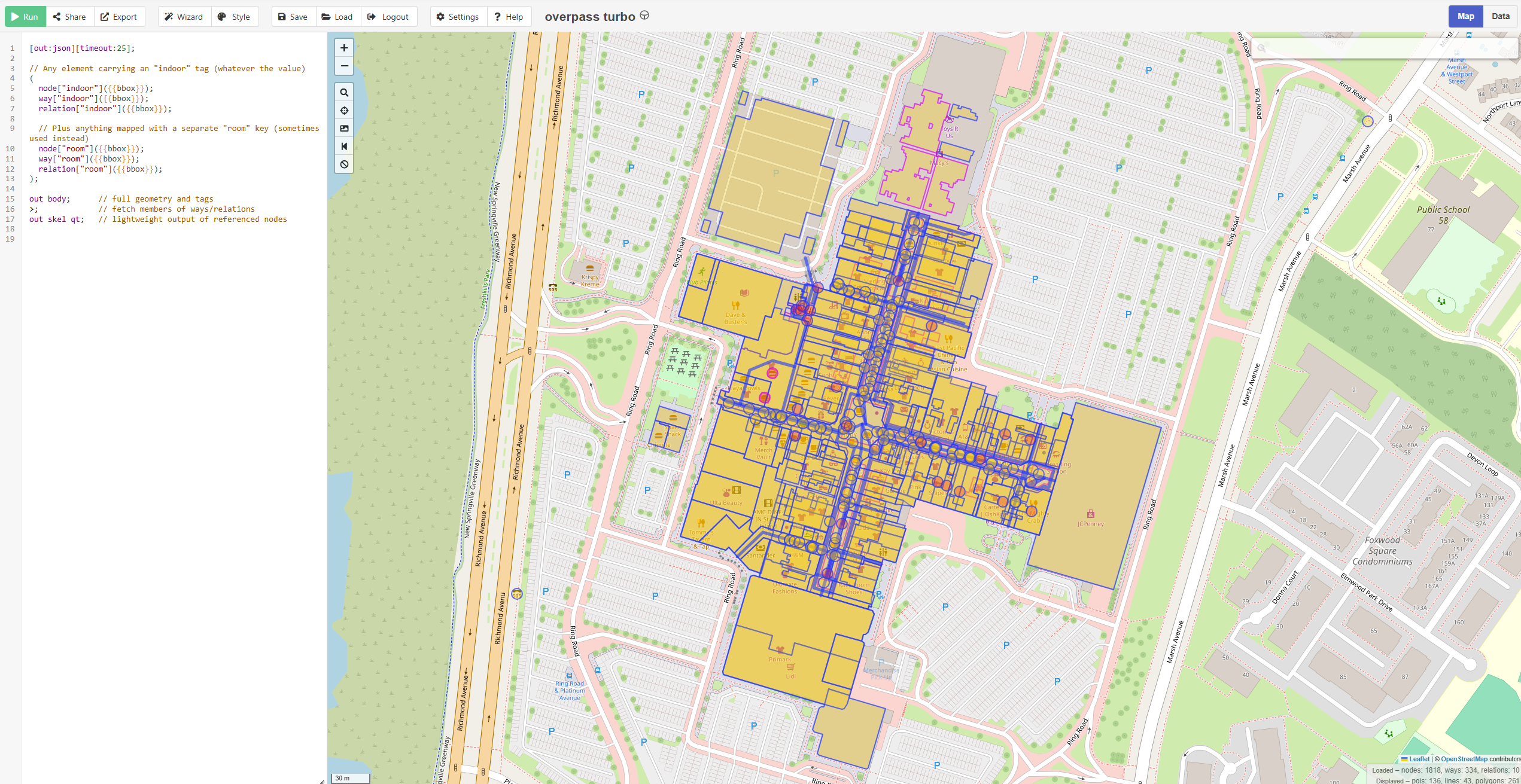
And we're up to day 27 of the #30DayMapChallenge and today's topic is "Micromapping" - *Map something small and precise. Zoom in and map a small area in high detail.
Day 26 of the #30DayMapChallenge brings us to the theme of "Map Projections" - *Explore different map projections and how they distort the world.
Moving onto the last week of the #30DayMapChallenge and it's day 25. Today's theme is Heat - *Map something related to heat.
As we enter the weekend it 's day 23 of the #30DayMapChallenge and today's theme is 2 colors - *Map based on memory. Create a map of a place you remember—hometown, favorite destination, or somewhere meaningful.
It's already 22 of the #30DayMapChallenge and today's theme is 2 colors - *Create a map using only 2 colors. No gradients or shading—just two flat colors.
On to day 21 of the #30DayMapChallenge and today's theme is Conflict - *Map a conflict. Political, territorial, or social—there are conflicts all around us.
It's day 20 of the #30DayMapChallenge and today's theme is OpenStreetMap - *Use OpenStreetMap data to create something. OpenStreetMap offers rich, editable data from roads to buildings and beyond.
It's day 19 of the #30DayMapChallenge and today's theme is Typography - *Map focused on typography. Let text and words do the heavy lifting today.
Sunday's challenge is day 17 of the #30DayMapChallenge and today's theme is Collaborative Map - *Collaborate with others on a single map. For today’s challenge, team up!
Saturday brings us to day 16 of the #30DayMapChallenge and today's theme is "Choropleth" - *Classic choropleth map. Use color to show data variation across regions.
Half way there! Day 15 of the #30DayMapChallenge and today's theme is "My data" - *Map something personal.
Day 14 of the #30DayMapChallenge and today's theme is a world map - *Map the whole world. Whether it’s continents, ecosystems, or oceans, this is the day to map the entire planet.
Day 13 of the #30DayMapChallenge and today's theme is a new tool - *Use a tool you’ve never tried before. The challenge has always been about trying new things.
Moving onto day 12 of the #30DayMapChallenge and today's theme is Time and Space - *Map something where time matters. Visualize change over time—urban growth, migration, or environmental shifts.
It's already day 11 of the #30DayMapChallenge and today's theme is the Arctic - *Map the Arctic.
We're onto day 10 of the #30DayMapChallenge and the theme is pen and paper - *Draw a map by hand. Go analog and draw a map using pen and paper.
We're onto day 9 of the #30DayMapChallenge.
We're onto day 8 of the #30DayMapChallenge.
Today is day 7 of the #30DayMapChallenge.
Today is day 6 of the #30DayMapChallenge.
Today is day 5 of the #30DayMapChallenge.
Today is day 4 of the #30DayMapChallenge.
Any now we're moving along to day 3 of the #30DayMapChallenge.
2nd of November brings us to the 2nd Day of the #30DayMapChallenge.
November 1st kicks off the 30-Day Map Challenge. Each day in November brings a new map visualization challenge, and naturally, I'll be using Icon Map Pro in Power BI.
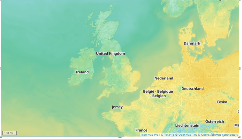
Meteomatics provide a weather API that can be used to overlay a wide range of weather layers onto your map as a WMS overlay.
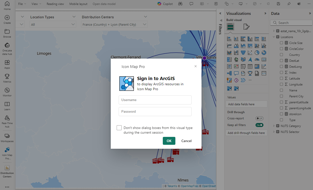
Esri are the market leader in GIS software and many of the companies we speak to have a large investment in ArcGIS with much of their geospatial data estate held within the platform.
I have spoken to a lot of companies over the last few weeks about the kind of things that they want to be visualizing on a map in Power BI.
I've just submitted an update to the old Icon Map visual in Microsoft AppSource, which should go live very soon.
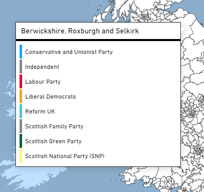
As a UK based geospatial company, it seemed natural to want to visualize the UK general election results as they're being announced inside of Power BI using Icon Map Pro.
While we have it on our backlog, Icon Map Pro doesn't yet have the ability to draw a legend.
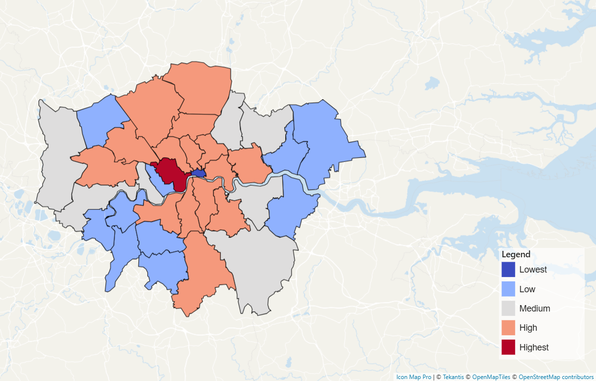
In this video I show you how easy it is to create a drilldown shape map using Icon Map Pro.
More than six years ago I created Icon Map, a map visual for Power BI. This year I've set up a new company alongside Tekantis CTO, Brynn Borton, to launch Icon Map Pro.