
On to the 2nd day of the 30 Day Map Challenge. Today's theme is another classic - Lines:
Challenge Classic: Map linear features (e.g., roads, rivers, migration paths, flow lines). Explore line thickness, color, and direction to convey information.
For this challenge, I'm using trade data, relating to import and exports to and from the United Kingdom. The data is sourced from UK Trade Info, a site I've been heavily involved with over the course of my earlier career in consulting. It's open data and made available under the Open Government License v3.
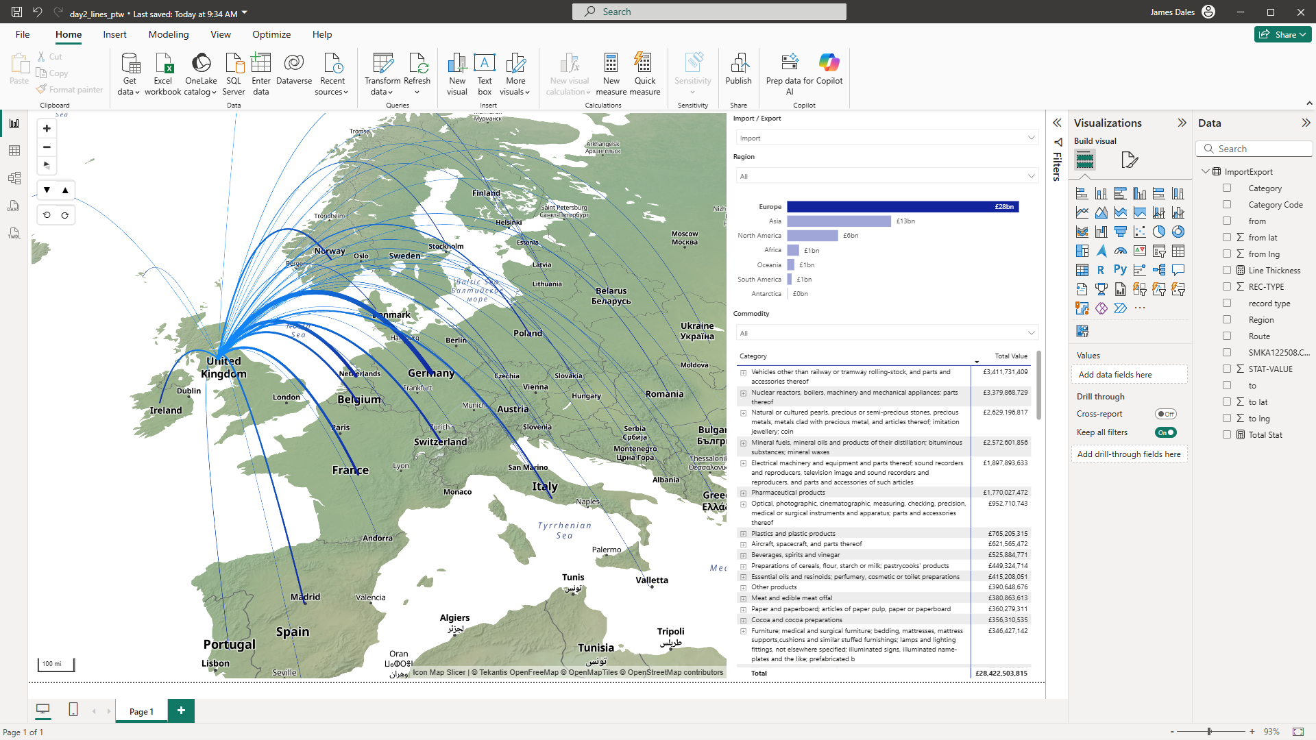
The data I've imported for the report, covers all imports and exports in September 2025. We're just exposing a fraction of it for the challenge, but it's over 670,000 rows of data, making up over £40 billion worth of trade.
Icon Map Slicer has the ability to draw lines in a number of ways - straight, shorted path and in 3D as I've used here. The trade value is summed up by a DAX measure, Trade Value, so I've created another measure to calculate a relative line width based on the trade value and current context:
Line Thickness =
VAR _MinThickness = 1
VAR _MaxThickness = 15
VAR _Current = [Trade Value]
VAR _RouteSet = ALLSELECTED('ImportExport'[Route])        -- keeps slicers, ignores the visual axis grain
VAR _MinVal = MINX(_RouteSet, CALCULATE([Trade Value]))    -- min total per visible Route
VAR _MaxVal = MAXX(_RouteSet, CALCULATE([Trade Value]))    -- max total per visible Route
VAR _Range = _MaxVal - _MinVal
VAR _Scaled =
    IF(
        _Range <= 0,
        (_MinThickness + _MaxThickness) / 2,              -- fallback when all routes tie
        _MinThickness + DIVIDE(_Current - _MinVal, _Range) * (_MaxThickness - _MinThickness)
    )
RETURN
    MAX(_MinThickness, MIN(_MaxThickness, _Scaled))
We then apply this measure to the line width setting in Icon Map using Power BI's conditional formatting options.
You can then use the slicers, region bar chart or expandable table of commodities to filter the map to show the relative trade to and from different countries.
Here's the Power BI report to try out - don't forget you can zoom, tilt and rotate the map.
Download the Power BI .pbix file to examine its construction.