
On to week 2 of the the 30 Day Map Challenge. The topic for day 8 is "Urban" to mark World Urbanism Day and I'm using today's challenge to highlight some of new functionality we're about to release in Icon Map Slicer 1.0.0.4 next month.
(World Urbanism Day) Map the built environment: dense street networks, highrises, urban sprawl, city infrastructure, or population density within a metro area.
Cities depend on efficient commuter transport to stay alive. Visualizing these systems helps us understand how rail and transit networks knit together the urban fabric, making it possible for millions to move smoothly through Europe’s metropolitan corridors. These networks might form the focus of a report mapping vehicle locations in real time, tracking delays and maintenance, or they might simply provide essential context to other spatial data.
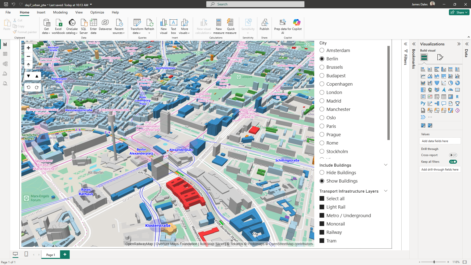
I'm going to look into how we can create filterable reference layers in Icon Map Slicer to add that additional context. The resulting report will show 3D buildings from Overture Maps - directly from their PMTiles source, colored based on their usage, where available.
In addition we're going to include OpenRailwayMap data for all of Europe showing the rail, tram, underground and light rail networks.
To display these in Icon Map Slicer, we're going to use the "Vector Tiles" reference layer capability. This requires a JSON style sheet following the Maplibre Style Specification. For the 3D buildings, I simply asked Chat GPT to create it for me:
I would like a maplibre style sheet to display Overture Maps buildings (and building parts) layer in 3D. Can you get the URL of the PMTiles for the Overture maps buildings and create a style sheet. I'd also like the buildings to be coloured by their usage/category (eg Residential).
The resulting file was ready to save as a JSON file on accessible web storage, and reference directly in Icon Map Slicer.
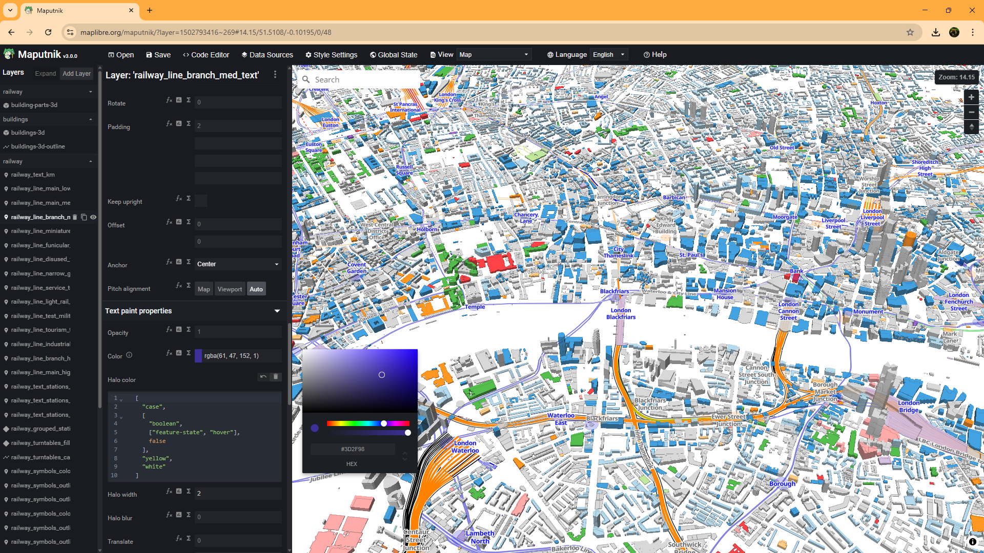
OpenRailwayMap was somewhat more complicated. I built on the excellent work of Hidde Wieringa to build vector tiles and stylesheets for OpenRailwayMap for all of Europe. I then converted the resulting MBTiles vector tiles files to PMTiles using the PMTiles tool from Protomaps, and tweaked the styles to remove the background mapping.
Let us know if you'd like to make use of this layer in your reports.
I now had a number of PMTiles files and two stylesheets. I merged the buildings stylesheet with the OpenRailwayMap style sheet referencing the different PMTiles sources as appropriate.
You can see the resulting file here.
If digesting the raw JSON is a little overwhelming, you can open https://iconmapstorageforblog.blob.core.windows.net/mapfiles/overturebuildings_orm.json in Maputnik for a more visual editing experience:
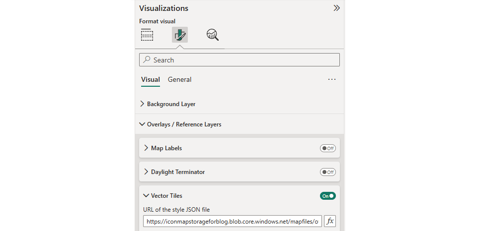
With our reference layer prepared, and the style sheets and PMTiles files stored in Azure Blob Storage, we're now ready to use it in our Power BI report.
You'll want to make sure you're using version 1.0.0.4 or later of Icon Map Slicer for this. (Don't forget to put Power BI Desktop in developer mode if using a preview release).
If we're happy to just display everything in our reference layer we can simply add the stylesheet URL as a Vector Tile reference layer:
However, in my report I want to be able to turn the building layers on or off.
To to this I created a disconnected table in my Power BI dataset, listing all the of the layer ids in the stylesheet. 2 rows, one including the building layer ids, and one without:

I then added the Layer Name field to a slicer, and assigned the field containing the layer ids to the Layer Names setting for the layer in Icon Map Slicer using the "fx" button:

We now have a Power BI slicer to turn the buildings on or off, leaving the OpenRailwayMap layers displayed.
I also wanted the report user to be able to determine which OpenRailwayMap layers are displayed. These aren't necessarily separate styles, the coloring is determined by the "feature" property. To enable this, we can use the new filtering capabilites.
Again I created a table in Power BI with the different layer names and associated feature names:

and assigned it to a Power BI slicer.
I created a DAX measure to return a comma separated list of the selected values:
Selected Types = CONCATENATEX('Infrastructure Types', "'" & 'Infrastructure Types'[id] & "'",",")
Then in the Icon Map Slicer's settings, set the Filter Property name to "Feature", and the Filter Value to use the newly created measure.
We now have two Power BI slicers, one to control the buildings layers, and one to control the transportation layers.
Finally to enable jumping to different cities, I created a simple table of locations with their longitudes and latitudes and added these as a simple circle layer to Icon Map Slicer. I made the fill and outline both transparent so the circles aren't actually visible. Adding the city name to a new Power BI slicer, then means that the user can jump from one city to another.
Here's the Power BI report to play with: