
There is a need to visualize geographic data in a Power BI report so the decision to include a map is the easy part. The next thing to address is, what kind of map to use and whether the layer you add should be there for analysis or simply for context.
That distinction matters in Icon Map Pro.
Icon Map Pro gives report authors a wide choice of data layers such as circles, images, lines, GeoJSON files, Vector tiles as well as reference layers such as map labels, traffic, weather, GeoJSON files, WMS or Raster layers. Those layers are powerful precisely because they are not all trying to do the same job. Some are there to answer the question. Others are there to help the user read the answer more easily.
That is a useful way to think about map design in Power BI:
Start with the business question. Then decide whether you need a data-bound layer only or a static reference layer as well.
In many cases, that decision matters more than whether you choose points, polygons or 3D.
The first decision: context layer or analytical layer?
One of the most useful ideas in Icon Map Pro is its separation between data layers and reference layers.
Data layers do the analytical work. These are the layers that are bound to Power BI data and participate in filtering, tooltips, drill-down and report interactivity. In Icon Map Pro, these include circles, heatmaps, H3 hexagons, images and icons, lines, WKT or GeoJSON from data, GeoJSON or shapefile data layers, and ArcGIS feature layers configured as data layers rather than reference layers.
Reference layers are typically there to provide context. They sit above the basemap, but they are not joined row-by-row to the Power BI data model. They are not the primary analytical content, and they do not cross-filter other visuals. Typical examples include a static GeoJSON boundary file, map labels, traffic, weather, WMS imagery or a live ArcGIS layer used purely as background context.
That distinction helps answer an important design question early:
Do users need to interact with the geography itself, or do they just need that geography as context?
If the boundary, road network, catchment area or planning zone is only there to orient the user, a static reference layer is often the cleaner choice. If it needs to carry measures, react to slicers at row level, or cross-filter the rest of the report, it should be a data-bound layer instead.
Often, a static layer is enough
This is where map design can easily become more complicated than it needs to be.
Because Icon Map Pro supports multiple simultaneous layers, it is tempting to turn everything into an interactive layer. But many reports do not need that. A static boundary overlay can often provide all the spatial context the report needs, while a single data-bound layer carries the actual analysis.
For example:
- A retail performance report may only need store circles on top of a static sales territory boundary file
- A logistics dashboard may only need a heatmap of delivery activity on top of a static road or region overlay
- A planning report may only need interactive site polygons with reference labels or a simple WMS layer in the background
In each case, the static layer helps the reader understand place, but it does not need to behave like data.
That is often the better design choice because it reduces visual clutter, simplifies configuration and keeps interactivity focused where it adds value.
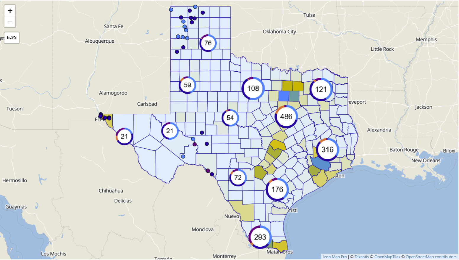
When to use circles
If the question is about specific locations, circles are often the best starting point.
The circles layer is one of the most flexible data layers in Icon Map Pro. It works well for site maps, store networks, service incidents, assets, sensors or any case where each record has a distinct coordinate. It can show simple location presence, or it can scale markers by a measure to create a proportional symbol map. It also support clustering, which is especially useful when points overlap heavily.
Circles are usually the right choice when users need to answer questions like:
- Where are the assets?
- Which sites are underperforming?
- Which locations have the highest incident volume?
They are also a good example of where a data-bound layer does the main work and a static reference layer does the supporting work. A circle layer on its own can answer the analytical question, while a static postcode or territory overlay simply helps the user interpret the locations more quickly.
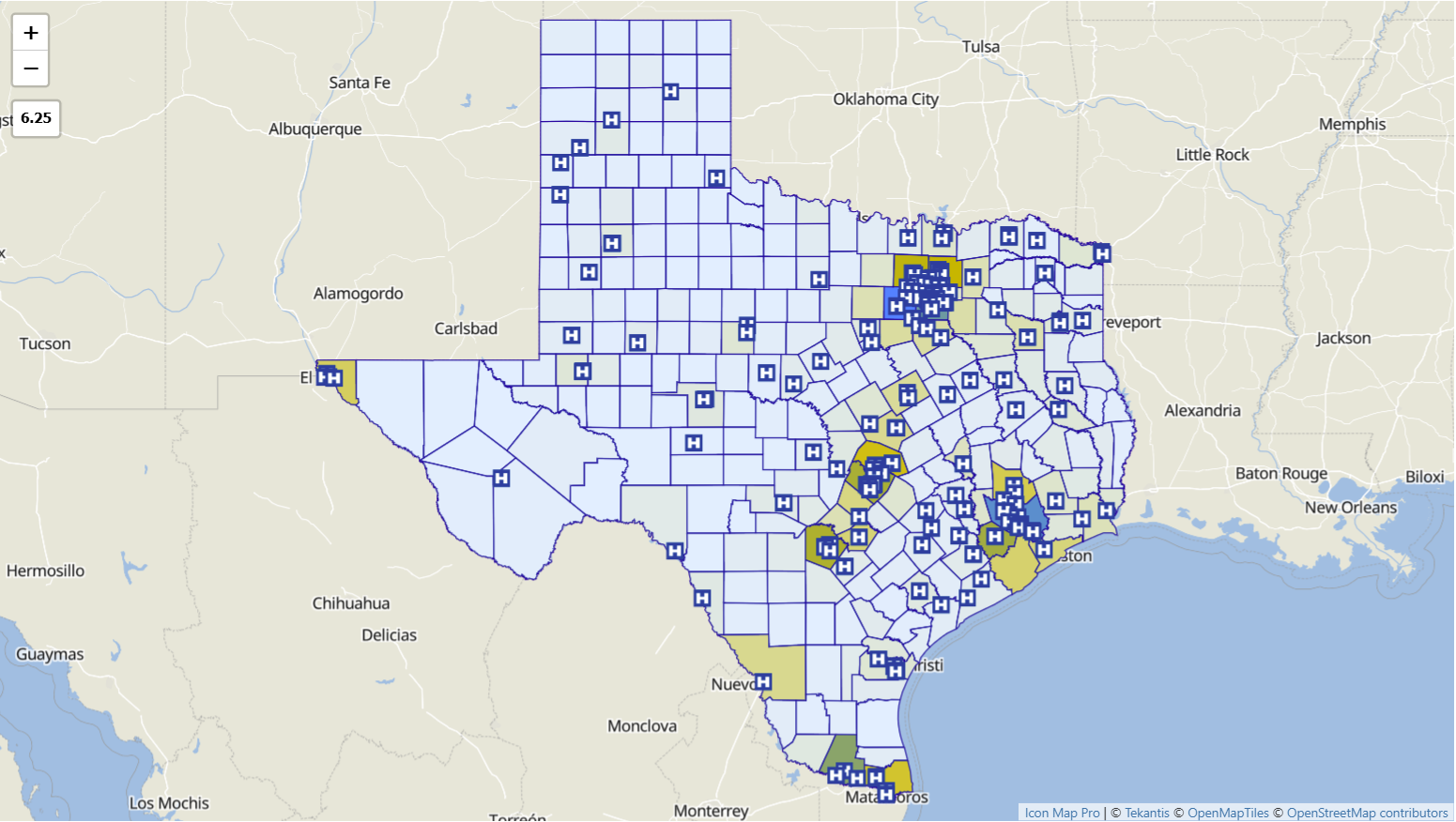
When to use images and icons
Images and icons are useful when the appearance of the marker matters more than its numeric size.
Icon Map Pro supports URL-based images, built-in icons, base64 images and dynamic SVGs driven by DAX. That makes this layer a strong choice when the marker needs to communicate category, asset type, state or direction, such as building type, store formats, aircraft types or status indicators. Rotation can also be used for directional markers.
This is often the more appropriate choice than circles when the business question is not “how big is this value?” but “what kind of thing is this?” or “what county is it in?”
Again, the same design rule applies: the icon layer should usually carry the business meaning, while any supporting geography can stay static unless there is a clear reason to make it interactive.
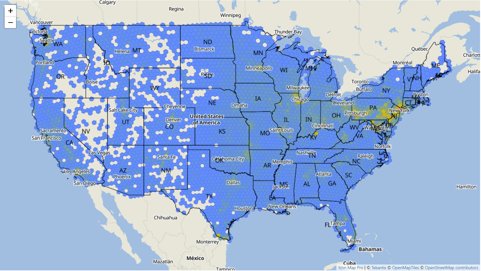
When to use heatmaps
Heatmaps are best when the question is about concentration rather than individual records.
If users want to know where activity is densest, where demand clusters, or where events are concentrated, a heatmap often communicates the pattern more clearly than plotting every point. In Icon Map Pro, the heatmap layer is designed for exactly that kind of density analysis. It can also be combined with circles, using the heatmap as background density context and circles above it for specific selectable points.
That combination is important. A heatmap is powerful for spotting patterns, but not for selecting individual items. So a common design is:
- Heatmap for broad pattern
- Circles or icons for precise interaction
- Optional static reference layer for territory or place context
That is a more useful composition than turning every component into a data-bound layer.
When to use H3 hexagons
H3 hexagons are particularly useful when the question is about spatial aggregation, but the answer should not depend on administrative boundaries.
This is one of the most interesting options in Icon Map Pro because it avoids the bias that can come with large and small geographic regions in a traditional choropleth. Hexagons create a uniform grid, making it easier to compare areas of equal size. They also support very large volumes and can be used in multi-resolution analysis, with resolution controlled by DAX if needed.
H3 is often a better fit than polygons when the business question is:
- Where is demand strongest across a consistent grid?
- Where are incidents concentrated without using postcode or council boundaries?
- How do we compare activity fairly across space?
If the user needs a grid-based analytical surface, H3 is a data-bound layer. If they still need familiar administrative context, a simple static overlay can sit behind it. That is often enough. You do not need to make every boundary interactive just because the visual allows it.
When to use polygons
Polygons become important when the geography itself is part of the question.
Icon Map Pro supports polygons in two distinct ways, and this is exactly where authors need to slow down and choose carefully.
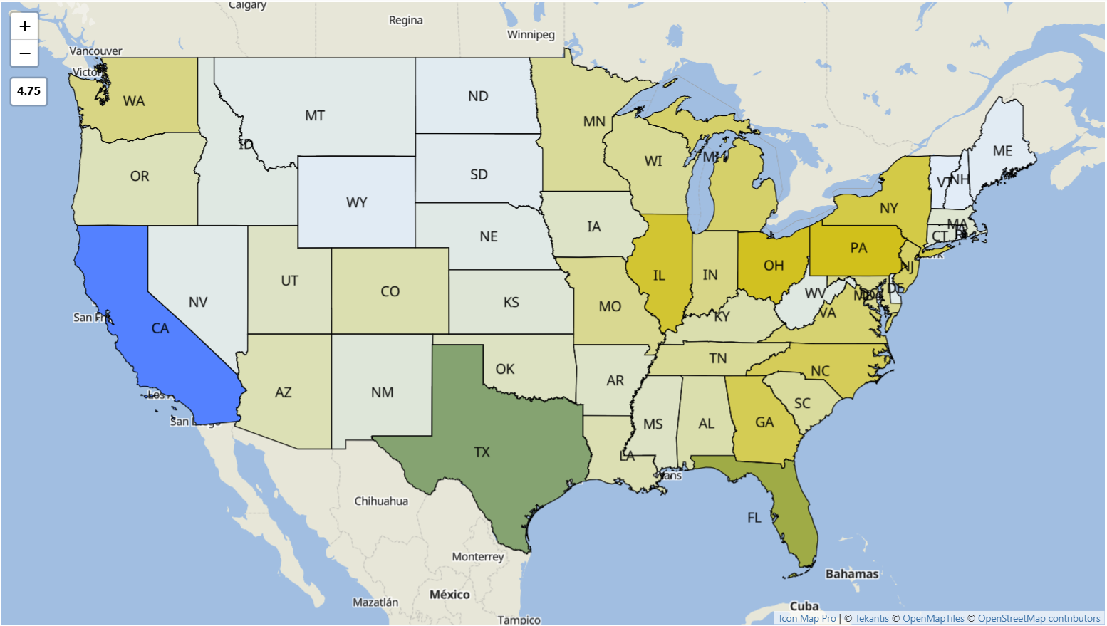
If the boundaries are simply then as contextual geography, use a GeoJSON / Shapefile / KML file reference layer or another reference layer. This works well for static territory outlines, planning zones, flood areas, infrastructure corridors or administrative boundaries that help orient the user but do not need to join to report data.
If the boundaries need to carry measures, support conditional formatting, respond to report filters, or participate in drill-down and drill-through, use a data-bound polygon layer instead. That could be:
- Shapes from Data ( WKT / GeoJSON )
- Shapes from Files ( GeoJSON / TopoJSON / Shapefile / KML )
- Vector Tiles
- ArcGIS Feature Layer
This is one of the clearest design principles in Icon Map Pro:
If the polygon is there to explain the data, use a reference layer. If the polygon is the data, use a data layer.
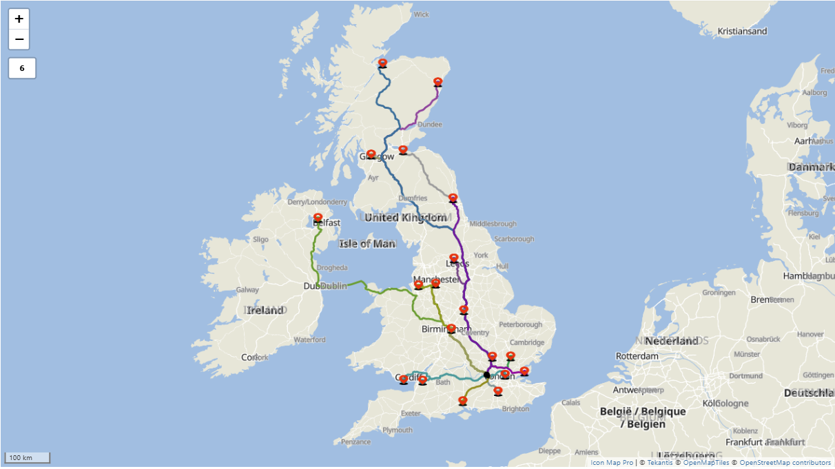
When to use lines
Lines are the right choice when the question involves movement, connection or flow.
In Icon Map Pro, there are two useful ways to think about line-based mapping. The standard lines layer is ideal for origin-destination relationships where each row has a clear start point and end point. It supports straight, curved and geodesic lines, with options for directional styling, symbols, endpoint images and animated dashes. That makes it useful for transport routes, network connections, supply chains or service coverage links.
But some line questions are more complex than a simple start and end pair. If the route itself matters, such as a road alignment, utility corridor, vehicle track, pipeline, rail path or multi-point journey, then a WKT or GeoJSON text string from the Power BI dataset is often the better option. That allows the geometry to come directly from the data model as a linestring or multilinestring, which is useful when the shape is stored in a spatial database or generated upstream.
There is also a useful middle ground for networks such as roads, railways and utilities: segmenting the linework into meaningful sections so it can be data-bound. Instead of treating the whole network as one static geometry, individual road segments, track sections or route links can each carry their own measures, such as delay, utilization, condition, incidents or maintenance status. That makes it possible to color, filter and select parts of the network based on Power BI data, which is often far more useful than showing a single undifferentiated line. In practice, this is where data-bound WKT, GeoJSON or joined shape layers can add real analytical value.
There is also a reference-layer option when the linework is there mainly for context rather than analysis. An uploaded GeoJSON, Shapefile or KML file can provide static line-based geography such as road networks, route corridors, infrastructure context or administrative boundaries without turning that layer into interactive report data.
So the choice is not just between one line style and another. It is also about whether the line is:
- a simple analytical connection between two places
- a more complex geometry that should come from WKT, GeoJSON or another spatial source
- a static reference layer that helps the reader understand the map
This is another case where supporting layers should stay simple unless there is a clear analytical need. A report showing routes between an origin and multiple destinations may only need interactive lines plus a static regional or network overlay. There is rarely any value in making every supporting boundary selectable as well.
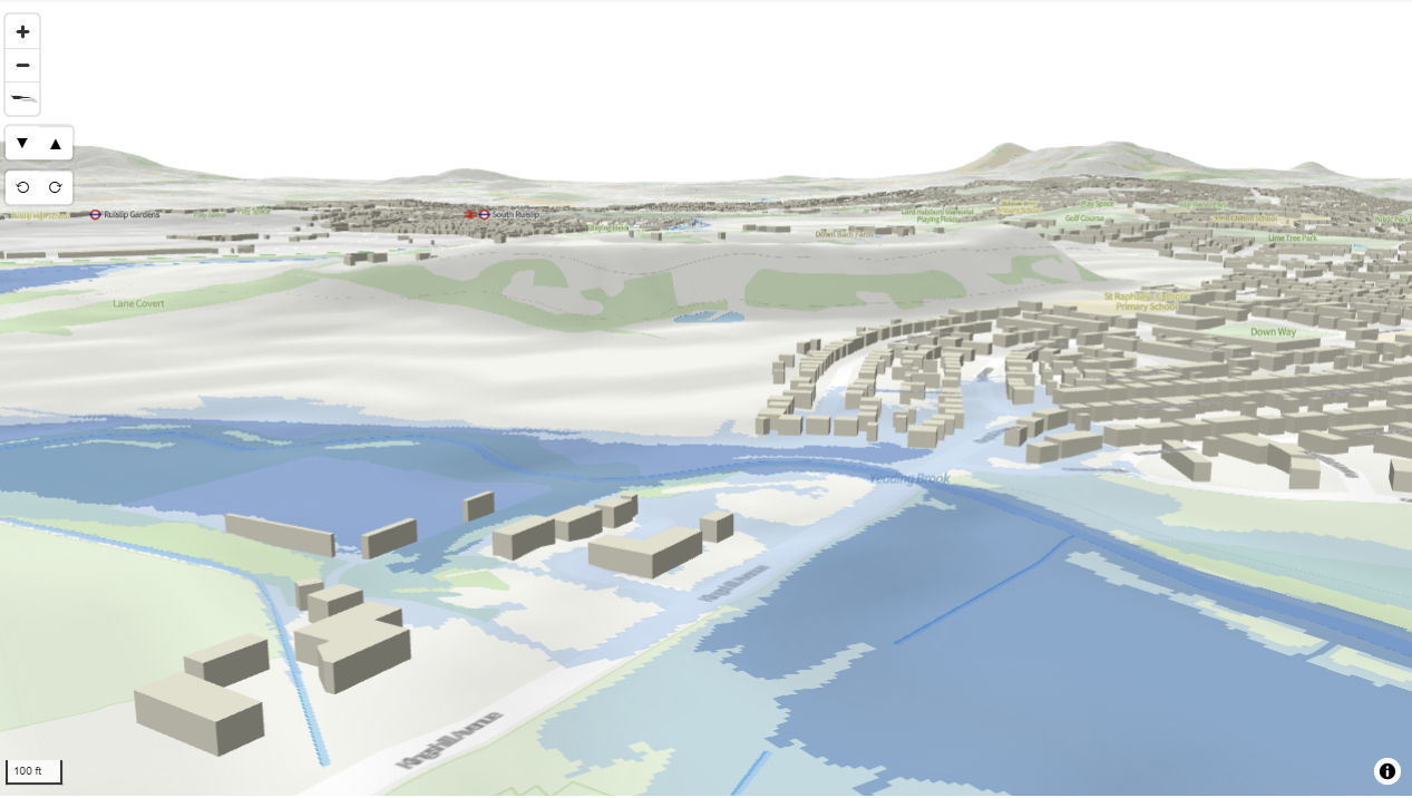
And what about 3D?
3D effects should be used selectively, but they can be very effective when they add a meaningful extra dimension to the analysis.
Icon Map Pro offers some basic 3D support, particularly through extrusion in layers such as H3 hexagons and polygon-based geometries under the right rendering modes. That can work well when the goal is emphasis, for example highlighting major concentrations or helping users see strong differences in magnitude more quickly.
Icon Map Slicer takes that further. It is the better fit when 3D is central to the experience rather than a light enhancement. This is where fuller 3D support becomes useful, including terrain, 3D lines, polygons, H3 and camera movement through tilt and pan. That opens up more expressive designs where color can show one metric and height another, adding a second analytical signal without needing a separate visual.
That extra dimensionality can be especially useful in scenarios where vertical context matters. Examples include 3D floor plans, making buildings stand out more clearly in dense urban views, or showing flood plains alongside 3D buildings on 3D terrain so the relationship between elevation, built form and risk is easier to understand.
But the same principle still applies: 3D should solve a reading problem, not create one.
If the business question is already clear in 2D, 3D may add more spectacle than value. In practice, it works best when the audience needs to understand height, terrain, built form or contrast in a way that flat mapping cannot show as clearly.
Multi-layer maps are powerful, but restraint matters
One of the strengths of Icon Map Pro is that it supports simultaneous layers, drill-down hierarchies, zoom-level reveal and slicer-controlled visibility. That makes it possible to build rich, progressive maps that change as the user zooms or filters.
That capability is valuable, but it should not become the default design pattern. In many cases, looking at one main layer at a time is still the best approach because it keeps the view cleaner and makes the analytical point easier to read. A good map in Power BI is not the one with the most layers. It is the one where each layer has a clear job.
Very often, the best design starts with a small number of layers, for example:
- one primary data-bound analytical layer
- one or more supporting reference layers where they genuinely add context
- clear zoom behavior
- limited use of tooltips and selection outside the main analytical layer
That keeps the map fast, legible and purposeful.
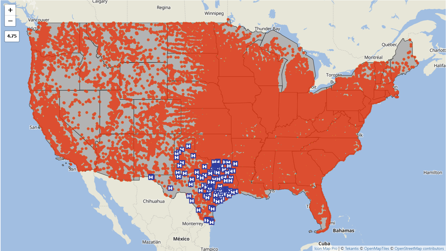
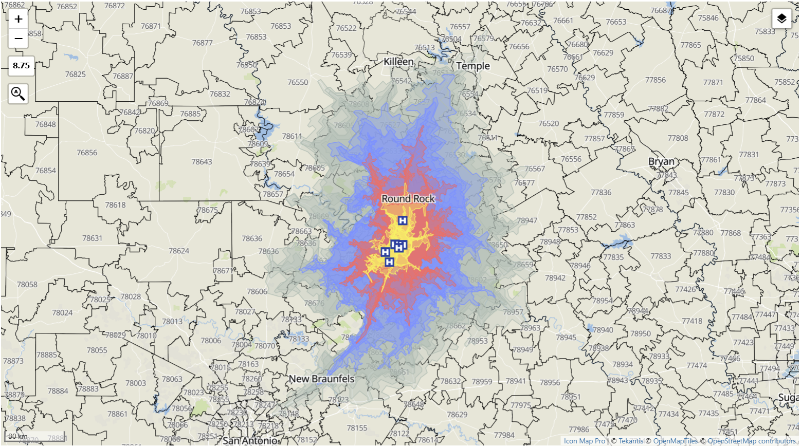
At the same time, combining different layer types can be very effective when each one contributes something distinct. For example, the US Zip Codes might be shown as a boundary reference layer and multiple data layers: 15, 30, 45 and 60 minute isochrones and health centers as icons. In that kind of design, the value comes from each layer adding a different type of context rather than repeating the same message.
This is also where Power BI interactivity becomes especially useful. By combining report slicers or bookmarks with conditional formatting, it is straightforward to let users hide and show layers interactively. That gives them a way to simplify the view when they want clarity, then bring extra context back in when they need a richer picture.
Icon Map Slicer adds another useful angle here through field-of-view filtering. Instead of treating the map in isolation, it opens up a different way to work with other visuals on the same page. You can keep other visuals synchronized with the map so that as a user pans or moves around the map, the data in the other visuals is updated to reflect the map's field of view.
Final thought
The real question is not whether to use points, polygons or 3D.
The real question is whether each layer is helping answer the business question, or simply making the map busier.
Icon Map Pro and Icon Map Slicer give report authors a rich set of options: circles, icons, heatmaps, H3 heaxgons, lines, shapes from data, shapes from files, ArcGIS feature layers and various reference layers. The value comes from choosing between them carefully, not using all of them at once.
In many cases, the most effective design is also the simplest:
Use static reference layers for context. Use data-bound layers for analysis. Add complexity only where it genuinely improves understanding.