Last week, Tekantis presented at the London Power BI and Fabric User Group for a session that showcased the capabilities of Icon Map.
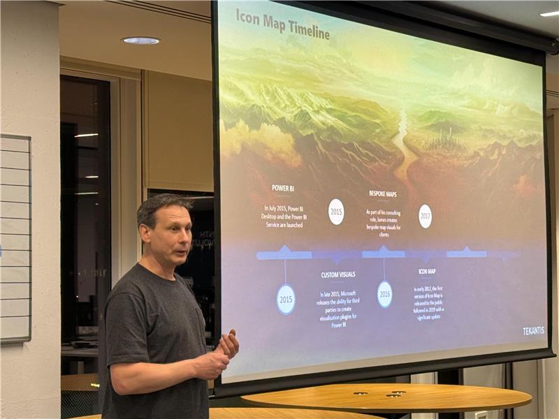
It marked James Dales’ return to speaking at the user group after two years. Back then, he hinted at what Icon Map would become. This session was not only about sharing what has been created since but focused on what is coming in 2026.
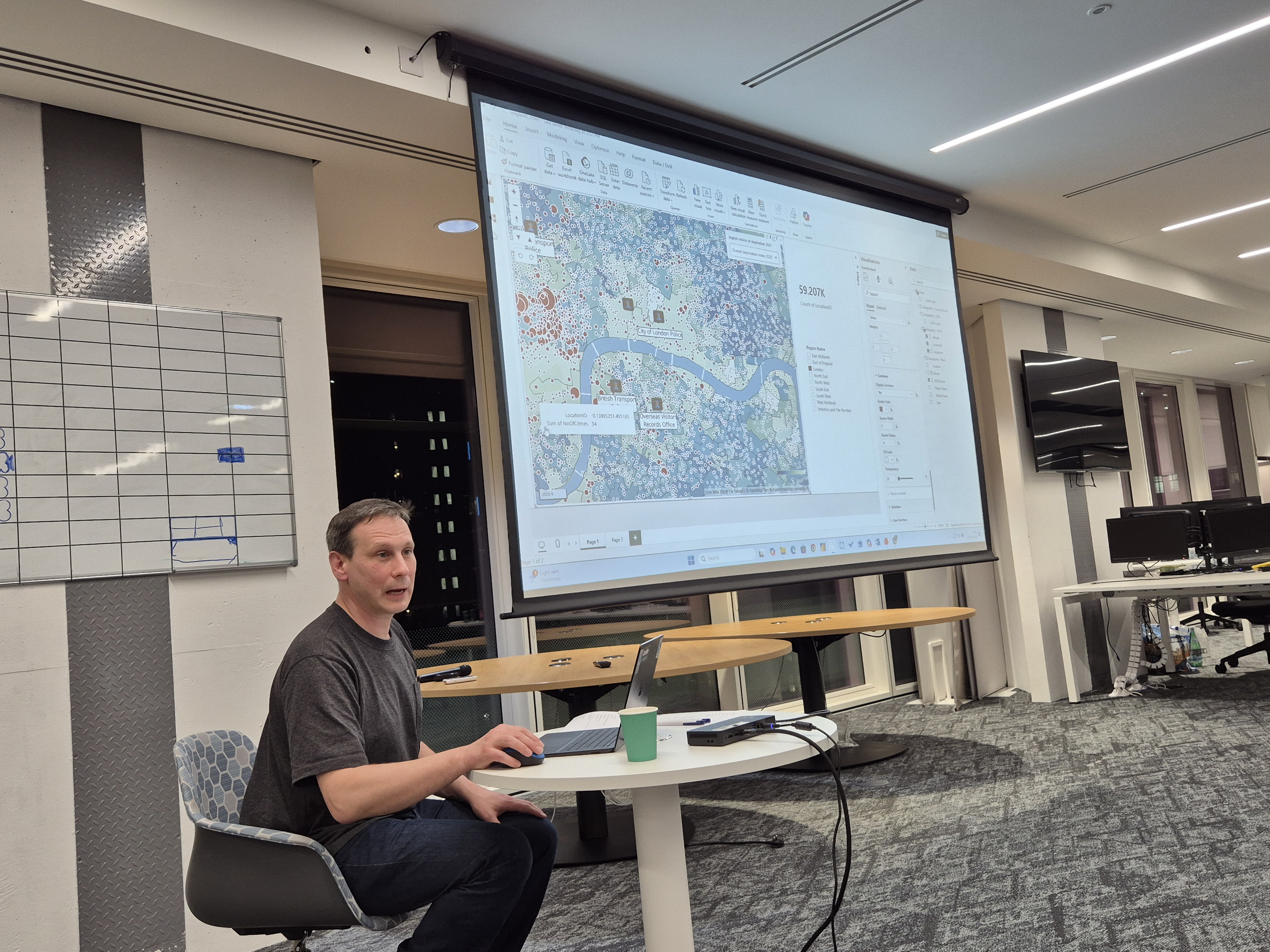
James shared what mapping in Power BI and Microsoft Fabric can look like when you move beyond simple points and bubbles. Starting from a blank report, he built maps from scratch in minutes based on hundreds of thousands of crime locations, augmenting the map with police station icons, labels and deprivation layers from our forthcoming catalog to show how quickly spatial context can bring data to life.
The session was intentionally demo-focused. Rather than slides or theory, it focused on live demos using real datasets, showing how maps can act as the starting point for analysis, not just something added at the end of a report.
One of the most engaging moments came when James explored property sales across England. Zooming from a national view down into a detailed three-dimensional landscape including flood risk layers, he showed how terrain, location and data interact in real time, making patterns easier to spot and questions easier to ask.
Seeing these layers work together on a single map made it clear how location can help teams explore relationships that are often difficult to surface in traditional reports.
Although London provided the backdrop for the session, the ideas apply anywhere. The same approach works for public sector teams, analysts, researchers and anyone using Power BI or Fabric where location adds meaning.
Reflecting on the session, James said:
“What I enjoy most about these sessions is seeing how quickly things click once maps stop being treated as decoration and start being used as part of the analysis. That’s when people realize how much more they can ask of their data.”
That enthusiasm carried through the room. Not because anything felt flashy, but because the workflows felt practical, intuitive and grounded in how people actually work.
What’s next
We’ll be sharing more details on the new Icon Map features discussed during the session, including what’s coming next in 2026.
In the meantime, if you’re curious about using maps as an active part of analysis inside Power BI and Microsoft Fabric, rather than a finishing touch, please contact us.