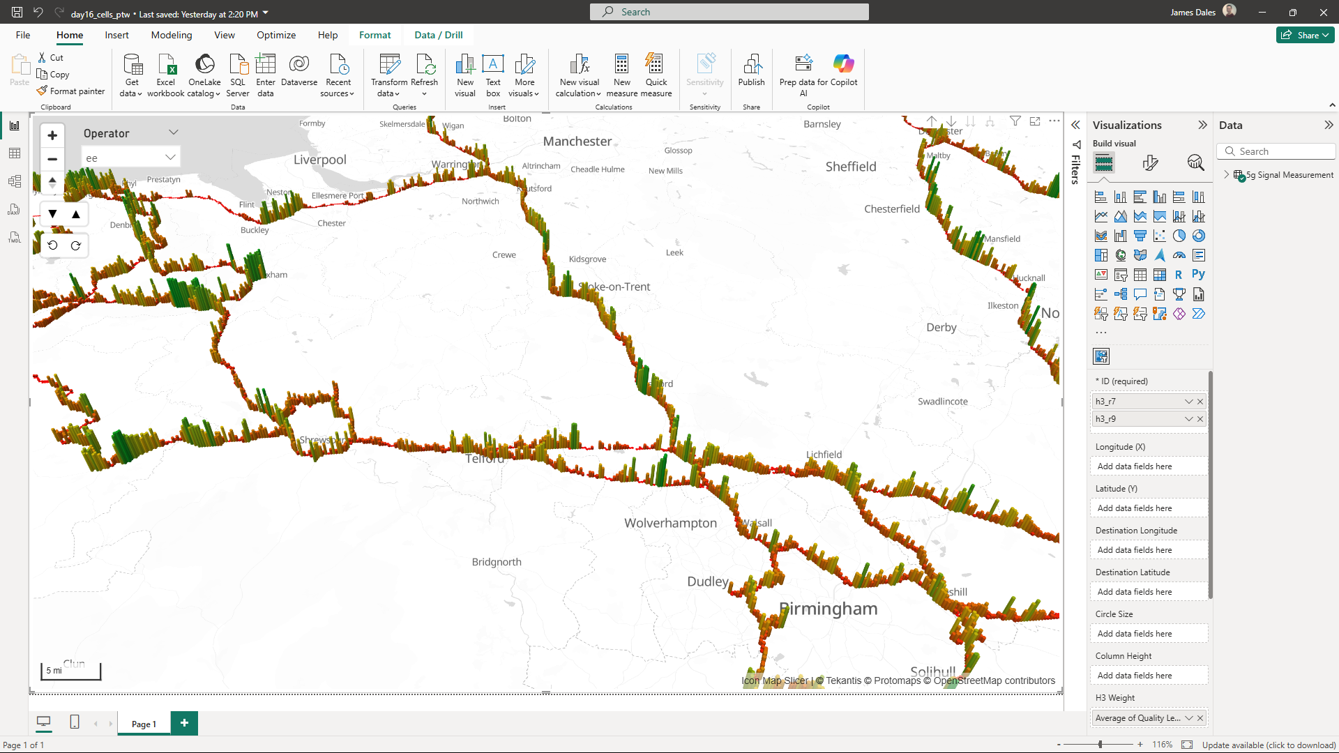
Day 16 of the 30 Day Map Challenge and today's theme is cells:
Map something composed of small, discrete units or networks. This could be a geographic cell (raster, tessellation), a cellular network, or a biological/social process (e.g., disease spread).
I've decided to map 5G cell network reception using H3 cells. In March Ofcom released a dataset representing mobile signal strength for the network operators across the UK. This data was collected by driving a vehicle around the UK's road network.

The downloaded CSV file is over 7gb and contains over 55 million rows of readings - too much to display in a single Power BI visual. Unperturbed, I asked ChatGPT to generate a python script to encode the longitude and latitudes into H3 cells indexes at various resolutions and add them for each row.
Loading this into Power BI meant I was able to bucket up those individual readings and create an average reception within each cell. By using different resolutions I was able to drag different H3 cell resolutions into Icon Map Slicer's ID field, creating a H3 cell hierarchy that we can use to drill down into more detailed resolutions.
The approach meant that I was able to visualise a 55 million row dataset and reduce it down to x unique H3 cells at resolution 9 and return a more meaningful result. These were visualised using Icon Map Slicer's native support for H3, colour coded the cells based on the signal quality and extruded in 3D for better effect.
Here's the resulting Power BI report:
and the Power BI .pbix file to download.
You may also be interested in this blog post showing how to draw cell tower RF diagrams in Power BI using Icon Map.