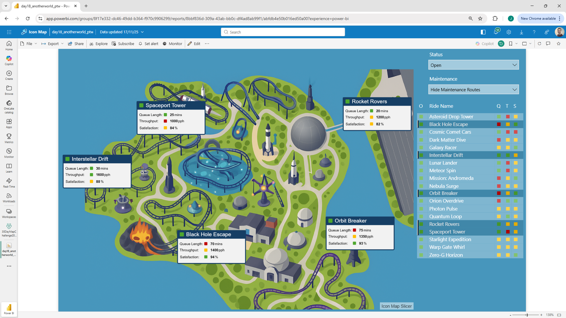
It's day 18 of the 30 Day Map Challenge and today's theme is "Out of this World".
Map something non-Earth: a fantasy realm, an exoplanet, the Moon, Mars, deep space, or a purely conceptual place (e.g., a mental map).
Not every map uses a real world background. You might be creating a Power BI report about a planned development, the inside of a building or vehicle or as we have here a theme park - and still overlay polygons, images, circles, lines etc. as you would over a real base map.
So for today's challenge, I've chosen to create an interactive map of a theme park. I asked ChatGPT to create a space themed theme park map based on a real theme park location - can you guess which one?

I took the generated image, imported into QGIS and then used gdal_translate to convert it to a cloud optimized geotiff (COG) - (see the blog post from day 9).
Then in Icon Map Slicer I turned off the background map and added the COG image as a raster overlay. This forms the base of our theme park map. But as it's Power BI, I wanted to show some metrics on the map. I imagined I was running a theme park and had KPIs for queue length, throughput and visitor satisfaction - as well as whether the park was open or not.
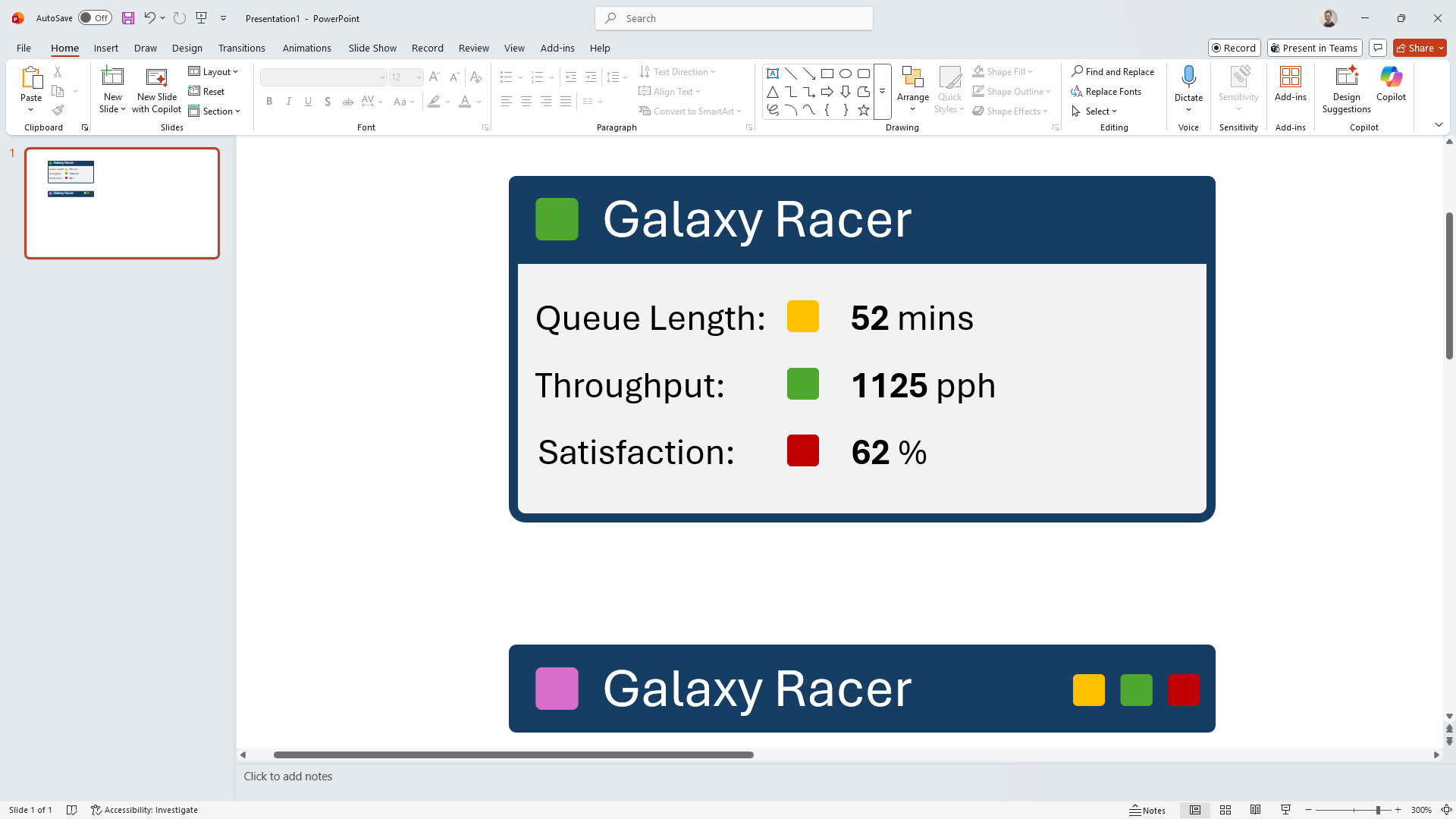
To display these metrics I've created SVG images in a DAX measure. This might sound complicated, but actually they're easy to create. I have two version of the image - a detailed one for when the map is showing a subset of rides and there's more space, and a simplified one, just using colours to indicate the KPIs.
To create these I started in PowerPoint and mocked them up using PowerPoint shapes:

I then grouped all the elements in each image, and then used the right click menu to save them as SVG images.
I then substituted the hard coded colours and text with the values from my Power BI table. Here's the simpler image as an example:
Stats Image Compact =
"<svg width=""1090"" height=""94"" xmlns=""http://www.w3.org/2000/svg"" xmlns:xlink=""http://www.w3.org/1999/xlink"" xml:space=""preserve"" overflow=""hidden"">
<g transform=""translate(0,31.5) scale(1, 0.17816)"">
<g transform=""translate(-640 -1229)"">
<path d=""M655 1248.21C655 1245.89 656.887 1244 659.215 1244L1705.79 1244C1708.11 1244 1710 1245.89 1710 1248.21L1710 1358.79C1710 1361.11 1708.11 1363 1705.79 1363L659.215 1363C656.887 1363 655 1361.11 655 1358.79Z"" stroke=""#163E64"" stroke-width=""13.75"" stroke-miterlimit=""8"" fill=""#163E64"" fill-rule=""evenodd""/>
<text fill=""#FFFFFF"" font-family=""Aptos,Aptos_MSFontService,sans-serif"" font-weight=""400"" font-size=""63"" transform=""matrix(1 0 0 1 789.392 1330)"">" &
MAX ( space_ride_metrics[Ride Name] ) &
"</text>
<text fill=""" & MAX ( space_ride_metrics[Queue Length Colour] ) & """ font-family=""Segoe Fluent Icons,Segoe Fluent Icons_MSFontService,sans-serif"" font-weight=""400"" font-size=""55"" transform=""matrix(1 0 0 1 1497.31 1333)""></text>
<text fill=""" & MAX ( space_ride_metrics[Satisfaction Colour] ) & """ font-family=""Segoe Fluent Icons,Segoe Fluent Icons_MSFontService,sans-serif"" font-weight=""400"" font-size=""55"" transform=""matrix(1 0 0 1 1569.17 1333)""></text>
<text fill=""" & MAX ( space_ride_metrics[Throughput Colour] ) & """ font-family=""Segoe Fluent Icons,Segoe Fluent Icons_MSFontService,sans-serif"" font-weight=""400"" font-size=""55"" transform=""matrix(1 0 0 1 1641.04 1333)""></text>
<text fill=""" & MAX ( space_ride_metrics[Status Colour] ) & """ font-family=""Segoe Fluent Icons,Segoe Fluent Icons_MSFontService,sans-serif"" font-weight=""400"" font-size=""73"" transform=""matrix(1 0 0 1 684.495 1340)""></text>
</g>
</g>
</svg>"
With both images created as measures, I then created an additional measure to determine whether to display the full version or the simpler version depending on whether a subset of rides was selected in the table visual.
Stats Image =
VAR TotalRides =
    CALCULATE(
        DISTINCTCOUNT( space_ride_metrics[Ride Name] ),
        ALL( space_ride_metrics[Ride Name] )              -- ignore all filters on Ride Name
    )
VAR VisibleRides =
    CALCULATE(
        DISTINCTCOUNT( space_ride_metrics[Ride Name] ),
        ALLSELECTED( space_ride_metrics[Ride Name] )      -- respect page/visual interactions
    )
RETURN
IF (
    VisibleRides < TotalRides,   -- something is filtering the rides (e.g. table selection)

    [Full Stats Image],
    [Stats Image Compact]
)
We can now display these at the ride locations on the map using Icon Map Slicer's image layer.
I then added an additional overlay showing linestrings of the maintenance routes, which is optionally displayed based on the slicer selection.
Here's the Power BI report to see it in action:
And the Power BI .pbix file to you can dissect the report and see in detail how it was put together.