It's day 13 of the 30 Day Map Challenge and today's theme is "10 Minute Map".
Start the timer! The maximum allowed time to design and produce this map is 10 minutes. Focus on speed, simplicity, and core communication.
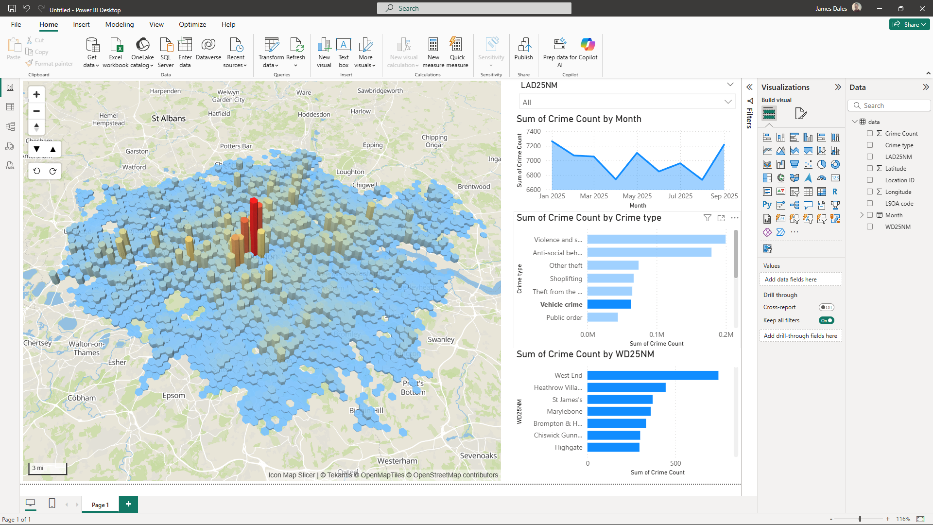
For this challenge I'm going to use the 10 minutes to create a map of 2025 crime in London, showing the whole process from downloading the source data, importing it into Power BI using PowerQuery and building and configuring the visuals.

For the report we download all the currently available crime data for the 2 police forces in London - 9 months from Jan 2025 to Sept 2025- from data.police.uk and import it into Power BI using Power Query. We also download a lookup file from the Office For National Statistics Open Geography Portal to enable us to roll up the crime locations to Wards and Local Authorities.
With the data loaded I then add a slicer to filter to a specific Local Authority if required, an area chart showing crime over time, and bar charts showing crime by Crime Type and Ward.
Then for the map I bucket the longitude and latitude coordinates into H3 hexagon cells. I configure the resolution so that the cells automatically get smaller and show more detail as you zoom into the map.
I also configure Icon Map Slicer to automatically filter the other visuals on the report as you pan and zoom the map, so they only represent data for what's currently in the map view.
In just 10 minutes, there wasn't time to make the report look pretty or tidy up the axis on the charts, but we're representing over 850,000 crimes in nearly 60,000 map locations, filtering by Local Authority, Ward and Crime Type.
Watch the whole process here:
Here's the resulting Power BI report.
And the .pbix file to download.