Monday brings us to day 10 of the 30 Day Map Challenge and today's topic is "Air"
Classical Elements 2/4: Focus on the atmosphere. Map weather, wind patterns, air traffic, pollution, or airborne transmission (e.g., pollen, sound).
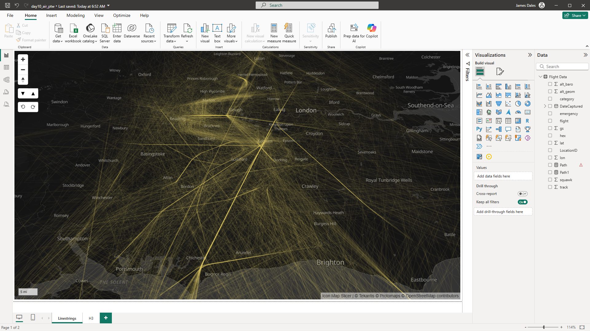
For today's report I've captured a day's worth of air traffic over the south of England.
To capture the data I've used a Raspberry PI with a USB stick from FlightAware with an aerial attached to listen to the ADS-B transmissions from aircraft as they fly over my house. This is setup in my attic for the best reception.

I've imported this raw data into the Power BI report.
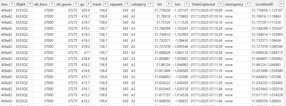
I've created two views of this data in Power BI using Icon Map Slicer. The first uses the captured locations and creates a linestring in WKT format for each aircraft's flight. This is done dynamically in DAX so it will respect any slicers or filters that we apply to the data - such as aircraft type or time.
Flight Path =
"LINESTRING ("
    & CONCATENATEX (
        'Flight Data',
        TRUNC ( 'Flight Data'[lon], 3 ) & " " & TRUNC ( 'Flight Data'[lat], 3 ),
        ",",
        'Flight Data'[DateCaptured], DESC
    ) & ")"
The result of which is we reduce over 200,000 rows of point data to a few thousand rows of linestring data.
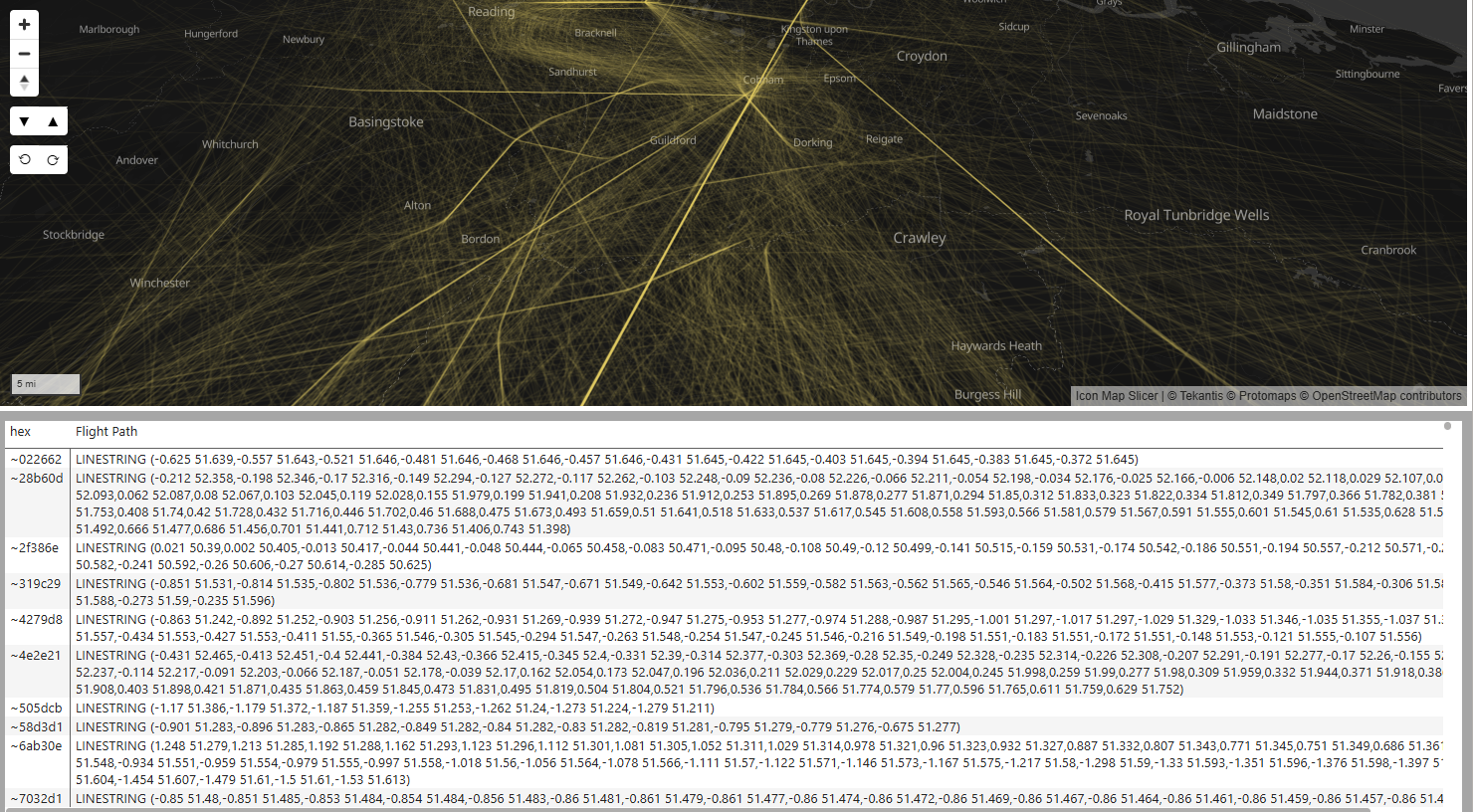
This is added to Icon Map Slicer as a WKT data layer. I've set the line transparency to 70% and set the lines to blur, so that only when multiple flights overlap we get a solid line.
I think the end result is quite effective at showing the busier areas of airspace and the routes taken by aircraft.
I also created a 2nd page in the report using H3 hexagons to visualise the same data. My preferred approach would be to pre-process the data to generate H3 cell IDs before loading the data into Power BI. That way we can display hundreds of thousands of hexagons on the map without worrying about numbers of rows of data that we're sending to the visual.
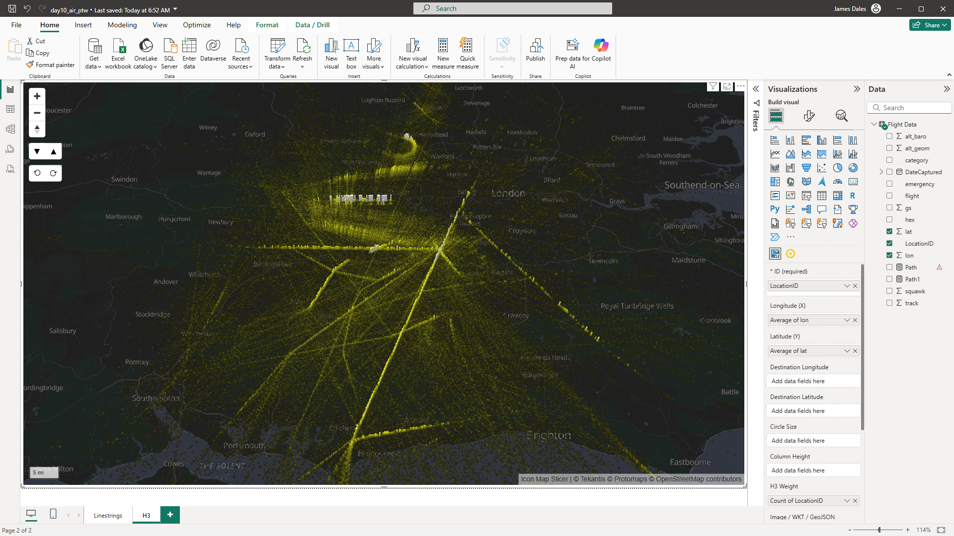
However in this case I've sent all 211,052 rows of data to Icon Map Slicer which is then creating the H3 cells on the fly, and setting the colours based on how many times we've detected planes within those polygons. To put this in context - the upper limit for most Power BI visuals is 30,000 rows of data.
Here's the Power BI report: