
Aviation is usually measured in time: on-time performance, turnaround minutes, connection windows and recovery timelines.
But flights, vehicles, noise, obstacles, weather and retail sales all play out somewhere – and often in 3D. The same 20-minute delay, track deviation or retail result can mean very different things depending on route, height, stand, terminal or community.
Aviation location intelligence treats “where” and “at what height” as key analytic dimensions. For BI teams, the prize is simple: fewer blind spots, faster decisions and analytics that reflect how the operation and airport ecosystem work.
Aviation is spatial (and often 3D), not just a timetable
Most aviation data already includes some form of location:
- Airports, routes and procedures
- ADS-B positions and trajectories
- Stands, taxiways, terminals and retail units
- Obstacles, terrain and OIS
- Noise monitors, environmental sensors and wildlife sightings
The problem is that location is often used as a label (“by airport”) rather than a dimension:
- Not just which flights are delayed, but where delay clusters along routes and on the ground
- Not just retail sales by terminal, but how sales vary by concourse, gate mix and passenger flows
- Not just whether obstacles exist, but whether they penetrate 3D obstruction identification surfaces (OIS) and affect real trajectories
- Not just noise levels at monitors, but contours and communities affected by real flight paths
Once you model the network in space and height, aviation analytics becomes about flows, corridors and footprints, not just rows in a table.
High-value use cases for aviation location intelligence
Location intelligence amplifies work you already do. Key areas:
Flight paths, routes and trajectories
- Use ADS-B to track aircraft in 3D, compare planned vs flown routes, and spot holding patterns, shortcuts and congestion
- Run route analysis on actual trajectories: time, fuel, resilience, noise and community impact
- Segment by altitude band or phase of flight to keep views understandable for non-specialists
Using an ADSB receiver to track aircraft across the South-East of the UK, the below map shows the number of tracked location points shown as H3 hexagons in 3D over the course of 2 years. Further analysis can then be done to assess the noise and emissions impact on the areas by year and month, for example.
![]()
Safety, obstacles and environment
- Airport obstacle management: 3D GIS models of OIS to see if terrain, buildings or vegetation violate safety clearance zones
- Noise and Emissions impact analysis: model contours around airports and overlay communities, land use and real trajectories
- Weather and hazard analysis: map storms, turbulence and icing risks against flight paths and phases of flight
- Environmental monitoring: track wildlife hotspots near airports, bird strike data and protected habitats
Operations and commercial performance
- Airport operations analytics: turnaround performance by stand, taxi route and congestion hotspot; ground fleet positioning vs SLA performance
- Route network analytics benefits from a geographic view of catchment, competition, distance, connecting opportunities and actual flown trajectories
- Retail sales in airport terminals: sales by unit, concourse and gate, linked to footfall paths, dwell times and route/network changes
All of these become easier to explain when people can see them on a map, not just infer them from tables.
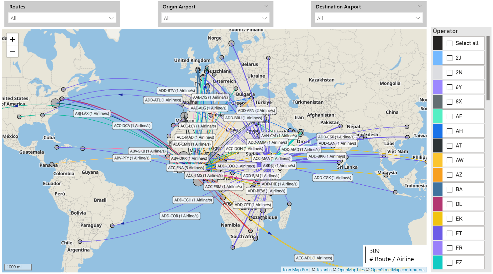
The map below displays routes between multiple origins and destinations, including the number of airlines operating on each route. The line thickness between each origin and destination represents the number of passengers per route or alternatively could be represented by route profitability.
Core data patterns BI teams should standardize
You do not need a perfect model, but you do need reusable patterns.
Geometry and height
- Points: aircraft positions (with altitude), stands, gates, sensors, wildlife sightings, retail units
- Lines: flight paths, taxi routes, towing paths, passenger movement flows
- Polygons: zones, noise contours, OIS footprints on the ground, terminal and concourse areas, habitats
- Height (Z): altitude and elevation for trajectories, OIS checks and some noise/hazard work
Time as a join key
Treat time as central, not an afterthought:
- Where was aircraft X at time T (and altitude H)?
- Which flights traversed region Y during wet-lease period Z?
- Which noise contours, hazards or OIS surfaces applied when this event occurred?
- Where were passengers when a promotion was active, and what did they buy?
Reference layers as products
Curate shared layers instead of letting each report reinvent them:
- Airport layout, stands, taxiways, terminals and retail zones
- Routes, procedures, sectors and airspace
- Obstacles, OIS, terrain and land use
- Noise contours, monitors and wildlife zones
- Catchments and markets
Add data quality rules and lineage so safety, environmental and commercial teams can trust what they see.
Governance, sensitivity and design in Power BI
Maps are persuasive. That is good for action, but risky without governance.
Access and sensitivity
- Separate base context (safe for broad audiences) from sensitive layers: OIS, detailed trajectories, noise, wildlife, retail by exact unit
- Use role-based access and row-level security so safety, environment, operations and commercial teams each see the right level of detail
Design principles for aviation-focused reports
- Use layers to keep each page focused: one main story (e.g. trajectory density, OIS infringements, noise contours, retail sales), plus minimal context
- Let users drill: network → hub → route or runway → stand, segment, terminal area
- Always include time controls; for trajectory and noise analysis, let users filter by phase of flight or altitude band
- Choose map visuals that can cope with high-volume points, multiple layers and custom basemaps (airport layouts, terminals, 3D concepts projected into 2D)
Specialist visuals such as Icon Map can help deliver complex aviation maps directly in Power BI, combining live positions, trajectories, OIS and noise layers, wildlife data, route performance and retail analytics in a governed way.
Getting started: make one question better
You do not need an “aviation geospatial program” to begin. You need one good question where “where” and “height” clearly matter, for example:
- Where do our flight paths and trajectories most often deviate, and what does that cost in time, fuel, noise or complaints?
- Where do OIS infringements or near-misses occur, and which procedures or developments drive the risk?
- Where are noise impacts and wildlife risks highest relative to current operations?
- Where are retail sales underperforming relative to passenger flows and gate mix?
For that one question:
- Standardize the basics: IDs for airports, runways, stands, terminals, retail units, routes; consistent coordinates and altitude; clear time stamps.
- Build one simple, layered map in Power BI that answers the question clearly.
- Prove value, then reuse the same geospatial building blocks for the next use case.
Do this a few times and you will have a practical, governed foundation for aviation location intelligence that supports operational, safety, environmental and commercial decisions – without forcing everyone into separate specialist tools.
If you are already building aviation dashboards, your next step is simple: pick one existing report where people are mentally “mapping” the numbers in their heads, and add the actual map. That small change is often where better questions – and better decisions – begin.