
It's November 1st, which means it's the first day of this year's 30 Day Map Challenge. Of course I'm aiming to use Icon Map for as many of the challenges as possible. Last year I used Icon Map Pro for all the challenges - this year, I'm going to be different and use Icon Map Slicer.
The theme for today is "Points" - Challenge Classic: Map with point data (e.g., individual locations, points of interest, clusters). Focus on effective symbolization and density visualization.
I've downloaded a dataset containing the location of trees in London and built a relatively simple report.
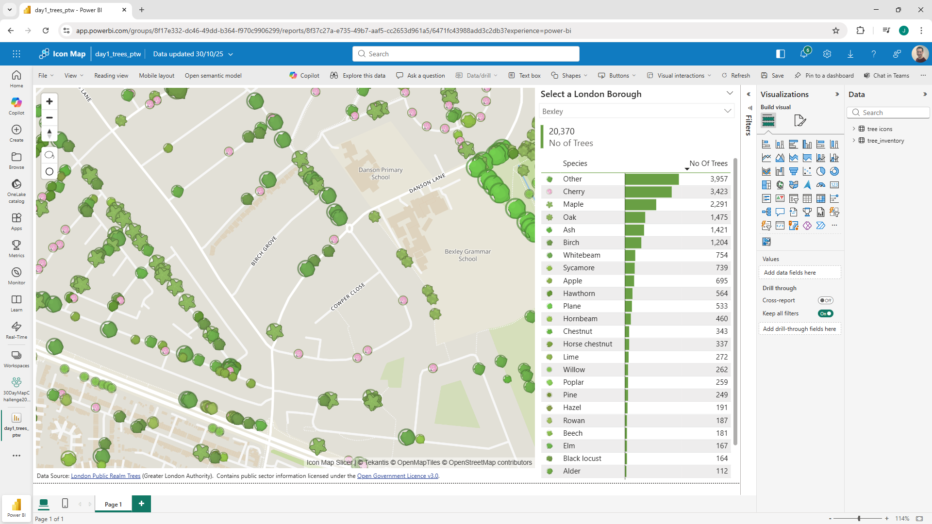
Rather than display these using traditional circles, I've asked Chat GPT to create SVG images representing each type of tree. The images are represented as URL encoded data URLs.
I've then plotted the tree locations on the map, using the generated icons, and the longitude and latitudes from the data. I also used the size of tree to scale the images so they reflect the real size of the trees.
And because the trees are part of the Power BI dataset, you can use the lasso tool to select all the trees in an area and see the breakdown of the species in the chart to the right. Equally you can select a species in the table and it will update the map to only show trees of the selected species.
There's a lot of data - millions of rows, so I've added a filter to limit the amount of data sent to the map, even then it can take Power BI to send sometimes 100,000 trees to visualize - way over the limit of other Power BI map visuals.
Here's the report to play with:
Or you can download the Power BI .pbix file to see how it was put together.