
Icon Map
Blogs
As new functionality is introduced into the visual, on occasions I will create a blog post to how to use the capability in more detail, or explain some of the potential uses.
- Dealing with WKT objects that are too long for a column
- Slicing and filtering combinations of map objects
- Mapping streaming flight data with Microsoft Fabric
- Options for hosting GeoJSON files
- Using vector tiles from GeoServer
- Adding custom Mapbox layers from Mapbox Studio
- Displaying tracks over time as line strings
- Rendering different object types on the same map
- Using Ordnance Survey maps with Icon Map
- Using a custom image as a map background
Dealing with WKT objects that are too long for a column (26th March 2024)
When using WKT or geoJSON objects in Icon Map from within your Power BI Dataset, sometimes they don't appear on the map. The most usual reason for this, is that they've exceeded the maximum width of a column in Power Query, which is 32766 characters. This doesn't cause an error when loading your data, but will truncate the WKT object at 32766 characters, which causes it to be an invalid WKT object and not be displayed on the map. A common strategy for overcoming this, is to split the WKT object into multiple rows, and then create a DAX measure using CONCATENATEX to join the rows back together. The following video shows how to do this using the Power Query GUI, without having to write any M code by hand:
Slicing and filtering combinations of map objects (26th March 2024)
One of the key features of Icon Map is the ability to combine different types of map objects on the same map. This can be useful for showing different types of data on the same map, or for showing different aspects of the same data. However, sometimes you may want to be able to filter some of the objects, but leave others visible on the map. Unfortunately this can't be configured within the visual, however with some datamodelling, it is achievable.
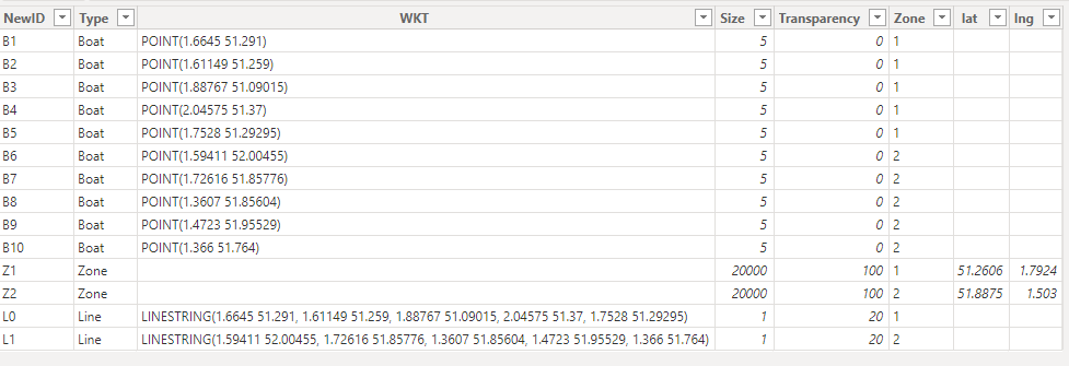
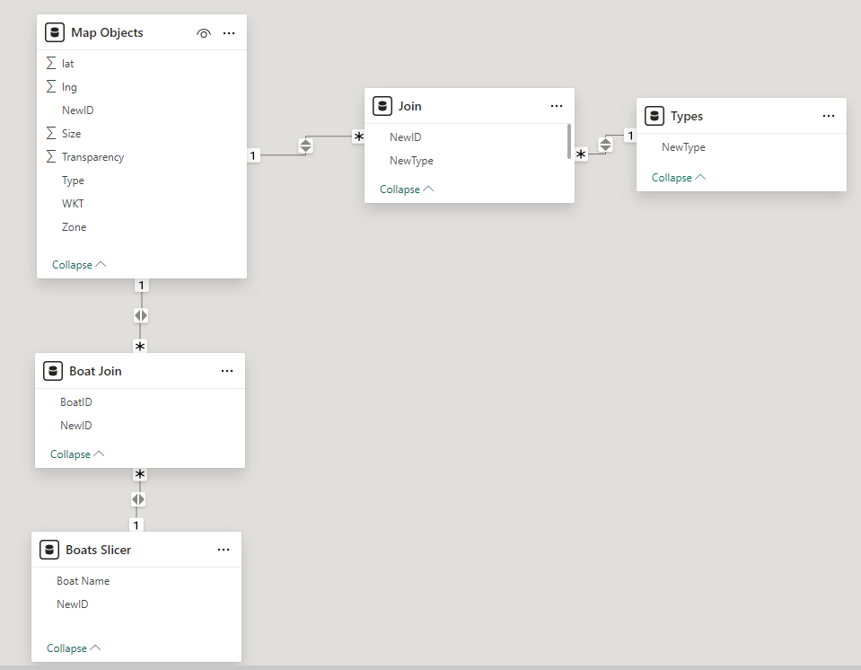
In this example we have three types of object on the map. Boats, represented as small blue circles, zones represented as larger circles of a fixed size in meters, and lines representing the tracks of the boats. The lines and boats are WKT objects, where as the zones are circles. Each boat, zone and line is an individual row of data in a MapObjects table:
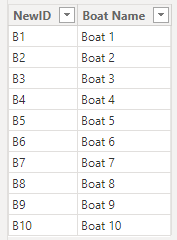
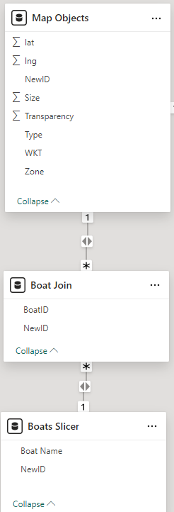
We have three slicers on the report, allowing different types of filtering. The Zone filter, simply shows lines, boats and zones for a specific zone. This is a straightforward slicer based on the zone in the MapObject table. The boat filter is a little more complicated as when we select a boat, we want to show only that boat, but may want to keep showing the zone and lines. To do this we create a dimension table for the boats:
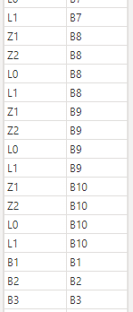
And a join table that contains a row for each of the boats, but also a rows for each zone and line, duplicated for each boat:
These tables are then joined and bi-directional cross filtering enabled.
Now when the boat from the Boats Slicer table is selected in the slicer, it will select the current boat and the lines and zones.
A similar technique is employed for a 2nd slicer to enable which object types, or combination of object types appear on the map.
The Power BI Desktop file is available to download, so you can explore this implementation.
Mapping streaming flight data with Microsoft Fabric (26th May 2023)
With the launch of Microsoft Fabric I've been keen to investigate the benefits of the new platform for mapping within Power BI. There will be more of these posts to follow focussing on the implications of the DirectLake capability, but this post is about streaming data into Fabric's KQL DB (which was Azure Data Explorer).
I was keen to actually use some real data, rather than generate fake data, so let's cover the data source first. The idea I had was to capture the details of aircraft as they fly above my house. This was pretty simple to achieve using a Raspberry PI and the PiAware software from FlightAware. There are details on what hardware is required and how to set it up here on Flight Aware's website.

Once set up, the aircraft details are available in json format and continually updated.
    { "now" : 1685088091.4,
        "messages" : 1231525991,
        "aircraft" : [
            {"hex":"402d62","alt_baro":1300,"squawk":"0430","mlat":[],"tisb":[],"messages":42,"seen":9.4,"rssi":-19.2},
            {"hex":"407d75","flight":"BAW414  ","alt_baro":9050,"alt_geom":9650,"gs":307.8,"ias":251,"mach":0.444,"track":222.8,
                "mag_heading":222.9,"baro_rate":3392,"geom_rate":3264,"squawk":"0535","emergency":"none","category":"A3","nav_qnh":1013.6,
                "nav_altitude_mcp":12000,"nav_heading":0.0,"lat":51.318375,"lon":-0.428096,"nic":8,"rc":186,"seen_pos":0.6,"version":2,"nic_baro":1,
                "nac_p":9,"nac_v":1,"sil":3,"sil_type":"perhour","gva":2,"sda":2,"mlat":[],"tisb":[],"messages":253,"seen":0.2,"rssi":-19.8},
            {"hex":"3c458b","alt_baro":32000,"squawk":"4147","mlat":[],"tisb":[],"messages":13,"seen":7.0,"rssi":-24.2},
            {"hex":"400877","alt_baro":8025,"version":0,"sil_type":"unknown","mlat":[],"tisb":[],"messages":18,"seen":2.5,"rssi":-22.8},
            {"hex":"400846","flight":"LOG67HN ","alt_baro":7250,"gs":248.0,"ias":233,"tas":258,"mach":0.400,"track":0.5,"roll":-1.2,"mag_heading":12.1,
                "baro_rate":1344,"squawk":"4455","nav_qnh":1013.2,"nav_altitude_mcp":10496,"mlat":[],"tisb":[],"messages":450,"seen":0.1,"rssi":-23.3}
        ]
    }
As you can see the json contains some great data including the positions, bearing, altitude etc. To get this data from my local network, I created simple .net console app to push it into an Azure Event Hub. I can't consider myself a .net developer any more, but this seems to do the trick, pushing the aircraft data every second.
    using System.Net;
    using Azure.Messaging.EventHubs;
    using Azure.Messaging.EventHubs.Producer;

    using (WebClient wc = new WebClient())
    {
        var timer = new PeriodicTimer(TimeSpan.FromSeconds(1));
        while (await timer.WaitForNextTickAsync())
        {
            var json = wc.DownloadString("http://piaware/skyaware/data/aircraft.json");
            EventHubProducerClient producerClient = new EventHubProducerClient("Endpoint=sb://#event hub namespace#.servicebus.windows.net/;
                    SharedAccessKeyName=RootManageSharedAccessKey;SharedAccessKey=#shared access key#", "flights");
            using EventDataBatch eventBatch = await producerClient.CreateBatchAsync();
            eventBatch.TryAdd(new EventData(json));
            await producerClient.SendAsync(eventBatch);
            await producerClient.DisposeAsync();
        }
    }
So now we have our real IoT feed of aircraft locations being streamed every second into the Azure Event Hub, we can now focus on the ingestion and presentation side of things in Microsoft Fabric. With a workspace using a Fabric capacity already set up, the first thing to do was to switch to the Real-Time Analytics person so that we have the appropriate components readily available to us.
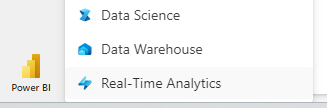
From there we can create new KQL database. In the new database, using the 'Get Data' menu, we can select 'Event Hubs' from the 'Continuous' section. From here you follow the steps to create a new table and configure the source. The source type should be Event Hubs and then you'll need to 'Create new cloud connection'. This took a little figuring out.
The Event Hub namespace should match the #event hub namespace# from the .net code snipped above, and the event hub is the "flights" name from the same line of code. For the credentials, I entered the Shared Access Key Name as the username, and the shared access key as the password.
With the cloud connection configured, go on to create a new consumer group - this is a simple as providing a name for it. We can now move on to defining the schema.
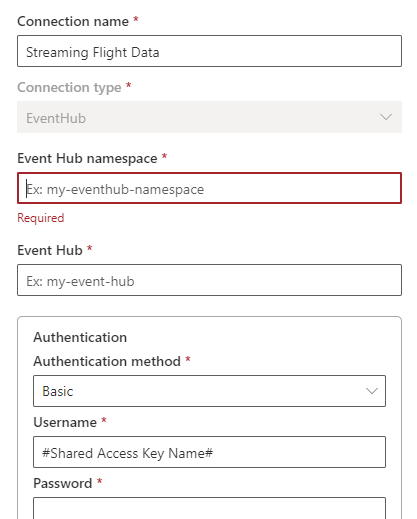
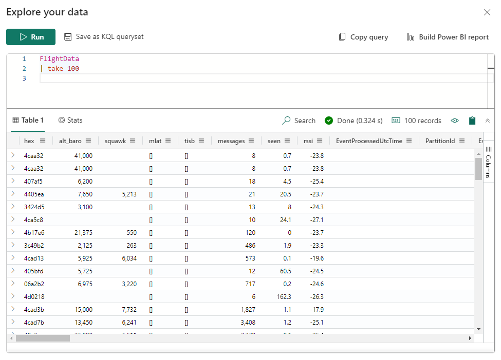
Select JSON as the data format and our flight data is interpreted into a table with a row for each aircraft at that moment in time. Each second a new row is created for each aircraft the Raspberry PI can see. Complete the process and we now have a table within our KQL database of live streaming flight data. Using the 'Explore your data' option you can write a quick query to check you have data flowing:
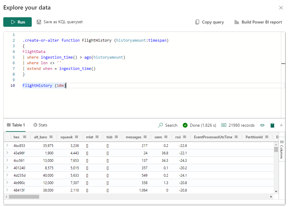
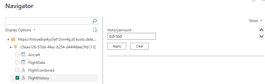
I had issues referencing the table directly from Power BI, so I created a function with a parameter so that we can specify the amount of history we want to query into Power BI. I also added a new column to expose the ingestion time for each row to Power BI, and filtered out data without locations.
Now lets flip over to Power BI Desktop. In the May 2023 release of Power BI Desktop we have the option of a Fabric KQL database as a data source.
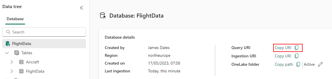
To connect, we have to provide the URL to the cluster
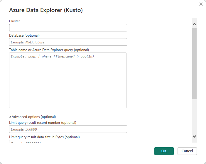
You can find this URL in the Fabric UI here:
This is all we need to provide to hit ok to continue. We can now select the function we've just created. We need to specify the parameter value. To retrieve the last 10 minutes enter 0.0:10:0. I won't detail the steps here, but I then created a parameter in Power Query to substitute the number of minutes with the parameter value, and then went on to create a dynamic parameter, so that we can use a slicer or filter to control the timespan on different visuals or pages. There's more information on that in the Microsoft documentation. Ensure when prompted that you select Direct Query, not Import.
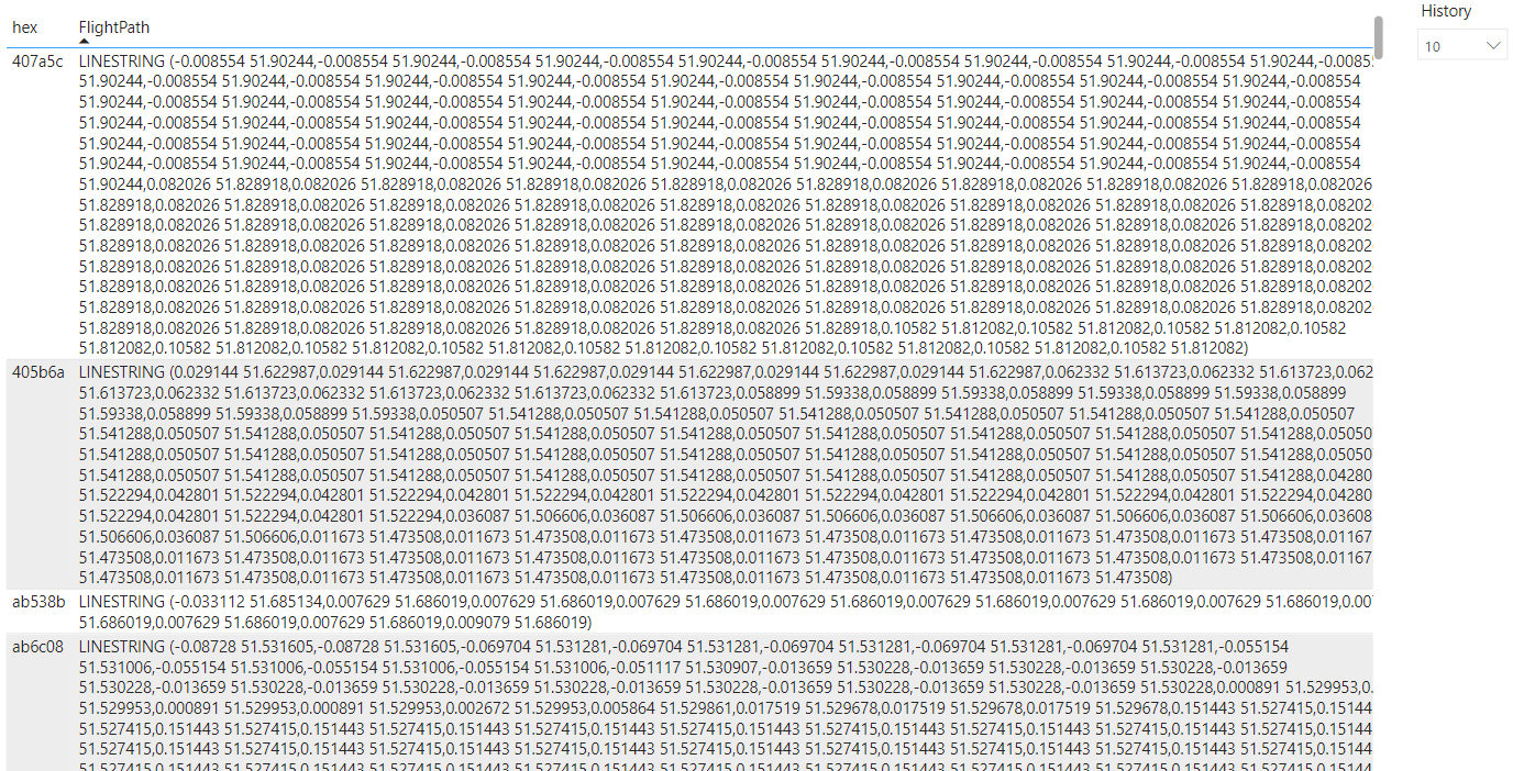
Ok now we have access to our data in Power BI and are ready to get it into a useable format for Icon Map. To display the flight history, I'm generating a LINESTRING for locations of each aircraft. We need one of these per aircraft, so this is where the DAX CONCATENATEX function is our friend:
FlightPath =
VAR _hex =
MAX ( FlightHistory[hex] )
RETURN
"LINESTRING ("
& CALCULATE (
CALCULATE (
CONCATENATEX (
'FlightHistory',
CONVERT ( FlightHistory[lon], STRING ) & " "
& CONVERT ( FlightHistory[lat], STRING ),
",",
'FlightHistory'[when], DESC
) & ")",
FILTER ( FlightHistory, FlightHistory[hex] = _hex )
),
ALL ( FlightHistory[when] )
)
The result is that instead of having a row per second of history for each aircraft, we now have a row per aircraft with the history as a well known text linestring.
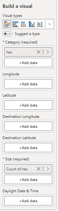
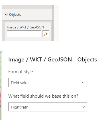
We can now start to configure Icon Map. The field configuration is straight forward, I added hex to the Category field, and for now also to the Size field - although we'll change that in a moment.
In Icon Map's formatting options, expand the 'objects' section and click the fx button against 'Image / WKT / GeoJSON' and then select the new FlightPath measure
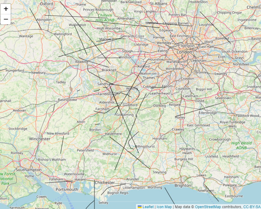
You should now see the linestrings shown on the map
To also display the images of the aircraft, I initially went back to KQL and unioned a second query with just the latest location of each aircraft, so that we get 2 rows - one for the linestring and one for the aircraft. However I've made this easier in Icon Map 3.3.1 about to be released, instead we use the 'Image at Line Destination' option to display an image at the end of the linestring (or multi linestring). I wanted a different image for each category of aircraft, so I created a DAX measure that returns a different SVG image for each type and selected this for the "Image at Line Destination" option. I also created a measure to return the latest compass bearing for each aircraft and used this in the 'Image Rotation' option. I also created a measure to get the latest altitude and replaced the Size field with this measure to that the aircraft appear larger or smaller depending on the altitude. I also set the label setting to show the flight number where available, set a custom map background and formatted the lines. Setting Power BI's automatic page refresh capability means that the planes update automatically.
After I had this running for a few days, I now have tens of millions of rows of data in the database, so I wondered whether I could show the extent of the sky I could pick up aircraft from, but also show the areas with the most amount of aircraft locations. This is when I discovered KQL's spatial clustering functions. Using the H3 method, back in KQL I created the following function
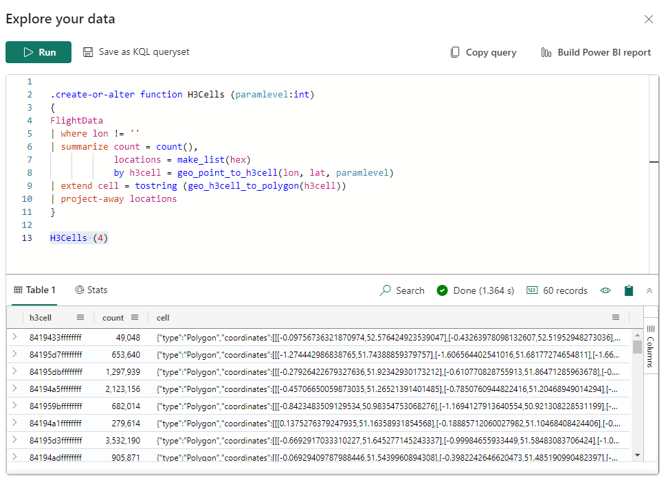
I added the function into Power BI in the same way as the FlightHistory earlier, and created a new dynamic parameter for the detail level. To add into a new Icon Map I dragged the h3cell field into both the category and size field. The size field isn't used in this case, but it needs to be populated. From version 3.2.16 Icon Map supports GeoJSON from data, in the same way as it always has Well Known Text. So selecting the cell field in the "Image / WKT / GeoJSON" conditional formatting options under Objects, allows the hexagons to be displayed on the map. The fill color is set using conditional formatting as a gradient based on the count column.
Options for hosting GeoJSON files (18th August 2022)
Creating choropleth maps using GeoJSON is a very popular use of Icon Map. However, unlike the Shape Map native Power BI visual, it is necessary to host those GeoJSON files externally. These files must be accessible from a URL that starts https:// and also have something calls CORS enabled. This makes the hosting options of where to store these files more complicated, and is the main question I see on an almost daily basis from new users to Icon Map who ask for support. I'm therefore creating this post to offer some suggestions for hosting those files.
Option 1 - GitHub
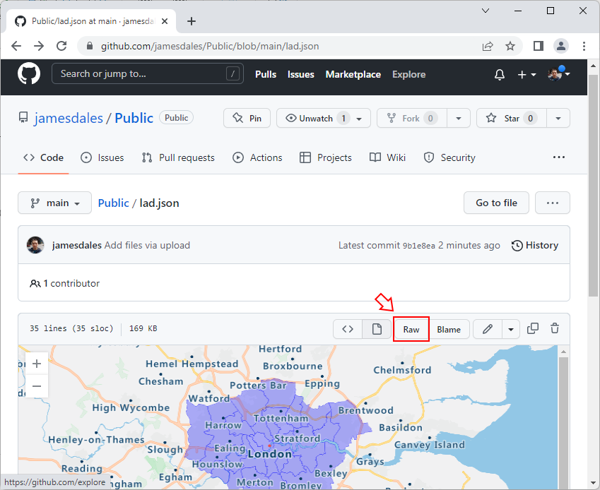
Hosting your file in a GitHub public repo works well in Icon Map. Ensure that your repo is public and upload your geojson file. GitHub also allows you to preview what that file will look like. Click on the 'Raw' button to navigate to the JSON text view of the file.
This raw URL can now be used to embed within Icon Map - eg https://raw.githubusercontent.com/jamesdales/Public/main/lad.json. Simply copy it from the browser into the GeoJSON visual formatting options of Icon Map.
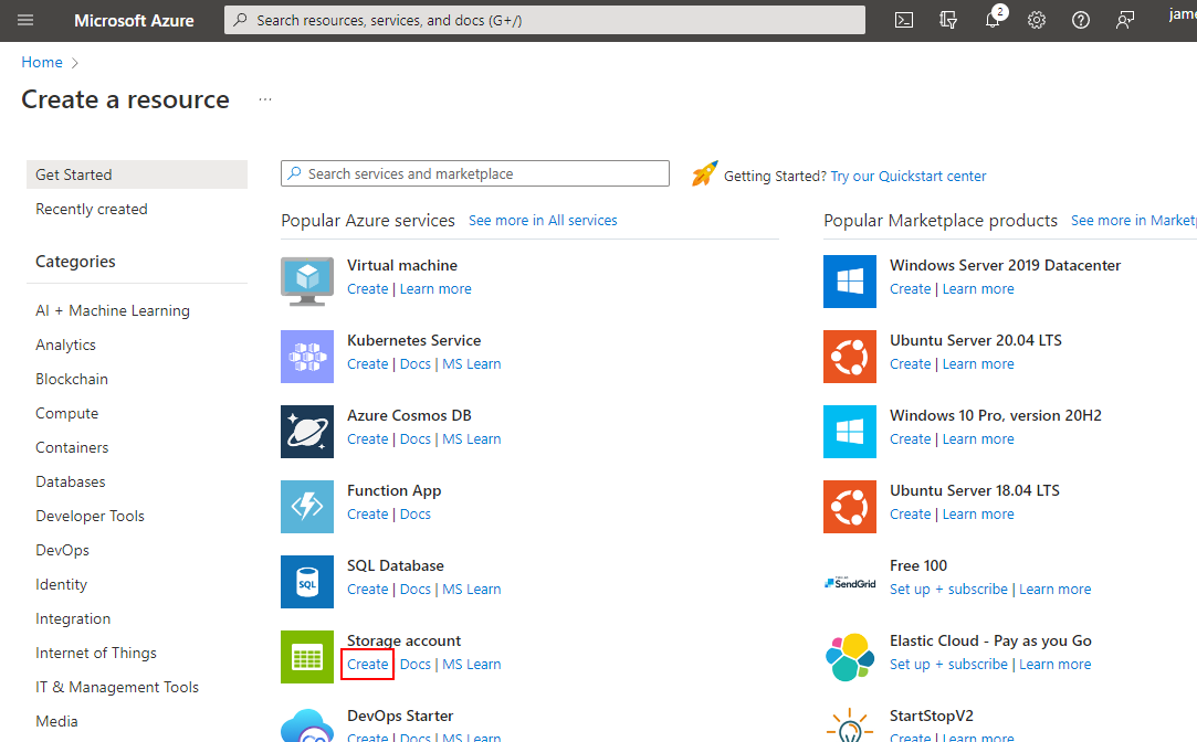
Option 2 - Azure Blob Storage - Public Access
Sign into the Azure Portal at https://portal.azure.com/ and create a new Storage Account.
You'll need to specify an existing or new Resource Group, and a unique name for your storage.
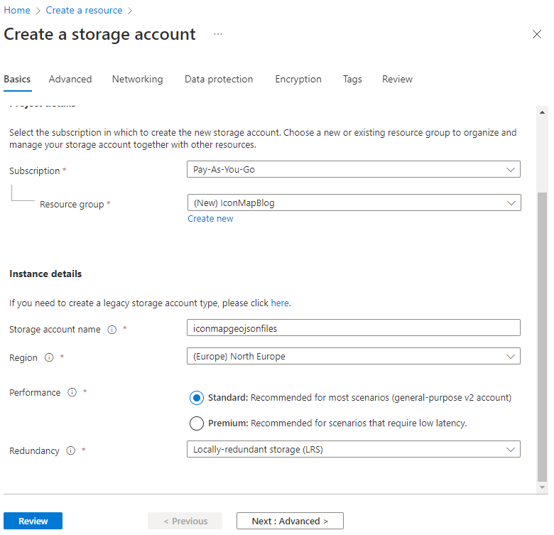
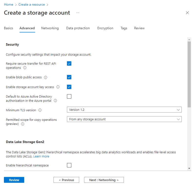
You will also need to ensure that "Enable Public Blob Access" is enabled on the next page.
When you're happy, click the 'Create' button. Azure will now deploy the resource - this can take a few minutes. Once it's been deployed navigate to your new storage account, and click the "Containers" section under Data Storage on the navigation menu.
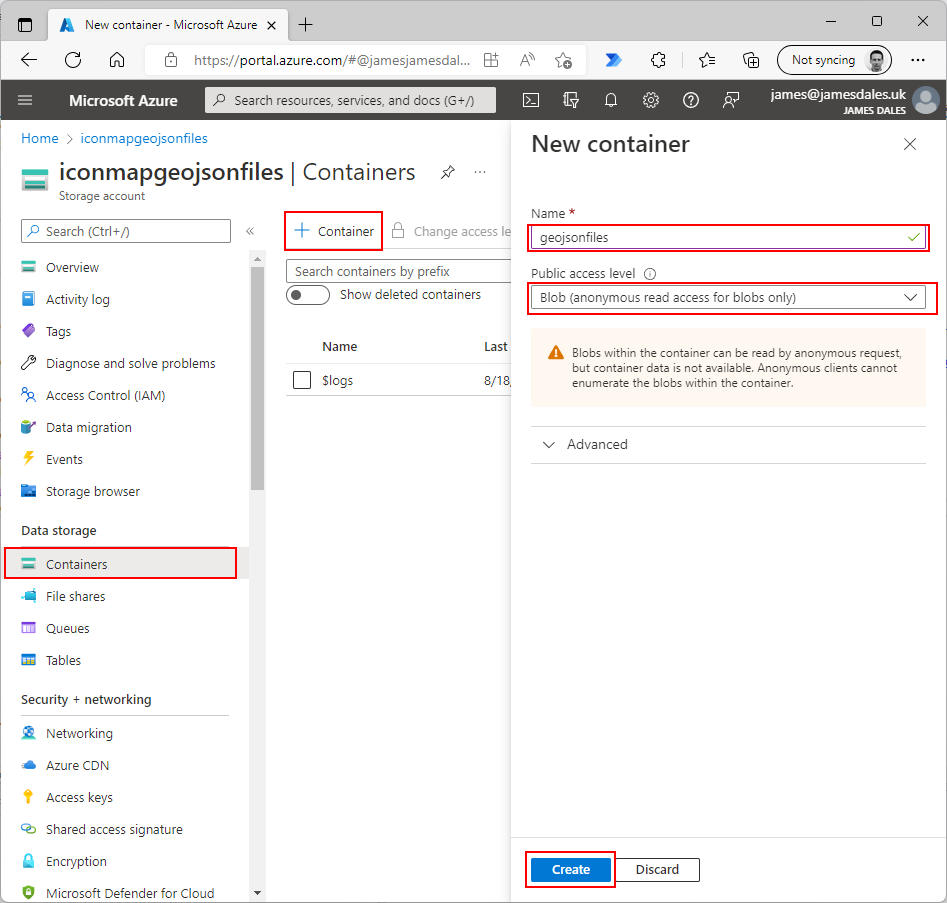
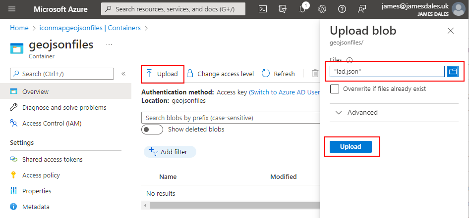
Create a new container. Give it a name. Then select "Blob (anonymous read access for blobs only)" and click "Create".
Click on your new container and then click "Upload" to add your GeoJSON file.
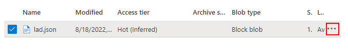
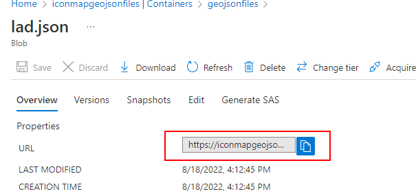
Once your file has uploaded, clicking on the "..." icon and selecting "Properties" will show the properties pane from which you can access the public URL to embed in Icon Map.
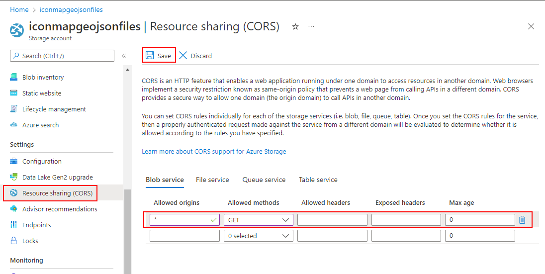
However, this isn't the end of the story. Whilst we have a https:// address for the file we can use in Icon Map, at this point it will error as we haven't enabled CORS on the storage account. Head back to the navigation menu for your storage account, and on the left hand side under "Settings" you should find an option named "Resource Sharing (CORS)". Click this to enter the CORS options screen. Enter * in the Allowed Origins box, Click "GET" in the Allowed Methods box, and then click save. Your URL should now work in Icon Map.
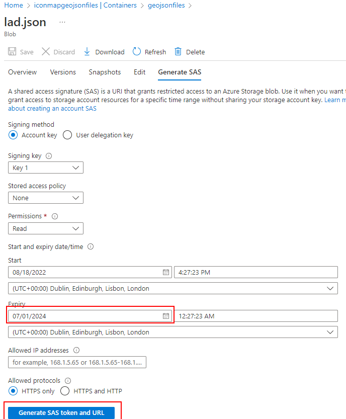
Option 3 - Azure Blob Storage - Private Access
In Option 2, our file is available to anyone. If public blob stores are not permitted in your organisation, you can create a private blob container and use a "Shared Access Signature" to access it securely. Follow the steps as above but instead of creating a public container select the "Private (no anonymous access)" option. Once you've uploaded your file, when clicking the "..." icon, instead of selecting properties, choose "Generate SAS". In the Generate SAS screen, select an expiry date far into the future, then click "Generate SAS token an URL".
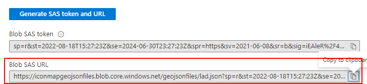
The URL to paste into Icon Map will be shown below the button and be in a format similar to: https://iconmapgeojsonfiles.blob.core.windows.net/geojsonfiles/lad.json?sp=r&st=2022-08-18T15:27:23Z&se=2024-06-30T23:27:23Z&spr=https&sv=2021-06-08&sr=b&sig=iEAleR%2F49kErsFzTEG4ggPEpBVt8q4i6k6cTIk1VfoM%3D. You will of course need to ensure that you also complete the CORS settings described in option 2.
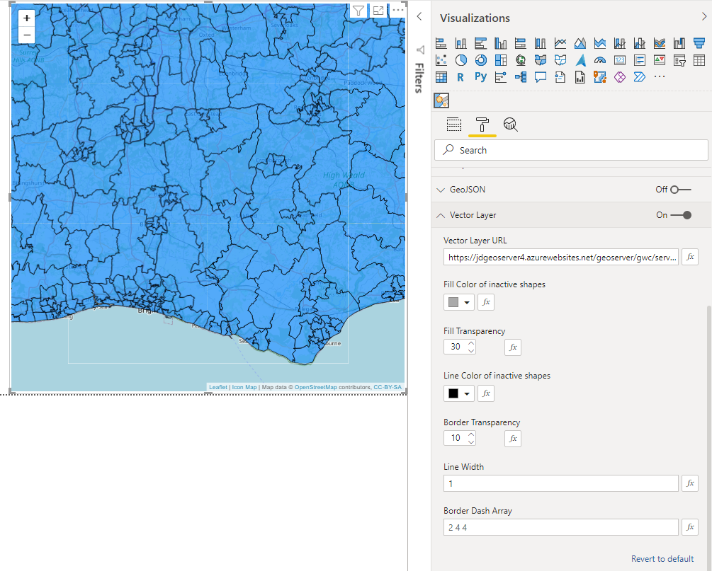
Using vector tiles from GeoServer (24th October 2021)
Vector tiles are loaded from a remote server in the same way as the raster background tiles are - as you pan around and zoom into the map, tiles for that location and zoom level are loaded. The difference with vector tiles, is that rather than pulling back pre-rendered images of that area, it's raw shapes which can have different formatting styles applied to them within Icon Map. This has a number of benefits over GeoJSON shapes and WKT and should allow a much larger number of polygons to be rendered on your map.
Using vector tiles also has some limitations:
- Labels are not currently supported
- Lasso select is not currently supported
- Zoom - as Icon Map only knows about the shapes in the tiles currently in the map area, it's not possible to all the relevant shapes based on the Power BI data available
Vector tiles require a tile server. This post describes how to set up a vector tile layer using the open source GIS server - GeoServer, and configure Icon Map to use it.
First of all you need GeoServer up and running. GeoServer can be downloaded from the GeoServer website. The documentation on that site describes how to install and set up GeoServer, so we won't cover that here. Once GeoServer is up and running you need to install the Vector Tiles extension.
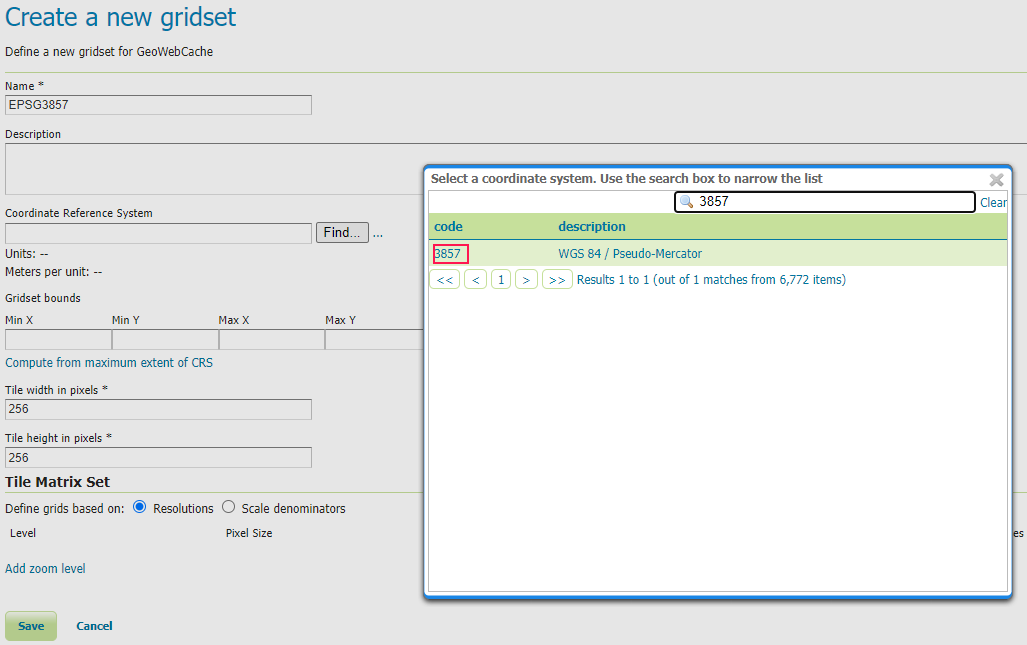
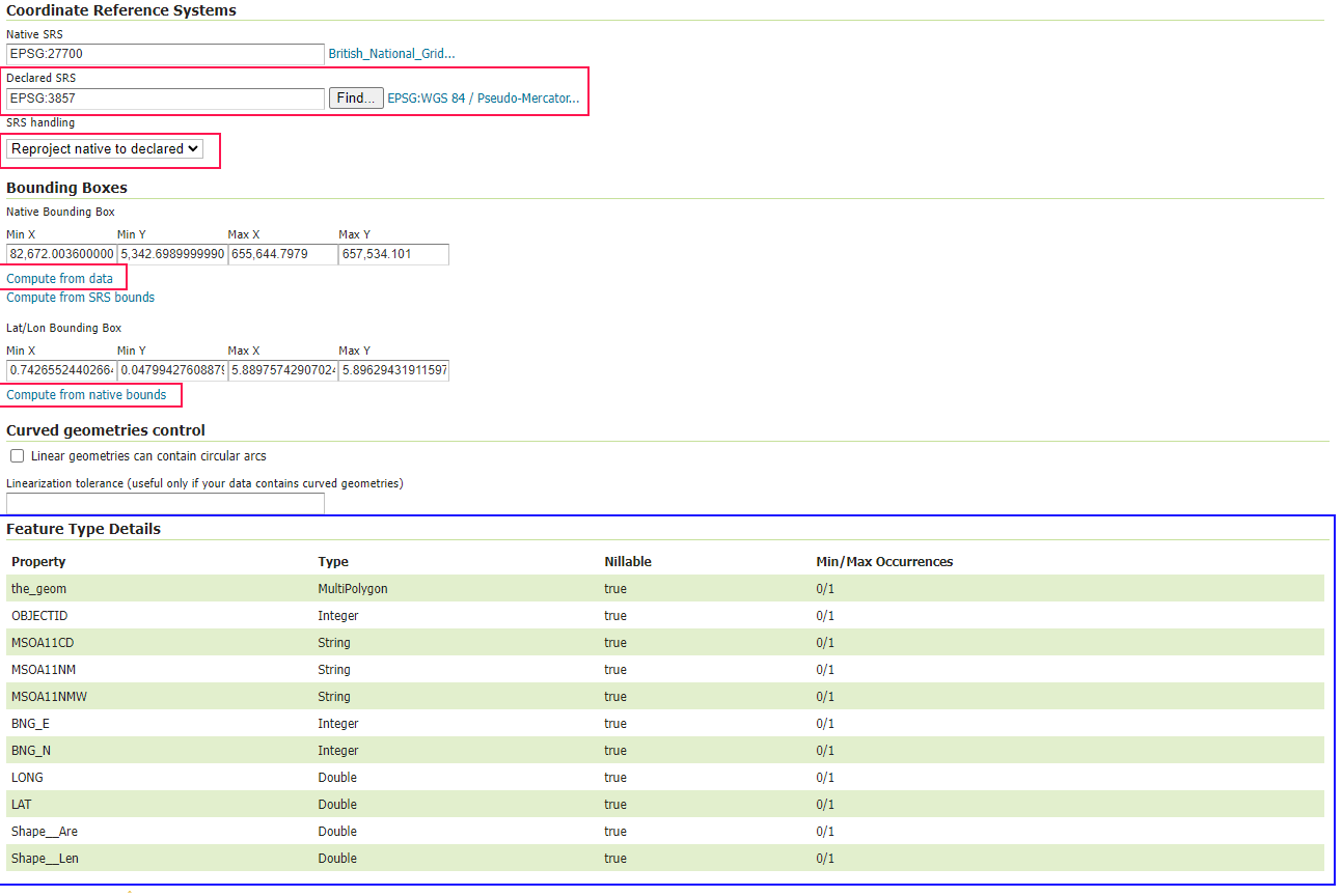
By default Icon Map uses the EPSG:3857 CRS, so we need to make sure GeoServer is configured to support that. Click on GridSets under "Tile Caching" and "Create a new gridset". Enter a "EPSG3857" as the name and click the "Find" button against "Coordinate Reference System". Search for 3857 and click the code:
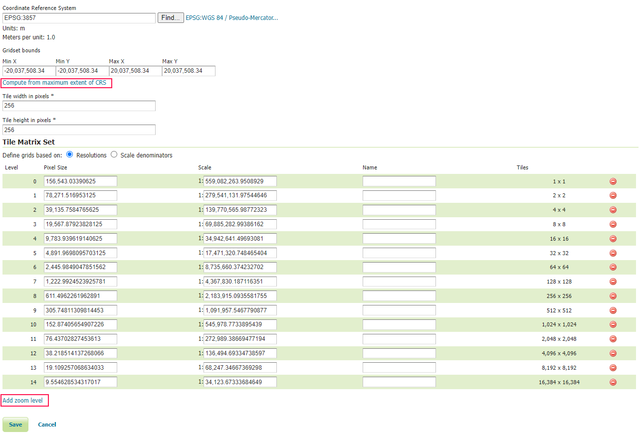
Then click the "Compute from maximum extent of CRS" link to calaculate the bounds. Then finally add zoom levels by clicking the "Add zoom level" link multiple times:
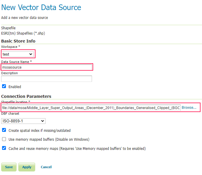
Now we have all the server components in place, we are ready to configure our data. First of all we need to transfer our dataset to our GeoServer's data directory. In this case I've created a new folder called 'msoa' and uploaded the files from the zip file of MSOA boundaries downloaded from the UK's Office of Nation Statistics Open Geography Portal in Shapefile format.
In GeoServer we need to add a new Store. We will select Shapefile as the source:
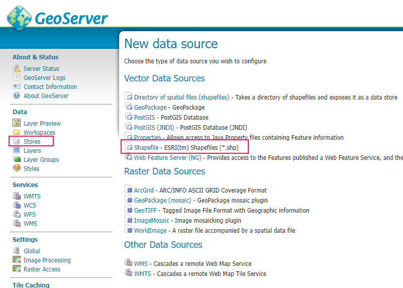
We then select a workspace, enter a name for the data source and select the .shp file from the msoa folder before clicking 'Save':
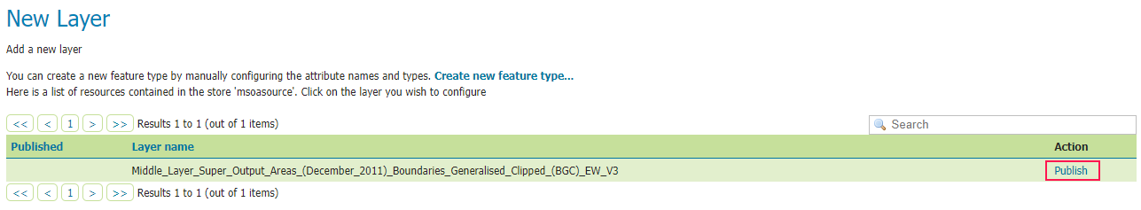
You should now get a list showing the layer just imported. Click the Publish link to start configuring the layer:
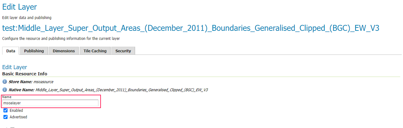
Firstly lets give our layer a concise name - msoalayer:
Then scroll down to the Coordinate Refstyle="max-width: 100%" erence System section. Our source data in this case uses the EPSG:27700 CRS so we will need to translate it to EPSG:3857. Click the "Find" button to search for and select EPSG:3857. Select "Reproject native to declared" in the SRS handling drop down. Finally click the "Compute from data" link and "Compute from native bounds" link. Also note the "Feature Type Details" section as this becomes relevant later when we use our layer in Icon Map:
Now scroll up to the top of the page and select the "Publishing" tab. Scroll to the WMS Settings section and note the selected Default Style:
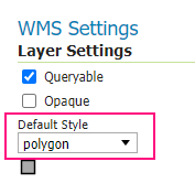
Scroll back up to the top of the page and select the "Tile Caching" tab. Make sure "application/vnd.mapbox-vector-tile" is selected under Tile Image Formats:
Now click "Save". We are now ready to start using our vector tile layer in Icon Map.
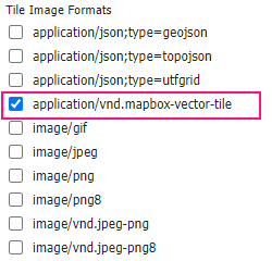
Firstly add Icon Map onto a report. In order to match our data to the vector tiles, we need to have a field contains values from one of the "Feature Type Details" area mentioned earlier. In this case the "areaCode" field matches the values in the "MSOA11CD" field. This is dragged into Icon Maps's category field. We also need to drag a measure or numeric field to the Size field, but this won't be used to render our vector data.
In the formatting pane, enable Vector Tiles. Enter the url in the following format: https://example.com/geoserver/gwc/service/wmts/rest/[workspace name]:[layer name]/[style name]/EPSG3857/EPSG3857:{z}/{y}/{x}?format=application/vnd.mapbox-vector-tile . We therefore end up with https://example.com/geoserver/gwc/service/wmts/rest/test:msoalayer/polygon/EPSG3857/EPSG3857:{z}/{y}/{x}?format=application/vnd.mapbox-vector-tile . Update example.com to match the address of your GeoServer. Note the address must the HTTPS for it to work in Power BI. Paste the URL into the Vector Layer URL textbox. You tiles should now render on the map:
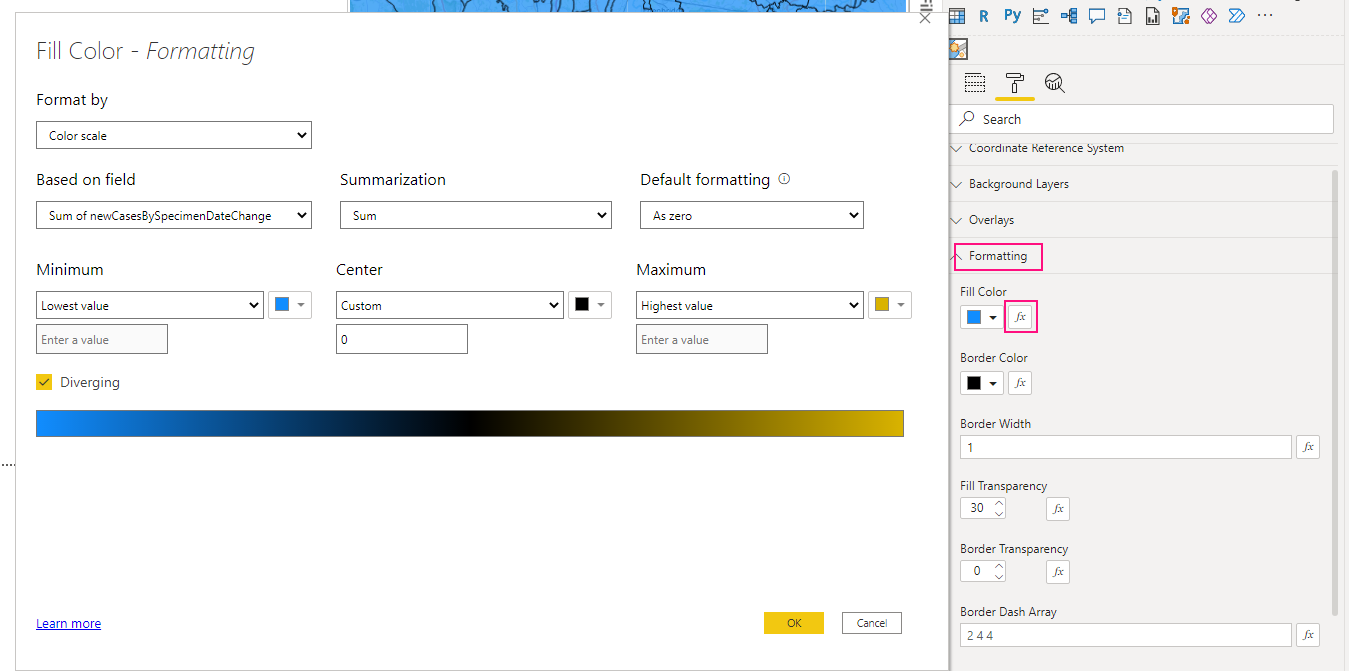
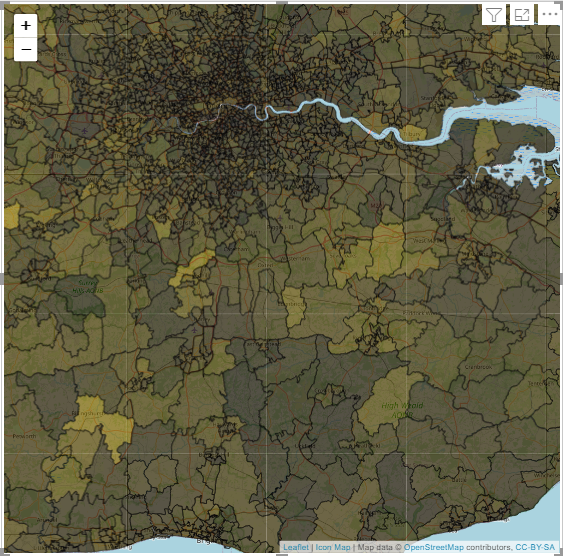
To create a choropleth map, use expression based formatting for the fill color in the formatting section:
The polygons that match values in your data should now adopt this colouring. The polygons that don't have a value in your data can be formatted using the options in the "Vector Tiles" section. An example Power BI report is available to download.
Adding custom Mapbox layers from Mapbox Studio (23rd August 2021)
Another quick blog to answer a common support question - if you've created a custom map layer using Mapbox Studio - how do you use it with Icon Map?
Once you've created you map, using the Share Option from the Mapbox Studio toolbar...

In the box that appears, select "Third Party" from the list of options in the "Developer resources" section, then select CARTO from the dropdown. You can then click the copy button for the Integration URL that is generated. This already contains your Mapbox token.
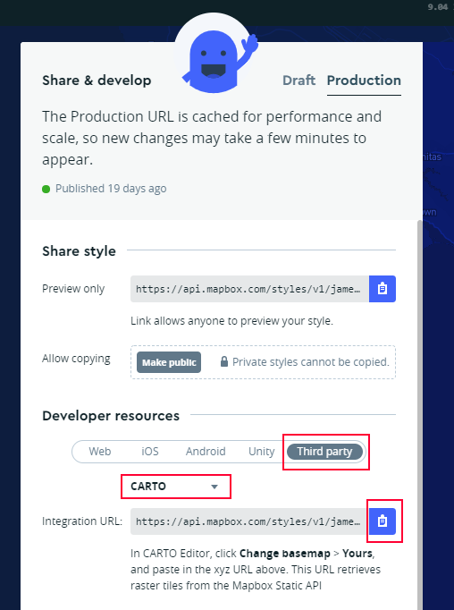
Now in Icon Map, select Custom URI from the background layer dropdown and paste your integration URL into the Custom Background URI box. Set the min and max zoom levels (usually 1 - 22 for Mapbox), and your new map background should appear. Don't forget to add a custom attribution in the "Controls" settings if required by your background layer.
Displaying tracks over time as line strings (16th August 2021)
I get quite a few requests for help where people are wanting to draw lines on the map representing a path that a vehicle or factory robot has travelled. Often this data arrives as a single coordinate pair on each row - one for each item at a point in time.
Unlike for example the Route Map custom visual, Icon Map however needs an origin and destination set of coordinates to be on the same row of data. This is to allow the flexibilty of mixing other object types on other rows of data. Therefore, to display these tracks in Icon Map the data will need some manipulation. Whilst it's usually straight forward enough to retrieve the previous set of coordinates, I thought I would show how to create the entire path as a Well Known Text LINESTRING object using DAX. If we create this as a measure, it means that we can dynamically alter the start and end times based on slicers. Drawing the whole path as a linestring also has the benefit that the line as a whole is selectable, rather than just a point in time.
Check out the example below. The source data is shown on the right. The DAX for the coordinates measure is shown, along with the resulting output, and how it can be displayed on Icon Map. The start and end times can be changed using the slicers at the top. Download the .pbix file to explore the map is configured.
Rendering different object types on the same map (15th August 2021)
It is possible to add objects of different types on the same map using Icon Map. The following types of object can be contained in your data and referenced on the map:
- Circles
- Lines
- Images
- Well Known Text
- Geojson objects
These can all exist on the map at the same time, it just depends on how you configure your data. The Power BI report below shows these different object types (except geoJSON) on the map with the data configuration in the table below. The report can be downloaded here so you can see how it has been configured.
All object types require the Category and Size fields to be defined (although not all will use the value in the size field).
Circles
Circles require the Longitude and Latitude fields to be populated. Destination Longitude and Latitude fields must be empty, and the Image / WKT expression based formatting setting must be empty. The size of the circle is specified using the Size field.
Lines
Lines require the Longitude and Latitude Fields and the Destination Longitude and Latitude fields to be populated. A circle at the origin will also be drawn using the size field for its radius, unless turned off in the object formatting settings. It is possible to draw an image at the origin and destination of the line using the object expression based formatting settings.
Images
Images require the same configuration as circles, but with the Image / WKT expression based formatting setting configured with a URL. It must either be an HTTPS:// URL or start DATA:// for 64bit encoded data, or SVG images. The image size will be based on the value you specify in the Size field. Images can be rotated by sepcifying a value between 0 and 359 in the Object formatting settings.
Well Known Text
Icon Map supports the following Well Known Text Objects: POINT, MULTIPOINT, TRIANGLE, LINESTRING, MULTILINESTRING, POLYGON and MULTIPOLYGON. It does not currently support GEOMETRYCOLLECTION. To plot a WKT object on the map, the Category and Size fields must be populated, although the value from the size field is not used. The Image / WKT expression based formatting field under Objects must be populated with a valid WKT object definition.
GeoJSON
GeoJSON shapes loaded from an external GeoJSON layer can be referenced in your data so that they can be selected, highlighted and formatted. The value in the Category field should relate to a property in the GeoJSON shape feature. The Size field must be populated but it not used. All other fields should be empty. The shape can then be formatted using the formatting settings. GeoJSON objects not referenced by your data can also be formatted using the GeoJSON formatting options.
Object behaviour
The behaviour of these objects can then be individually configured using expression based formatting to determine whether they are selectable, should show a tooltip, have a label.
Using Ordnance Survey maps with Icon Map (21st July 2021)
Icon Map has provided the ability to use your own map tile server for some years. However, this relied on the mapping provider supporting the WGS 84 / Pseudo-Mercator projected coordinate system as this was the only one supported by Icon Map. Today's release (3.1.0) adds support for additional coordinate systems, which opens up possibilities to use background maps not previously supported, such as Ordnance Survey Leisure Maps which use the British National Grid coordinate system.
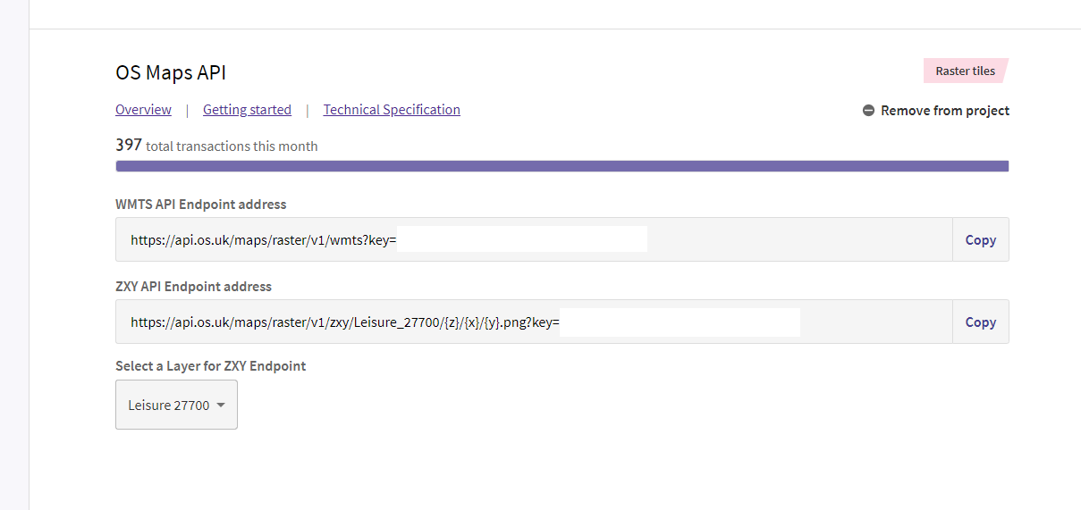
In order to use Ordnance Survey maps, you'll first need an API key, which means signing up for an account at https://osdatahub.os.uk/. Most UK public sector organisations can use the Public Sector Plan with unlimited access. Once you've signed up, create a new project and add the OS Maps API to it. Select the "Leisure 27700" from the dropdown. You should now have the endpoints populated with the appropriate URLS with the key already included:
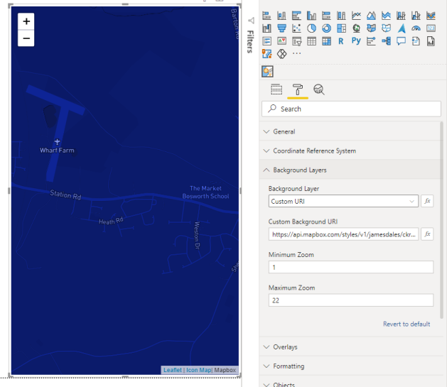
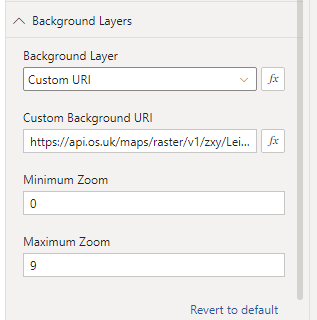
Now we have an API key, let's start to set up Icon Map in Power BI Desktop. Once you've added Icon Map onto your report, and added your data fields to the field wells, let's look at the background map configuration. In the Background Layers section, select "Custom URI" from the Background Layer dropdown. Copy and paste the "ZXY API Endpoint address" from the OS portal into the Custom Background URI textbox in Icon Map:
We now need to configure the minimum and maximum zoom levels. These are described in the technical specifications in the OS Maps portal: https://osdatahub.os.uk/docs/wmts/technicalSpecification.
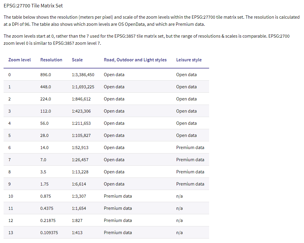
With a premium plan, the Leisure maps have zoom levels from 0 to 9 so lets configure that in Icon Map:
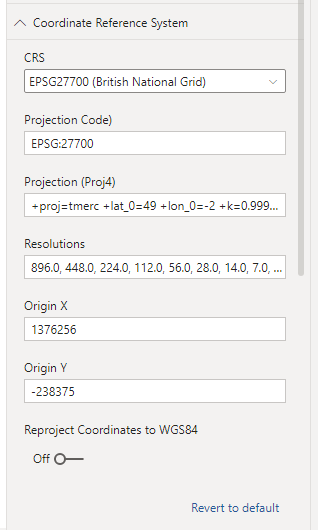
The background map tiles are now configured, but they still won't show as we haven't yet configured the British National Grid coordinate system that these tiles use. So in the Coordinate Reference System formatting options in Icon Map, select ESPG27700 (British National Grid) from the dropdown.
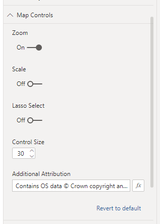
We also need to add the appropriate attribution text at the bottom of our map. In the Map Controls formatting options paste "Contains OS data © Crown copyright and database rights 2021" into the Additional Attribution text box:
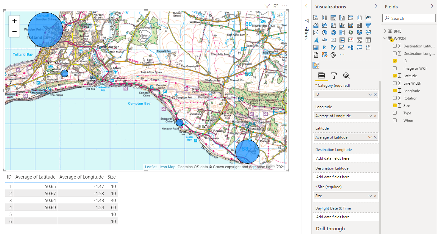
Now we can start plotting data on our map. If your coordinates are in longitudes and latitudes, then configure the map as normal and your objects should appear over the OS Leisure Maps base layer:
If your data has coordinates in British National Grid format (BNG), then we need to turn on the Reproject Coordinates to WGS84 option in the Coordinate Reference System formatting options. Drag the X and Y coordinates from your data into the Latitude and Longitude fields in Icon Map.
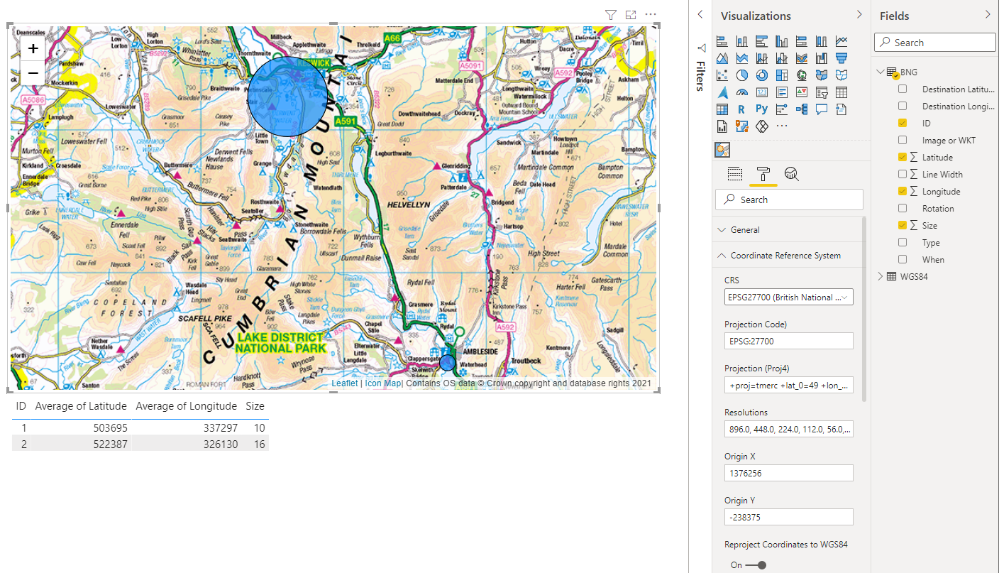
At the moment it's not possible to chose which objects require reprojection or not - it's all or none. Let me know if more flexibility would be useful here. Currently reprojection is supported for GeoJSON layers, WKT objects, circles, lines and images.
Using a custom image as map background (12th July 2021)
There are times when you might want to create a map, but not use map tiles as the background. Perhaps it's a shop store plan, a hand drawn image or an aerial photograph. Icon Map now supports these of scenarios with a flat map simple co-ordinate system. Essentially where you'd otherwise use a latitude and longitude, instead you just use the X,Y coordinates that relate to a location on an image. This blog explains how to use the UK's Ordnance Survey's Leisure Maps which are only provided in OSGB 1936 / British National Grid. This will pre-populate the configuration for OS Leisure Maps. If you're using a different OS Map layer, then you will need to add the additional Resolutions for zoom levels 10 to 13. You can find these in the technical specification table shown above.
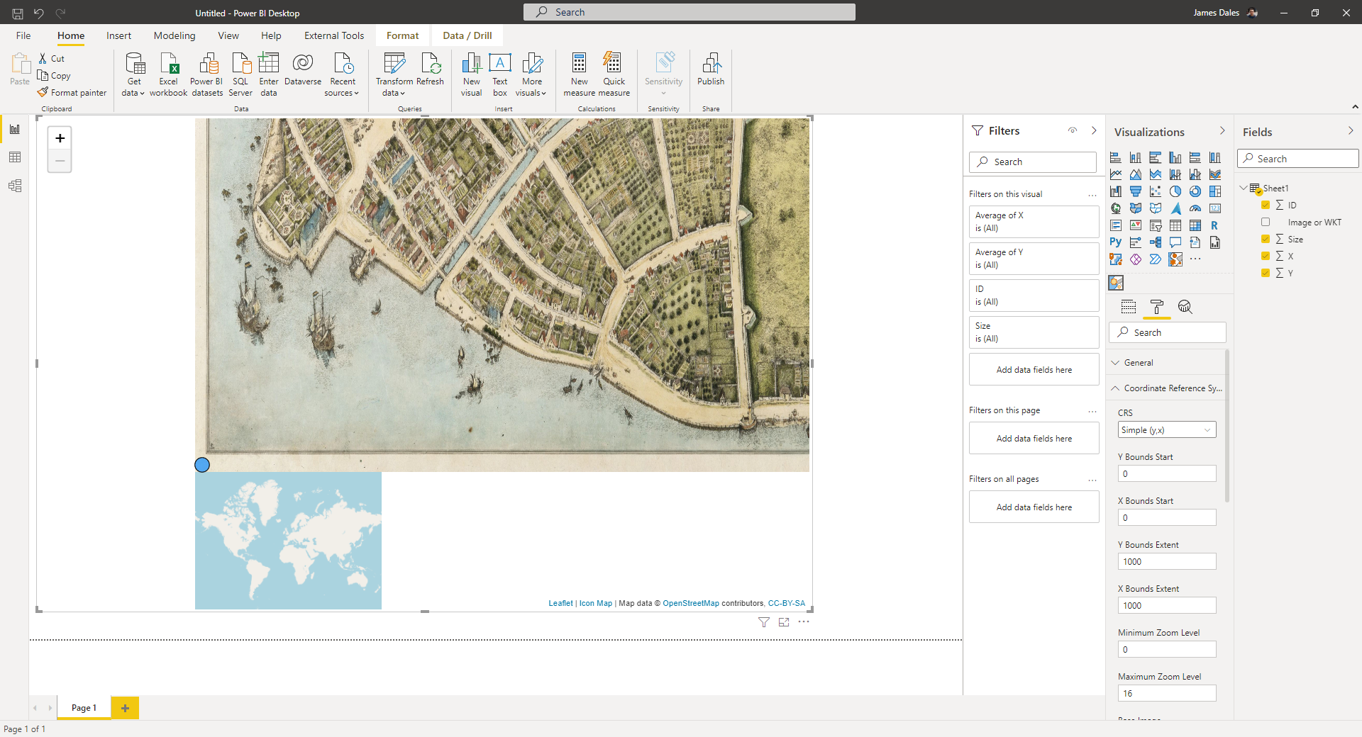
As an example, I've found this old 16th century plan of Old Amsterdam to use as a map background, on which we're going to highlight some features.

The map is available on wikimedia here: https://en.wikipedia.org/wiki/File:Castelloplan.jpg.
To ensure we use the largest version of it, we're going to use this version here: https://upload.wikimedia.org/wikipedia/commons/0/08/Castelloplan.jpg which is shown to be 3267 pixels wide and 2401 pixels high.
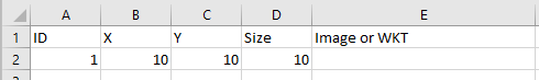
But, as always before we can do anything in Power BI, we need some data, so to get us started I've just created a simple one line spreadsheet for now and loaded it into Power BI.
So now lets download the latest version of Icon Map from the downloads page and add it into Power BI as a custom visual. Now we're ready to go.
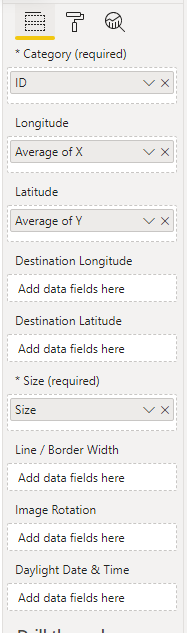
First we need to assign the data fields to the visual. Use the following configuration of fields:
Add Icon Map onto your report canvas. Then we need to reference our plan of Old Amsterdam. To do this in Icon Map's formatting settings we need to change the Coordinate Reference System settings. Change the CRS to Simple (Y,X) and paste in the URL of the large image into Base Image:
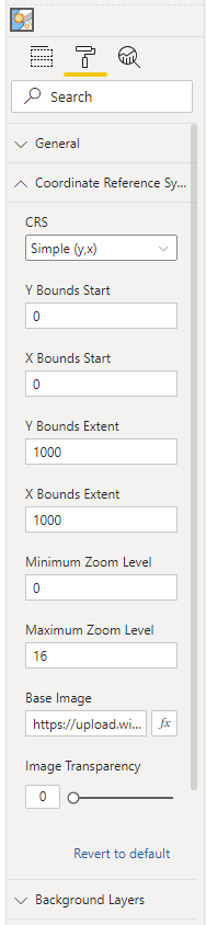
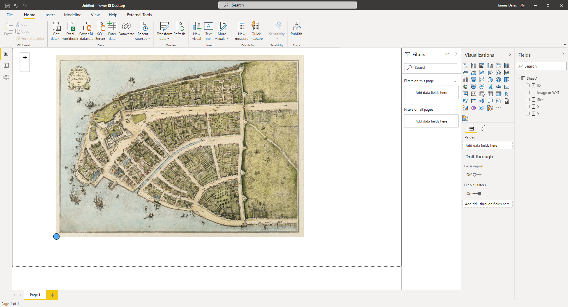
You'll probably not see anything straight away on the map, but try zoom out as far as you can, and you should see something like this:
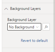
The first thing you'll probably notice is that we still have a map of the world showing. Let's get rid of that next. In the formatting options, under Background Layers set Background Layer to None
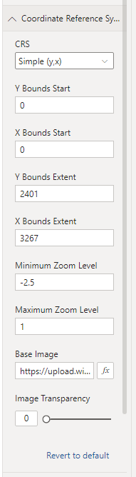
Then we need to configure our map so that the zoom works better, our image isn't stretched and our circles etc appear in the right place on the image. In the Coordinate Reference System settings, we set the X Bounds Extent and Y Bounds Extent to match the width and hight of the image. We can also change the min and max zoom settings. These may need to be a negative number when using a flat map image:
Then with these settings applied, our map should now be ready to start adding some data.
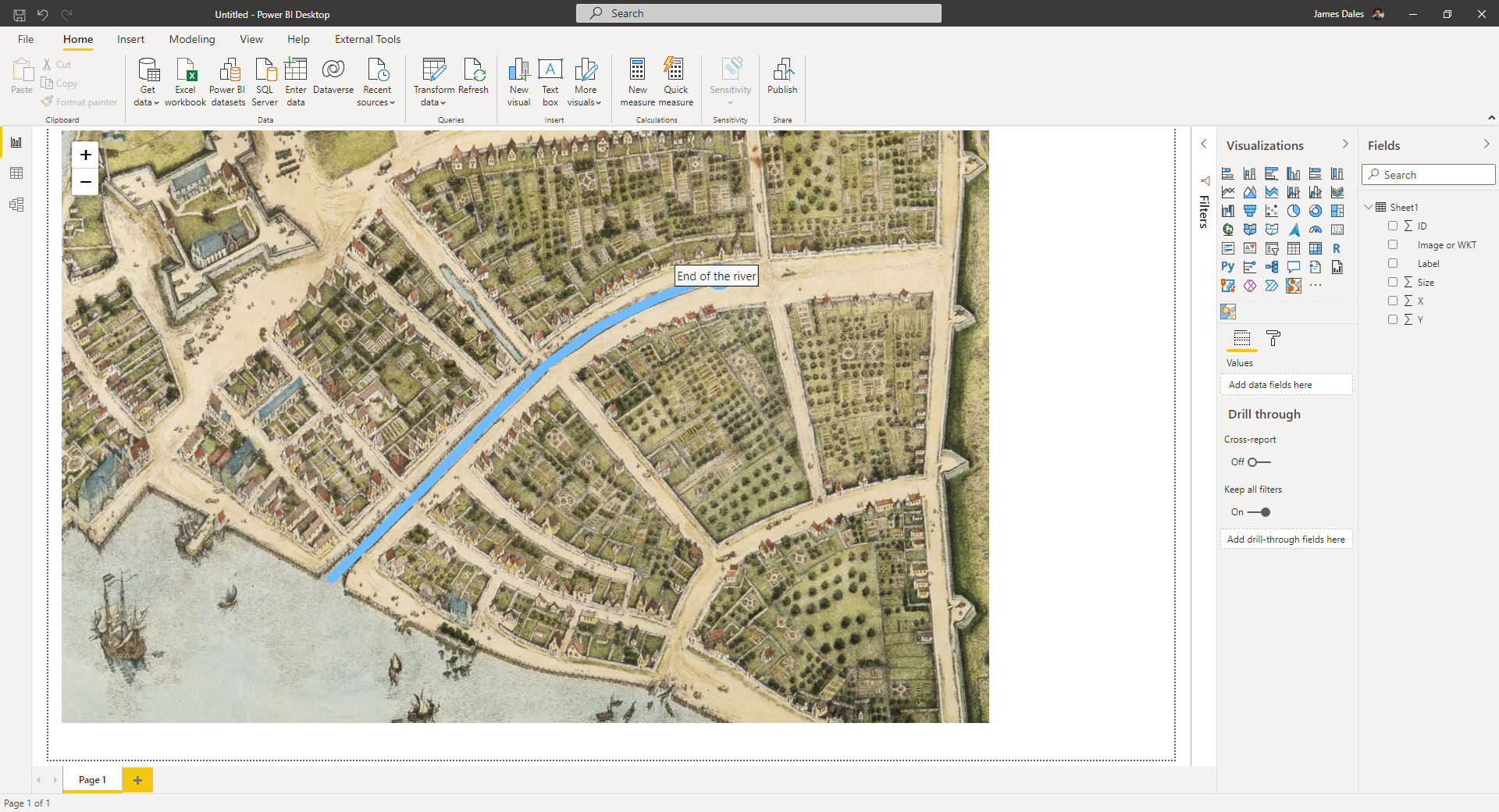
The blue circle at the bottom left hand corner is our one line of data. We're plotting a circle at 10 pixels up and across from the bottom left hand corner. Let's move our circle to the inland end of the river and add a label. First we need to find the X,Y coordinates. I'm using Paint.Net to work out the coordinates. As I hover over the end of the river, you can see the X,Y coordinates in the status bar at the bottom, representing the location of the cursor. The end of the river shows around X:1930 Y:1128:
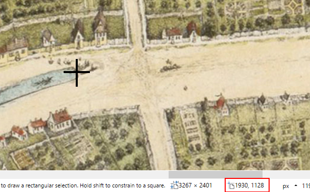
However, don't forget that Paint.Net will show you the coordinates from the top left. We need coordinates from the bottom left, so take the Y coordinate away from the high of the map (2401 - 1128 = 1273). Let's update our Excel sheet with these new coordinates and refresh.
Let's add a label field to our data and add it onto the map. Don't forget to refresh your Power BI query.

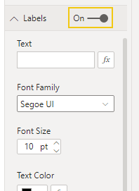
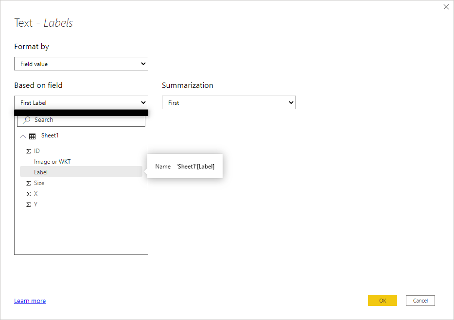
In the map settings, turn on Labels and click the fx button next to the Text textbox.
In the dialog box that appears, select our new Label field.
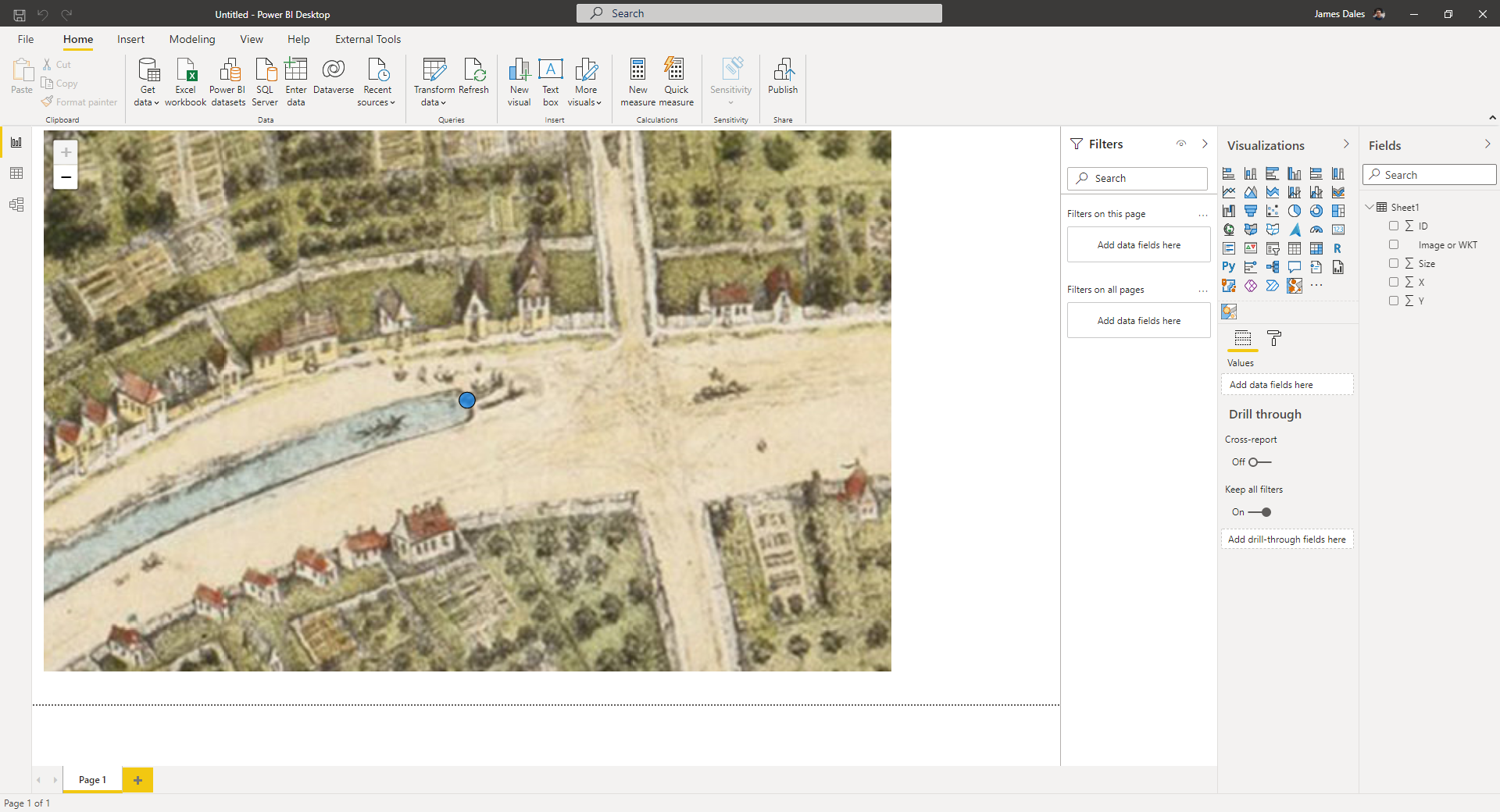
Now our label should appear over the circle.
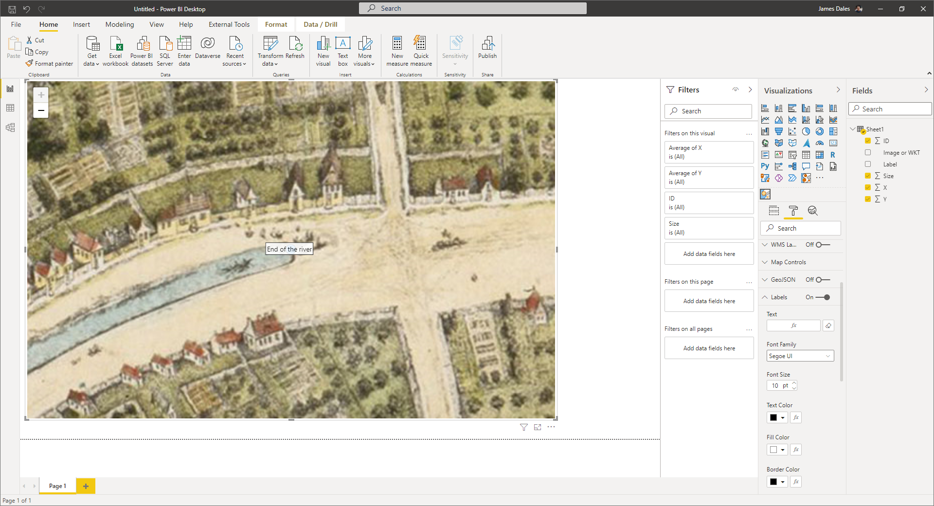
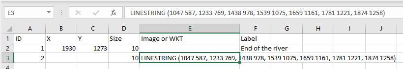
Finally, lets add a line to represent the river. For this we're going to create a linestring in Well Known Text (WKT) format using the points from along the river and add it as a new row of data. Note the X Y coordinate fields need to be blank, but still have a value in size:
Lets refresh the query again, to bring it into Power BI. Now in the map formatting options, under Objects, click the fx button against Image / WKT and select the "Image or WKT" field from our data model.
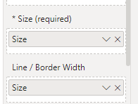
Now our line should appear on the map. But it's a bit thin, so let's use the size field and add it to the Line / Border width field well:
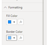
Also let's change the colour to a blue by changing the Border Color setting under Formatting:
And now we have our map with a line, circle and label on a zoomable custom map. The .pbix file and source Excel file can be downloaded if you want to see how it has been built.
There are all sorts of possibilities achievable with this. This example was created using the same techniques as above playing images of trains at X Y coordinates, but combined with the Play Axis slicer.